The network for creativity
Join 1.25M professional creatives like you
Connect with clients, get discovered, and run your business 100% commission-free
Creatives on Contra have earned over $150M and we are just getting started
Back to feedPost

AI is powerful.
But most AI products are still… hard to use.
We worked on the Super Sense AI experience
and the biggest challenge wasn’t the model…
It was making intelligence usable.
AI systems today are complex by nature.
Even infrastructure like AI superclouds exist to simplify and scale AI workflows across systems.
But if UX fails ❌ none of it matters.
Here’s what we focused on:
• Simplifying AI interactions
• Designing intuitive flows for complex outputs
• Making AI feel human and usable
Because users don’t care about models.
They care about outcomes.
Built using:
· Figma
· Framer
· AI workflows (Claude + structured prompting)


The network for creativity
Join 1.25M professional creatives like you
Connect with clients, get discovered, and run your business 100% commission-free
Creatives on Contra have earned over $150M and we are just getting started



Related posts

Explaining "unlimited development" in 30 seconds is harder than it sounds.
That was the brief from figue.ai: a subscription where startups get a dev team without hiring one. Great product, but abstract. So I skipped the buzzwords and showed what it actually feels like: you ask, it gets built, you ask again.
Every interface in the video is rebuilt from scratch, so the product feels real instead of mocked up.
Really enjoyed this one! If you're launching something that's hard to explain, that's exactly the kind of project I love.


TOP!!


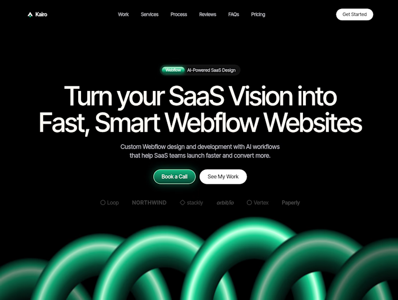
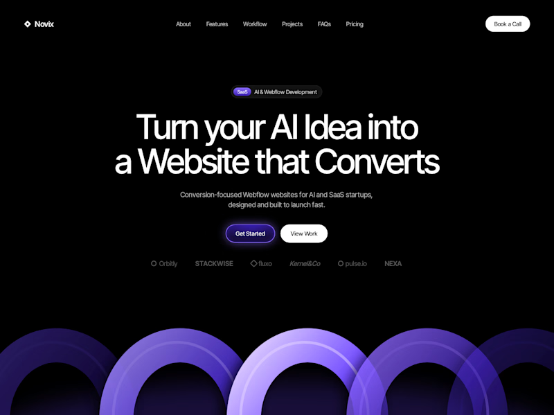

Both look great, but Violet & Black gets my vote! The purple accents give it a more modern, premium feel while keeping the design clean and focused on conversions. Amazing how a color change can create such a different brand personality. Have you tested which version performs better with visitors?

Vihta is a Framer template for saunas, bathhouses and wellness venues, designed in Figma and built in Framer. It has 14 pages, live booking, gift cards and a CMS for events and a journal. Coming soon to the Framer Marketplace.
Nice work!!