The network for creativity
Join 1.25M professional creatives like you
Connect with clients, get discovered, and run your business 100% commission-free
Creatives on Contra have earned over $150M and we are just getting started
Back to feedPost

Working On First Project On Contra - Kickstarter Campaign Page creation including all Image Rendering , campaign Video & Other Marketing content


NEW PAID PROJECT
Manish shahBillie BBQ
The network for creativity
Join 1.25M professional creatives like you
Connect with clients, get discovered, and run your business 100% commission-free
Creatives on Contra have earned over $150M and we are just getting started







Related posts

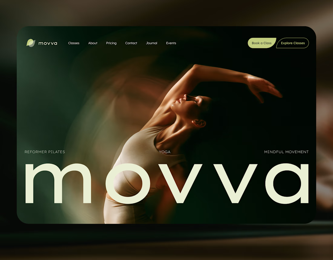
MOVVA is now featured on Contra 🤍
I’m especially happy about this because working on this template was a creative outlet for me.
I wanted to build something useful for a business: a website that covers what a studio needs when it opens, from an easy-to-use schedule to clearly structured class information, with a solid foundation for SEO.
At the same time, I wanted it to feel beautiful. To bring a sense of movement, lightness, and the joy of taking a class into the design. To capture that friendly atmosphere that makes you want to walk into a studio and give it a try.
Thank you, Contra team!


Huge congrats on getting featured! 🤍 MOVVA looks stunning - love the mindful movement vibe and that hero image. Super useful concept for studios. Well deserved feature!

An existing brand identity showcased across a new campaign. This was one of my favourite projects ever!

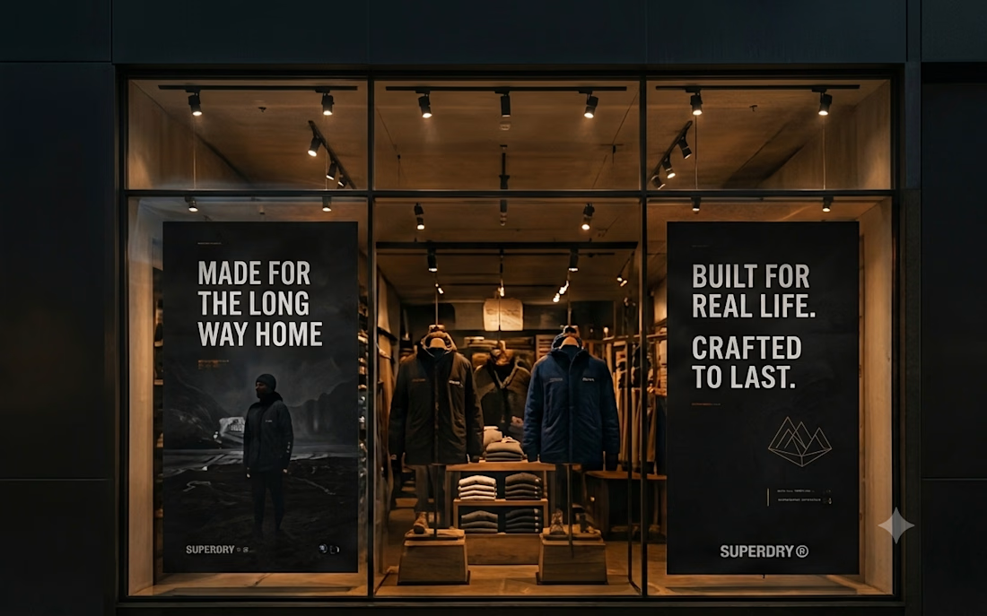
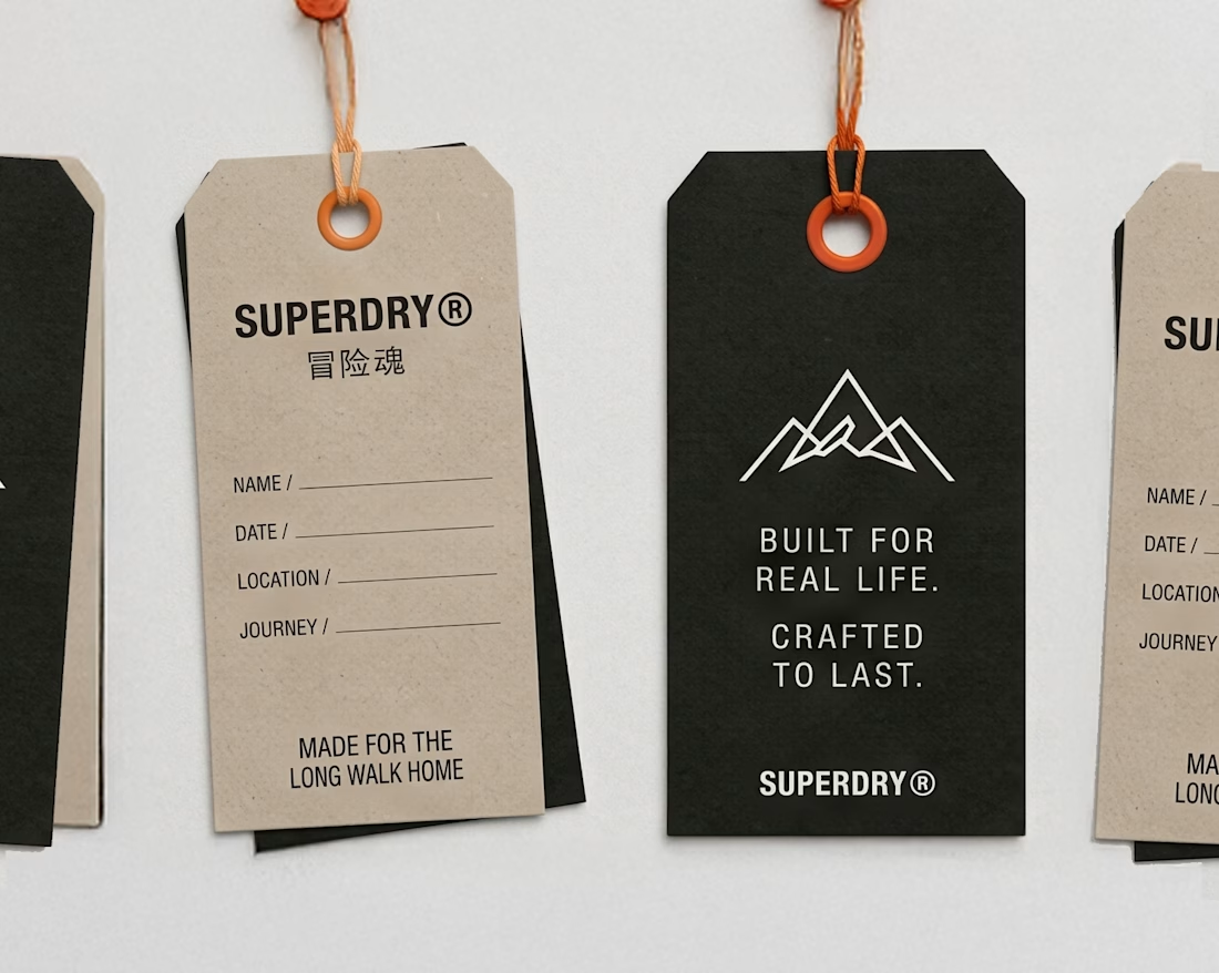
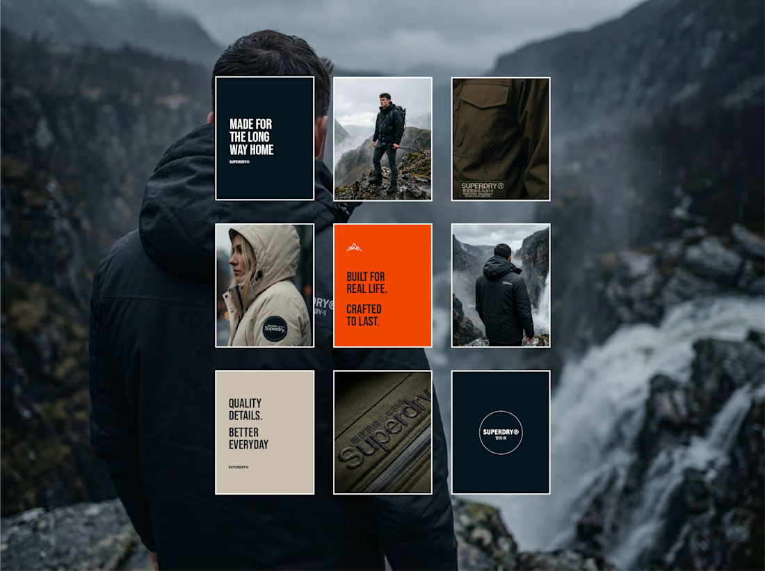
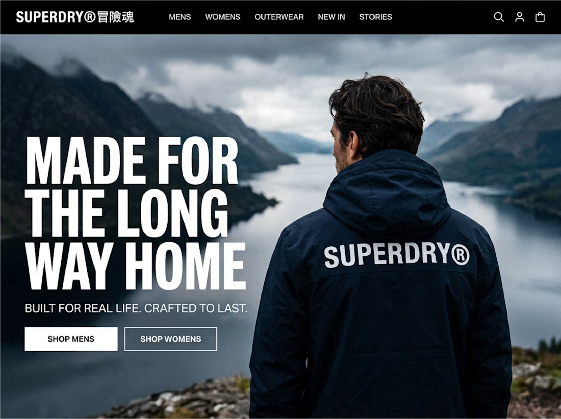

That gold foil on textured paper is just perfect. Really love the soft swirl in the logo, feels so calm. Saved for inspiration!

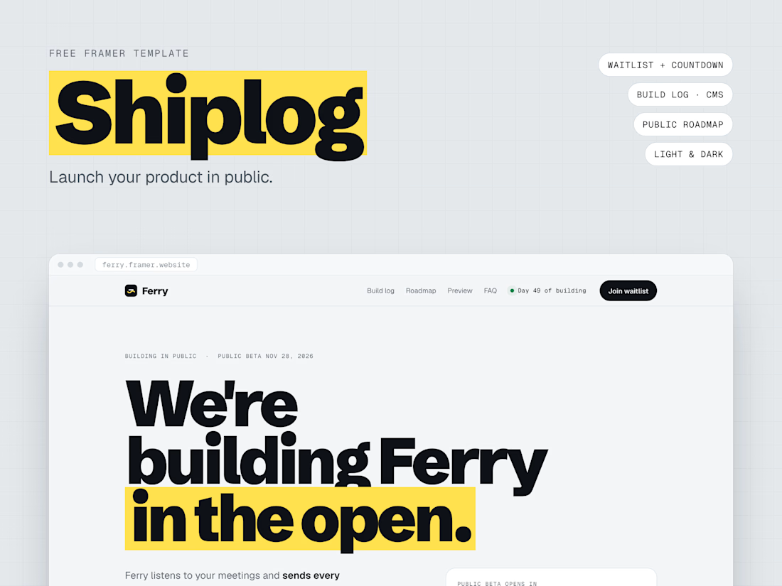
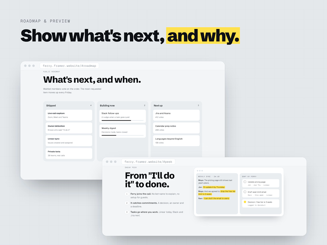
I designed and built Shiplog, a free Framer template that helps founders launch in public and grow a waitlist before launch day.
The problem: Most pre-launch pages give visitors nothing to follow. People sign up once and forget the product exists.
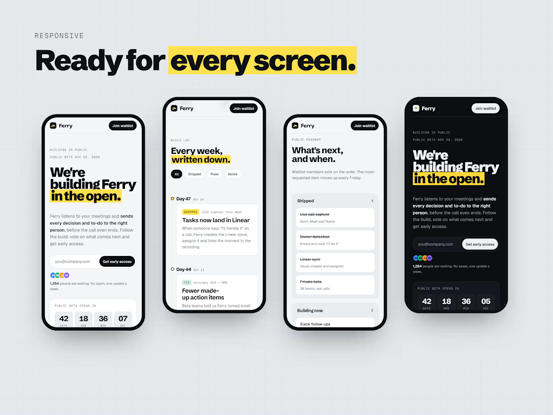
My approach: A launch page built around progress people can watch. Visitors see a live countdown, a dated build log, a public roadmap with votes and a note from the founder. That gives them a reason to sign up and come back.
What’s inside
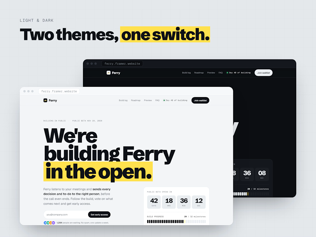
• Waitlist forms in the hero and in the closing section, plus a countdown and a progress bar
• A build log and a roadmap, both managed from the Framer CMS
• A product preview section and FAQ
• Light and dark modes, plus desktop, tablet and phone layouts
Design choices: a bold headline font with a yellow highlighter on key phrases, and monospaced labels for dates and status.
Free on the Framer Marketplace: https://incredible-tone-549125.framer.app/
Launching soon? I design and build launch pages, SaaS sites and custom Framer components. Message me here on Contra or email asadhussainsyedi101@gmail.com.


A dated build log is a smart answer to the dead waitlist problem, it gives people a reason to come back before there is a product. The monospaced labels for dates and status is a nice touch too, it makes the progress feel real rather than decorative.