The network for creativity
Join 1.25M professional creatives like you
Connect with clients, get discovered, and run your business 100% commission-free
Creatives on Contra have earned over $150M and we are just getting started
Back to feedPost
Taste Test
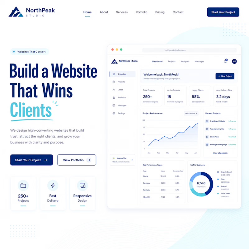
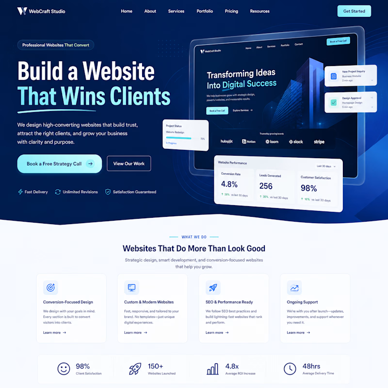
Your homepage hero section creates the first impression.
Which one would make you stay and keep scrolling?
🅰️ Option A: Clean & Minimal
🅱️ Option B: Bold & High-Impact
Vote below and tell me why you picked it! 👇
🅰️ A
🅱️ B
#WebsiteDesign #UIUX #WebDesign #LandingPage #CreativeCommunity #DesignInspiration #Contra


8 votes
Ends in 1d


The real answer depends on what happens after the scroll. option B sells the vision faster. option A earns trust faster. whichever one matches your actual sales process after the hero is the right pick, not whichever looks better in isolation

Wow that's great to hear
I think I have also learn something
glad it added a new angle. the scroll behavior after the hero is where the real signal is anyway

I prefer Option A. Option B feels more like an AI generated UI, while Option A has a more refined and intentional look.
Wow Some people don't even think that way at all, thanks once again for the information
The network for creativity
Join 1.25M professional creatives like you
Connect with clients, get discovered, and run your business 100% commission-free
Creatives on Contra have earned over $150M and we are just getting started
Related posts

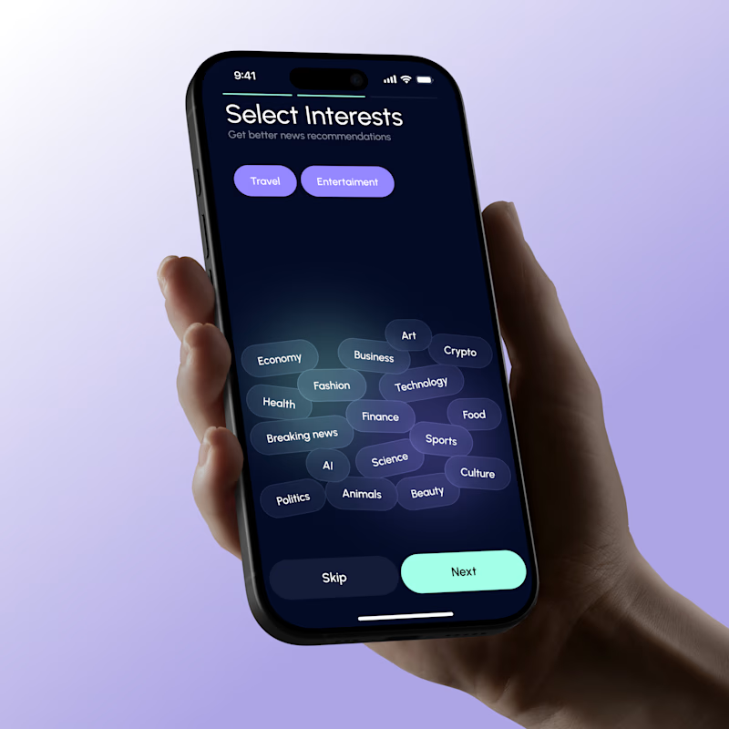
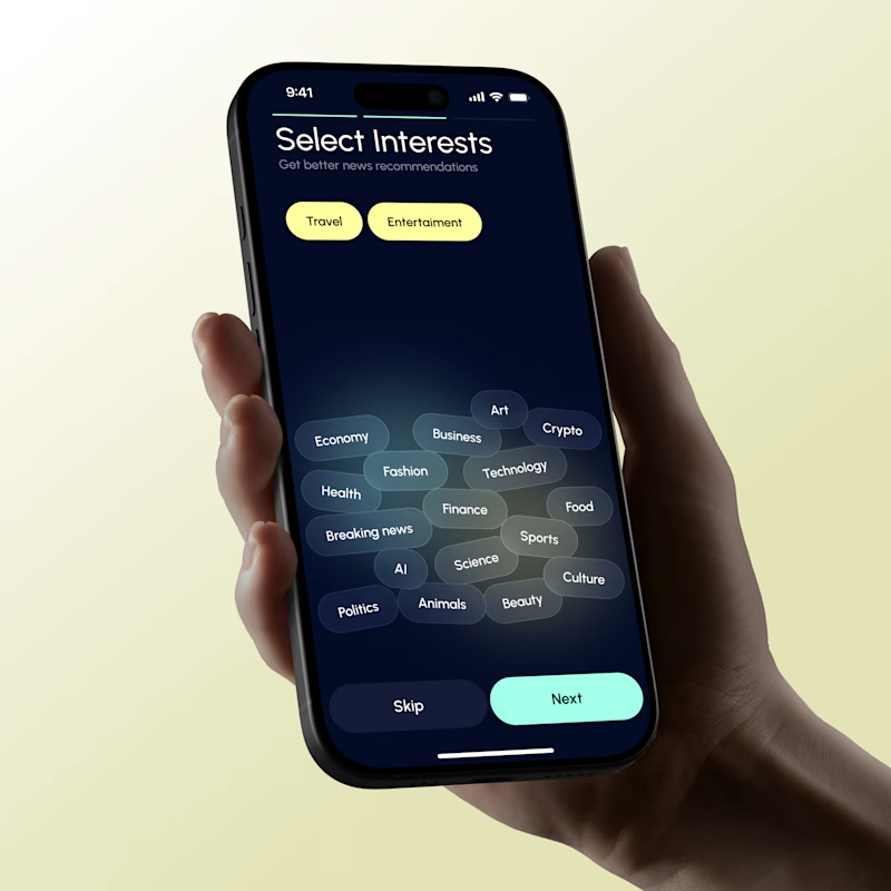
Color palette vote 🎨
Same product. Same layout. Different color direction.
Which palette feels stronger to you and why? 🎨
45 voted
54%
39 voted
46%
84 votes
Closed

The warm cream palette feels stronger

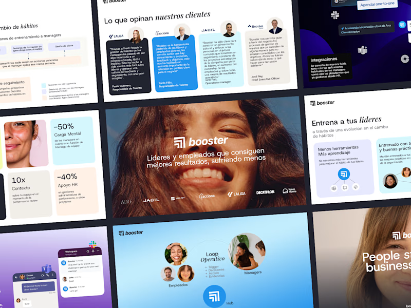
I just uploaded this new case study for a sales deck design template done in Google Slides...which cover image do you prefer?
Here's the case study for reference :)

53 voted
69%
24 voted
31%
77 votes
Closed
It is so so amazing 😍

41 voted
79%
11 voted
21%
52 votes
Closed

Butterfly mood looks incredibly immersive and lively!🔥













Trending

Claude
Claude has entered the design space. How are you using Claude Design?

Contra University
Learn from expert creatives how to earn more using next-gen AI tools.
creativeaiflow
Creative AI workflows are evolving. What tools do you use, and what are their strengths and weaknesses?
freelancerlife
Freelancer life is wins, pivots, and everything in between. What’s yours right now?