The network for creativity
Join 1.25M professional creatives like you
Connect with clients, get discovered, and run your business 100% commission-free
Creatives on Contra have earned over $150M and we are just getting started
Back to feedPost


A beautiful website means very little if nobody can find it.
One mistake I see often:
Businesses spend weeks improving their website design but treat SEO as something to do afterward.
SEO should start while the website is being built.
Things like:
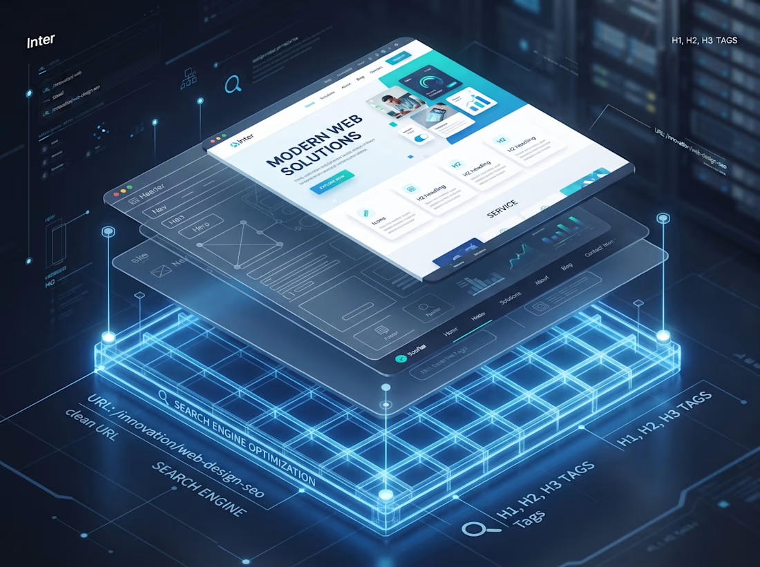
→ Site structure
→ Page hierarchy
→ Clean URLs
→ Heading structure
→ Internal linking
→ Image optimization
→ Mobile performance
→ Core Web Vitals
→ Search intent
These decisions affect how easily Google can understand and rank your website.
Whether it’s Webflow, WordPress, or Wix, development and SEO shouldn’t be completely separate processes.
Build the right foundation first.
Then make the website look great.
What do you think businesses overlook most when launching a new website: SEO, speed, or conversion?

The network for creativity
Join 1.25M professional creatives like you
Connect with clients, get discovered, and run your business 100% commission-free
Creatives on Contra have earned over $150M and we are just getting started






Related posts

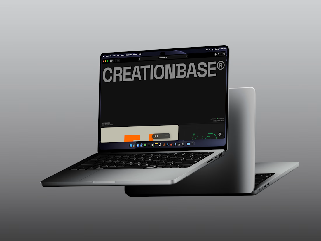
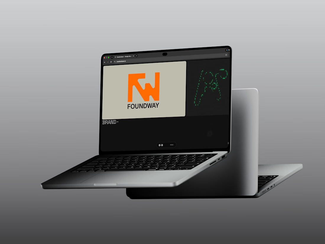
Overhaul of the Creationbase website.
A very different direction.
In the words of Dieter Rams “Good design is as little design as possible.”
I’d love to hear your thoughts.
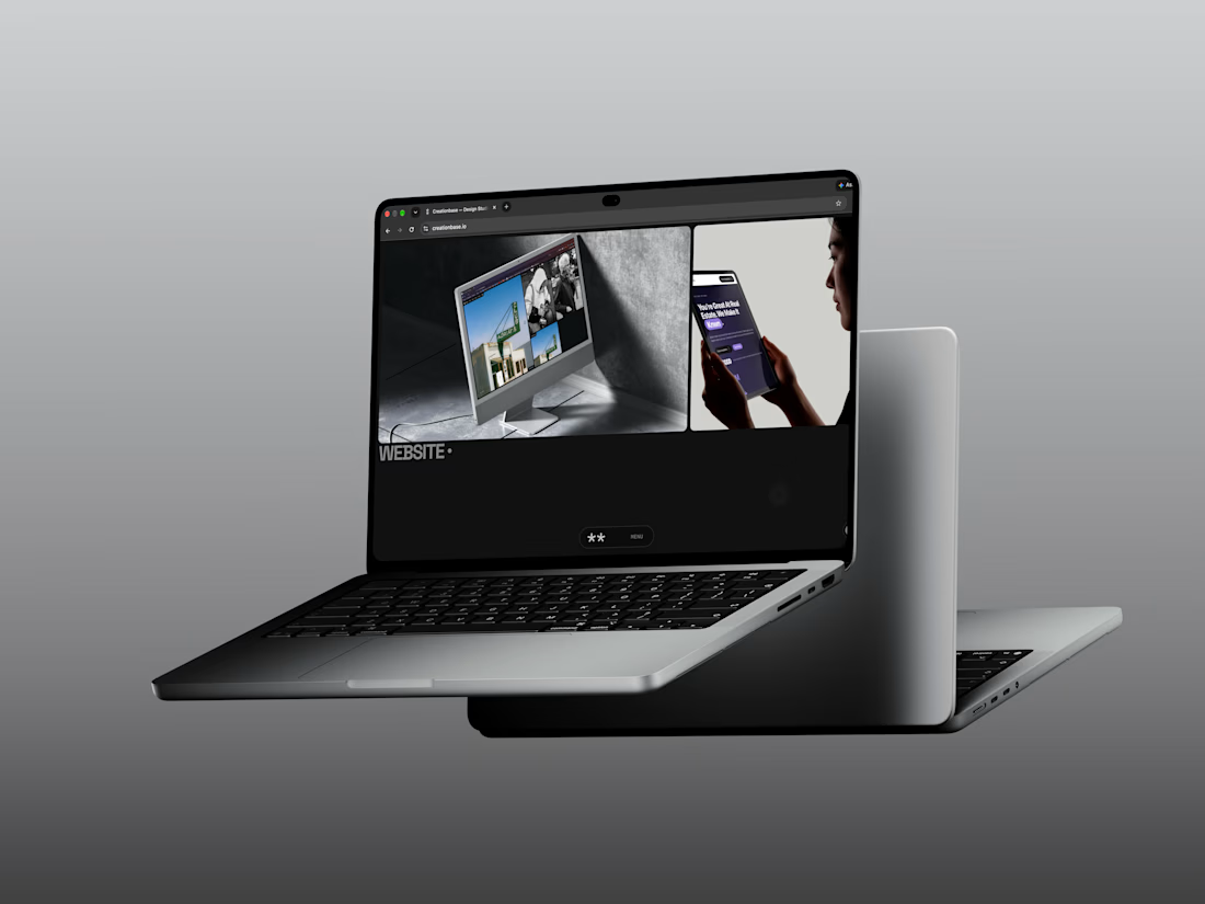
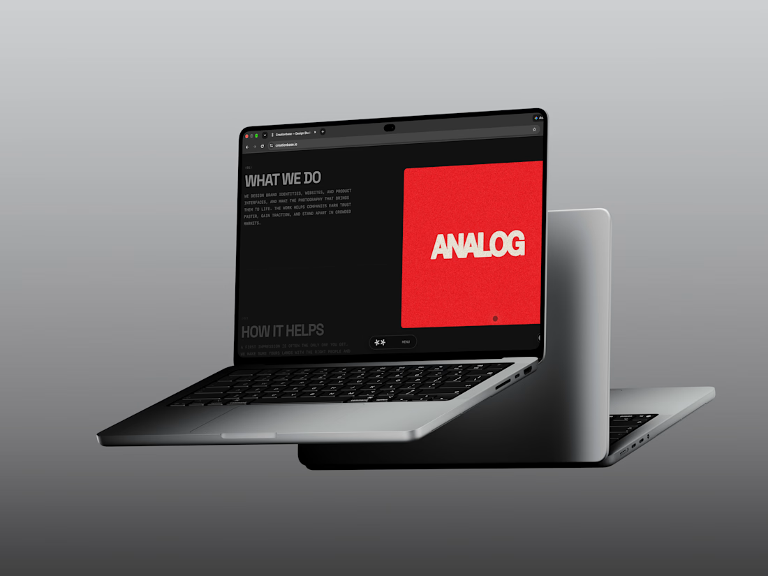


Most revisions happen because you saw your website too late.
A month of waiting, a big reveal, and it's not what you had in mind.
Here's how we avoid that:
I mock up the first page only. Very rough - more of a direction than a design.
If it's good, you see it right away.
If it's not, we ask ourselves why. The product is good and we know our job, so something else has to change: the content, the positioning, or a weak point in the product we need to raise with you.
Either way, we iterate on that one page together. That's how the tone of your website gets shaped.
After that we just keep adding meat on these bones. It snowballs, and by then there aren't many places left to disagree.
This is what a client wrote after hiring me again:
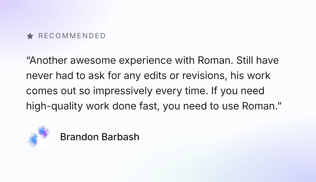

There is nothing more valuable than a long-term partnership

Just published a new UX & Conversion Copywriting concept on my profile! 🚀
Most habit-tracking apps lose users in two places: vague landing pages that don't explain how the app fits real life, and overwhelming onboarding flows that ask for too much before delivering a quick win.
For this self-initiated PulseHabit concept, I mapped out the full user journey:
• SEO Landing Page: Built to turn high-intent search traffic into free trials using zero-friction microcopy.
• 4-Screen Onboarding Flow: Focused on single-habit selection to eliminate decision fatigue and get users to Day 1 activation faster.
Check out the full breakdown on my profile and let me know which screen you’d test first! 👇