The network for creativity
Join 1.25M professional creatives like you
Connect with clients, get discovered, and run your business 100% commission-free
Creatives on Contra have earned over $150M and we are just getting started
Back to feedPost
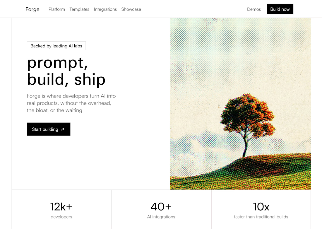
I’ve been exploring how contrast can give a UI more personality.
For this concept, I kept the interface restrained and let the visual direction do more of the expressive work.
The idea was simple:
Not everything needs to compete for attention.
Sometimes a stronger visual identity comes from knowing what to hold back.
That balance is something I enjoy exploring when designing interfaces.


Love this mindset. How do you usually pitch this level of visual restraint to clients who want to cram everything into the hero?

I usually don't pitch it as “let's remove things.”
I frame it around what we want the user to understand first. If everything is competing for attention in the hero, the main message can actually become less clear.
So I usually show a couple of variations and let the difference...


That monochrome aprooach made the already strong colored & dithered visual stand out even more ans it looks really nice. Great design and approcah!
Thank you
The network for creativity
Join 1.25M professional creatives like you
Connect with clients, get discovered, and run your business 100% commission-free
Creatives on Contra have earned over $150M and we are just getting started











Related posts

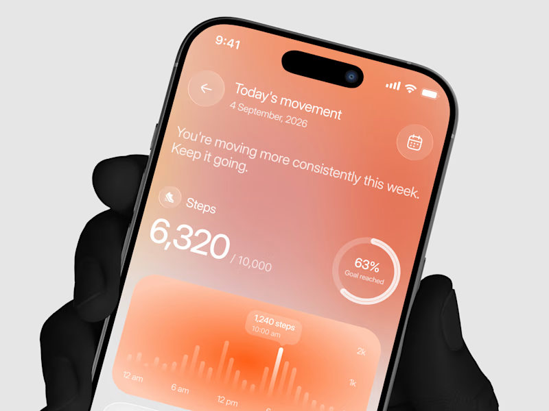
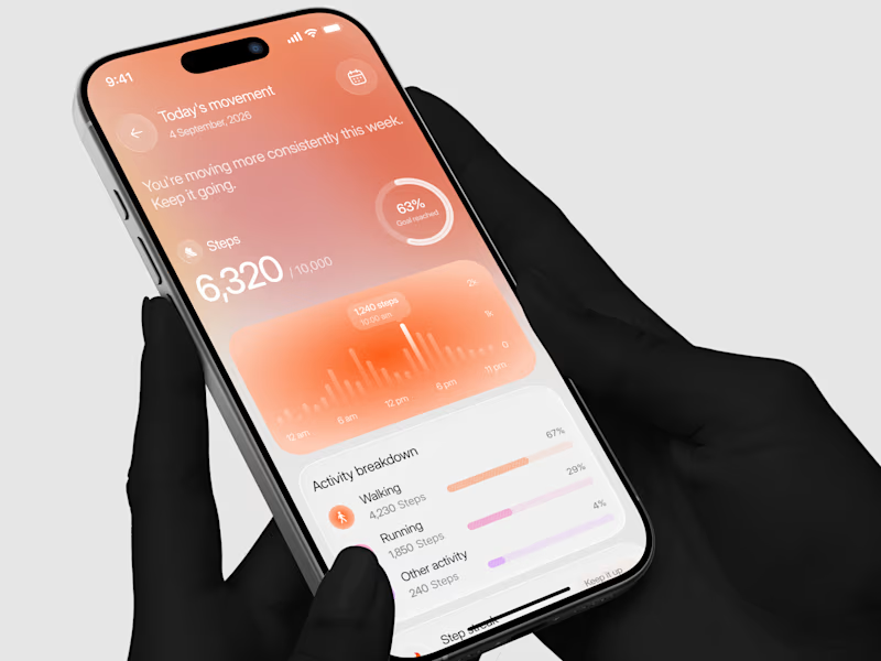
Designed a step tracking screen where you can see your daily progress and weekly trend in one glance.
Same screen, two shots. Which one would stop your scroll? 👀

11 voted
73%
4 voted
27%
15 votes
Closed


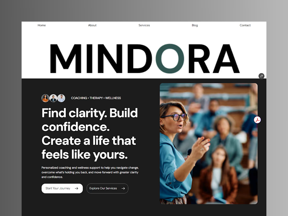
Introducing Mindora — a Life Coaching & Wellness Framer Template.
I designed Mindora for life coaches, wellness professionals, and personal growth brands looking for a calm, modern, and welcoming online presence.
Inspired by clarity, confidence, and meaningful growth, Mindora features a thoughtful layout, dedicated service sections, a blog for sharing valuable insights, and a clean visual style designed to help brands connect with their audience.
Built with Framer, it's a customizable starting point for creating a professional coaching or wellness website.
Explore Mindora and bring your next website idea to life.
Kindly check it out the template: https://www.framer.com/marketplace/templates/mindora-life-coach/



Great work

Exploring a clean, modern SaaS dashboard UI. Focused on simple layouts, smooth interactions, and a better user experience 🚀


i had to like this, it got my attention, very nice build mate.