The network for creativity
Join 1.25M professional creatives like you
Connect with clients, get discovered, and run your business 100% commission-free
Creatives on Contra have earned over $150M and we are just getting started
Back to feedPost

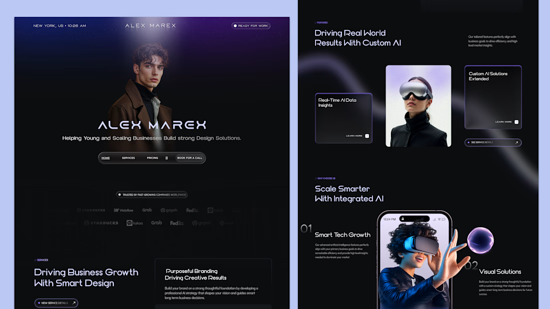
Most websites don’t fail because of bad ideas — they fail because of weak design.
This is what a high-converting, future-ready UI looks like 👇
I didn’t just design a “beautiful” interface here.
I designed something that:
• Grabs attention in 3 seconds
• Builds instant trust
• Feels premium without trying too hard
• Guides users toward action (not confusion)
The reality?
Your product might be great — but if your design doesn’t reflect that, you’re losing opportunities every single day.
That’s where I come in.
I work with startups and growing businesses to craft UI/UX that actually performs — not just looks good. And yes, I also have a development team to bring everything to life.
If you’re serious about scaling, let’s talk.
💬 Open to collaborations & new projects

The network for creativity
Join 1.25M professional creatives like you
Connect with clients, get discovered, and run your business 100% commission-free
Creatives on Contra have earned over $150M and we are just getting started





Related posts

AI Sales Agent SaaS Landing Page
A modern AI Sales Agent & Sales Intelligence SaaS website designed for startups and growing businesses looking to automate sales workflows, streamline lead management, and boost revenue through intelligent automation and real-time insights. The design combines a premium SaaS aesthetic with a conversion-focused user experience, featuring clear product messaging, interactive sections, and a scalable interface built to support modern sales teams.

Amazing design

Saas Management Landing Page Design


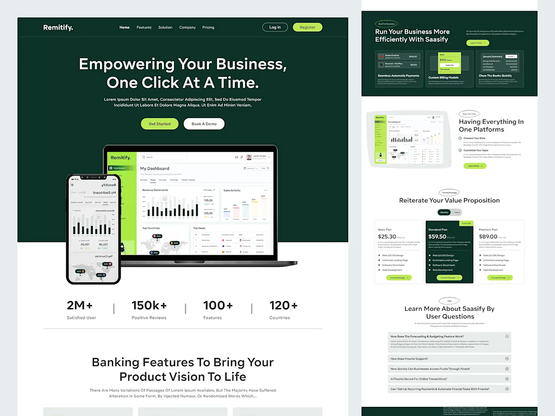
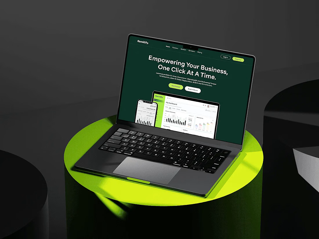

The deep green with lime accents reads "finance you can trust" without feeling like a bank, and the stats row right under the hero adds instant credibility. When pages like this get built, the dashboard in the hero is the part I'd make live: a lightweight animated version with...

Brand identity work for WesoftAI
