The network for creativity
Join 1.25M professional creatives like you
Connect with clients, get discovered, and run your business 100% commission-free
Creatives on Contra have earned over $150M and we are just getting started
Back to feedPost

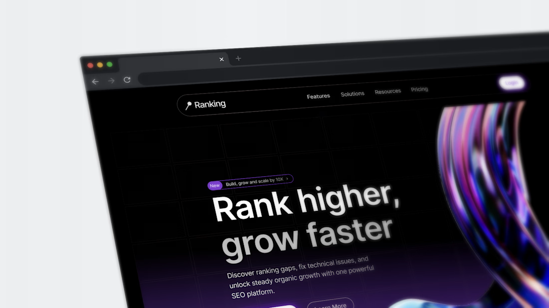
A sneak peek into Ranking, a SEO software as a servicen tool to rank, grow and scale business faster.
The network for creativity
Join 1.25M professional creatives like you
Connect with clients, get discovered, and run your business 100% commission-free
Creatives on Contra have earned over $150M and we are just getting started

Challenges
View all


Related posts

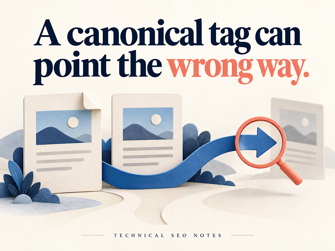
A Canonical Tag Can Be Present and Still Point to the Wrong Page
A redesigned page can look right while its canonical tag points to an old URL. A check that only asks whether the tag exists will miss that mistake.
Before signing off the release, define which URL should represent each page, then check what the deployed website actually declares.
For example, imagine a workshop page available at both its clean address and a newsletter URL with tracking parameters. If they show the same workshop, both should declare the agreed clean URL. A separate workshop with different content needs its own decision.
For each page type, check:
• The expected canonical is written down before testing.
• The declaration in the initial HTML points to that URL, and JavaScript does not replace it with a different one.
• The target opens the intended page, with suitable crawl and indexing settings.
• Internal links, redirects and sitemap entries support the same preferred address.
A correct value in the CMS settings is only part of the evidence. Test the public page, including any alternate URLs that visitors actually use. Include another page built from the same template to see whether the problem repeats.
Keep the handoff short: requested URL, expected canonical, actual declaration, target response and the person responsible for correcting it. That gives a developer enough information to reproduce the problem and QA a specific condition to retest.
Then compare the implementation with Search Console's indexed record. Check the crawl date before using an older result to judge a new deployment. Google's selected canonical is a separate observation; a correct declaration does not guarantee that Google will choose it, and the live test cannot predict that choice.
The release check can establish that the website sends the intended signals. Record Google's later selection separately so the team can distinguish a deployed defect from an indexing decision.
I put together the implementation checks and examples in the full guide on Technical SEO Notes:
https://technicalseonotes.org/canonical-tags-purpose-examples-and-implementation-checks/
Projects and client work: NikoCodes
https://nikocodes.com/



slightly exhausting personality trait: I need every new project to be the best thing I've ever designed.
14 years of doing this and somehow the obsession is only getting worse.
constantly learning, getting better, changing my mind, finding new things I want to try.
god I love design.





A feels more professional ❤️