The network for creativity
Join 1.25M professional creatives like you
Connect with clients, get discovered, and run your business 100% commission-free
Creatives on Contra have earned over $150M and we are just getting started
Back to feedPost

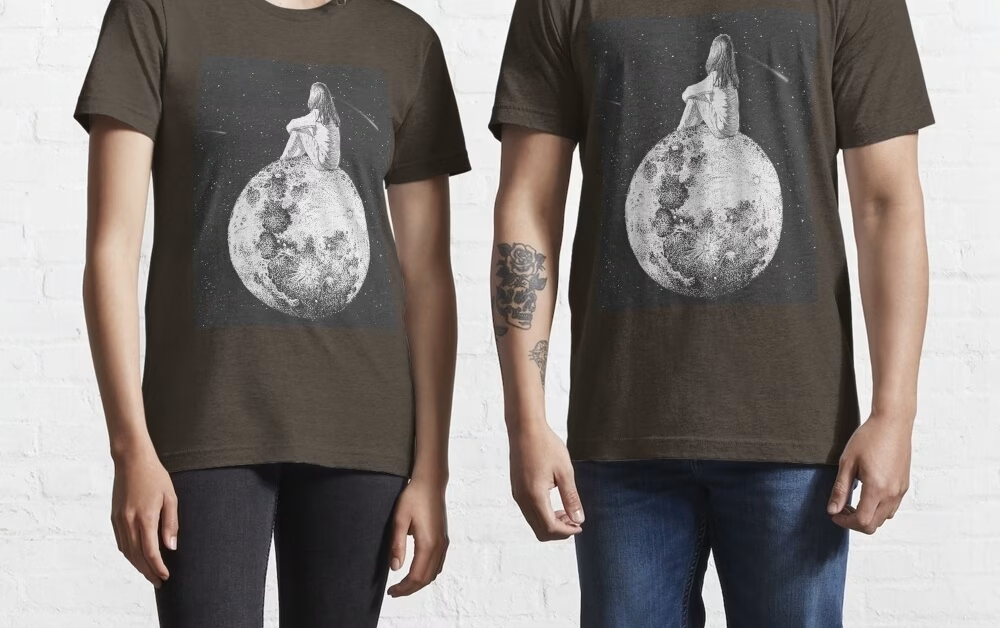
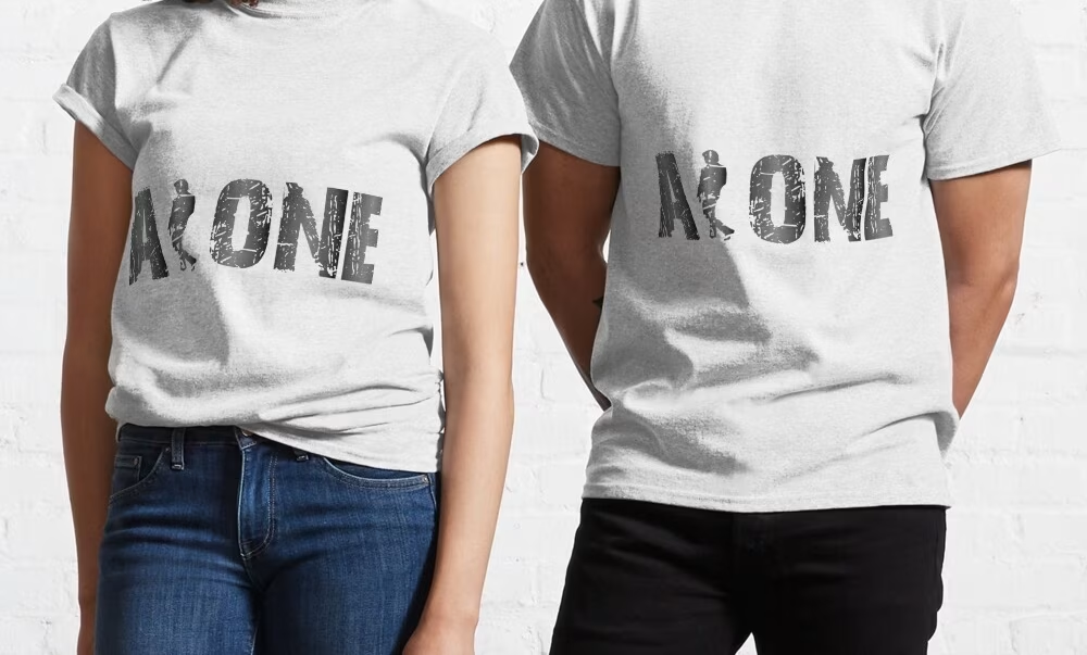
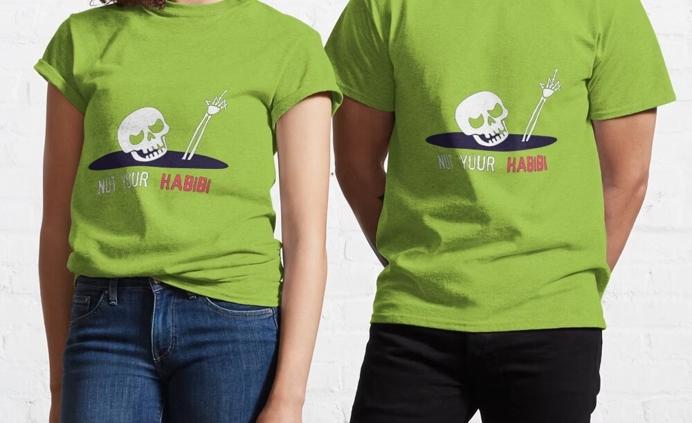
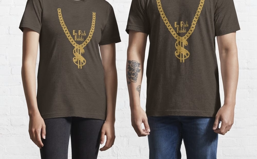
Some logo designs that are printable on t-shirts


The network for creativity
Join 1.25M professional creatives like you
Connect with clients, get discovered, and run your business 100% commission-free
Creatives on Contra have earned over $150M and we are just getting started





Related posts

XNOMAD — Brand Identity Design!
XNOMAD is a premium modular camper brand based in Scandinavia, offering both rental experiences and ownership of off-road pickup campers.
The goal was to create an identity that could sit naturally between two worlds:
Scandinavian minimalism + rugged outdoor capability.
Rather than following the typical loud adventure aesthetic, we kept the system clean, modern, and confident, reflecting XNOMAD's idea of quiet luxury and freedom.
The identity was built around a distinctive X, supported by a minimal wordmark, bold blue palette, typography, graphic patterns, and applications across digital and physical touchpoints.
Wake Up Anywhere.
One of those projects where simplicity did most of the talking.


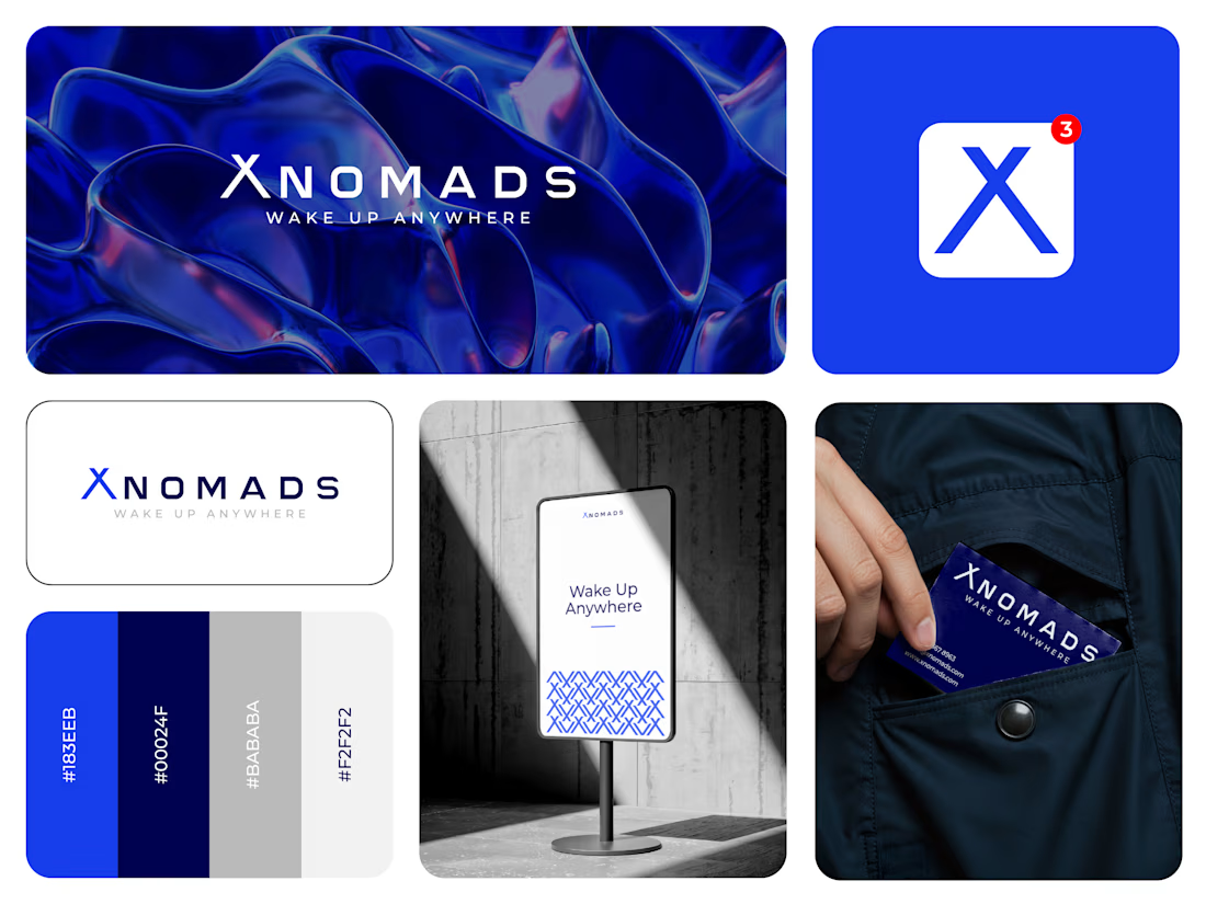

The blue visual system and mockup presentation work so well together.

Cleann🔥

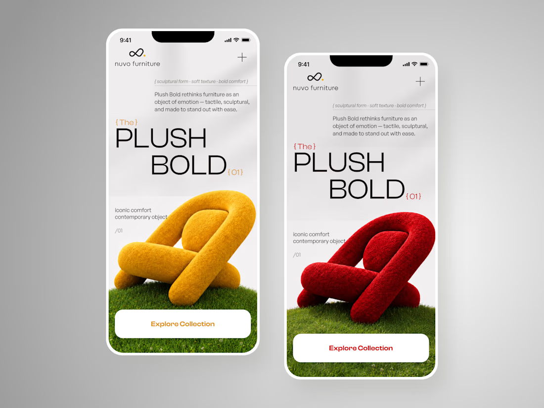
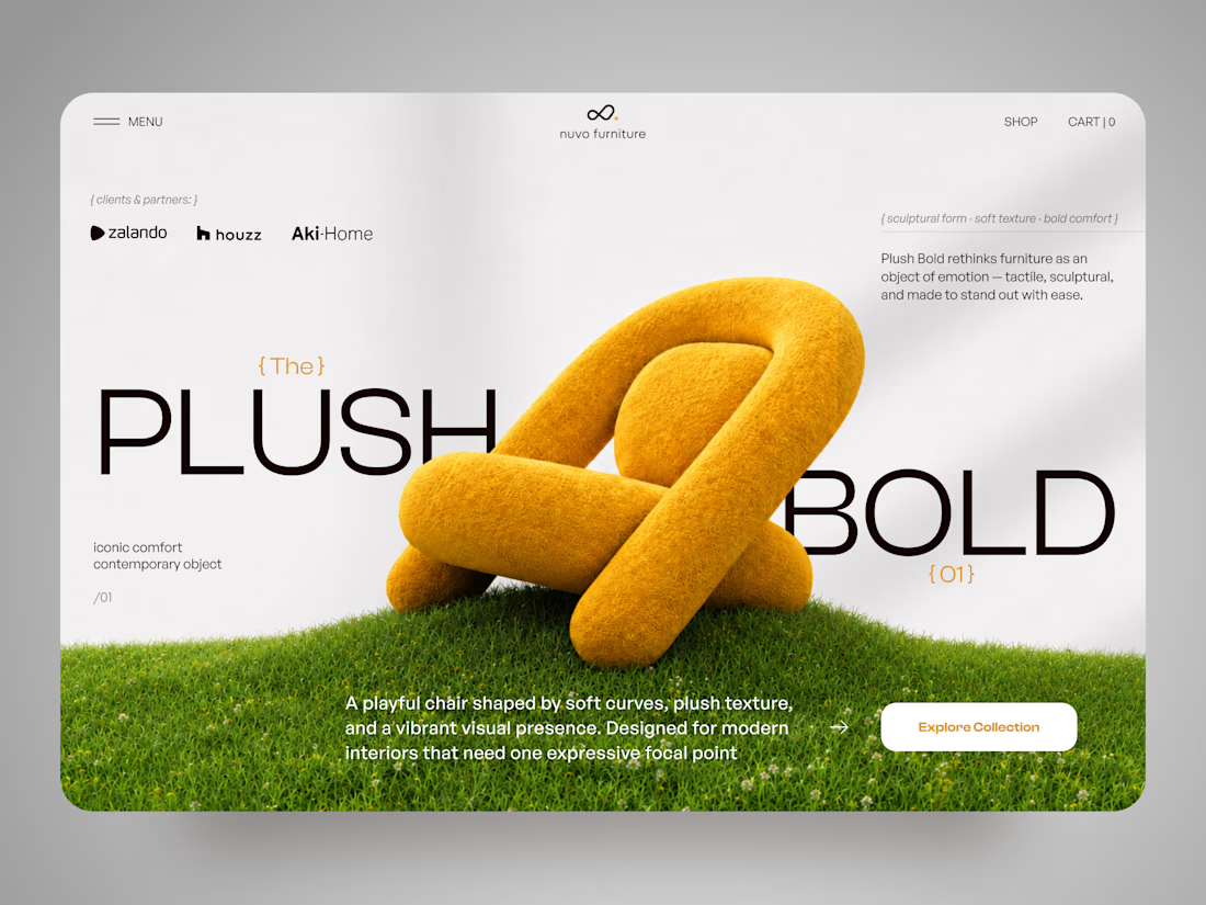
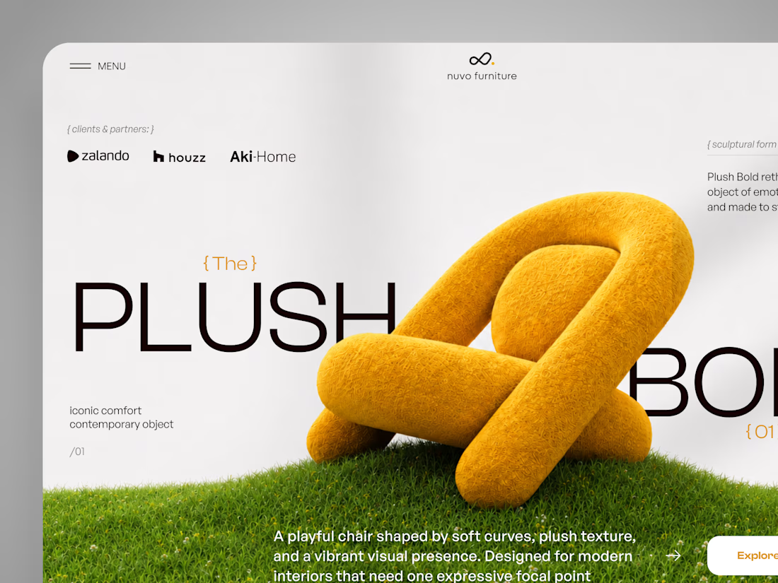
NUVO Furniture — Sculptural Furniture E-commerce Concept 🪑✨
NUVO is a contemporary furniture website concept built around one idea: let the product become the experience.
At the center of the concept is Plush Bold — an expressive statement chair designed to feel more like a...

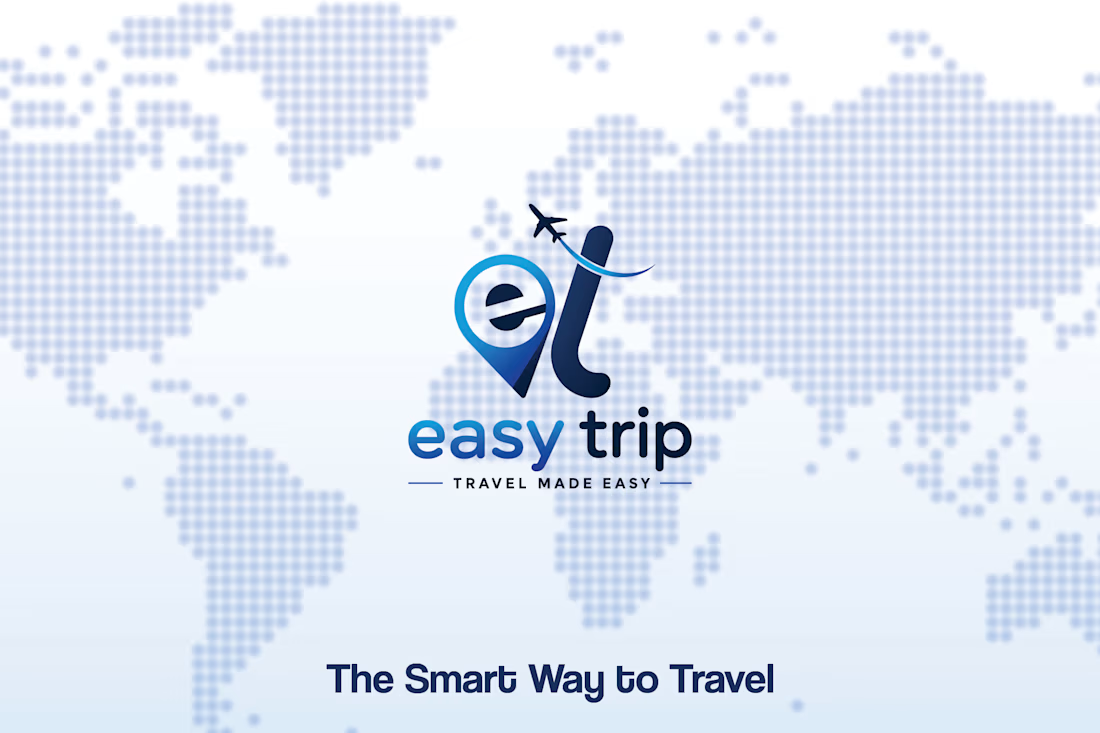
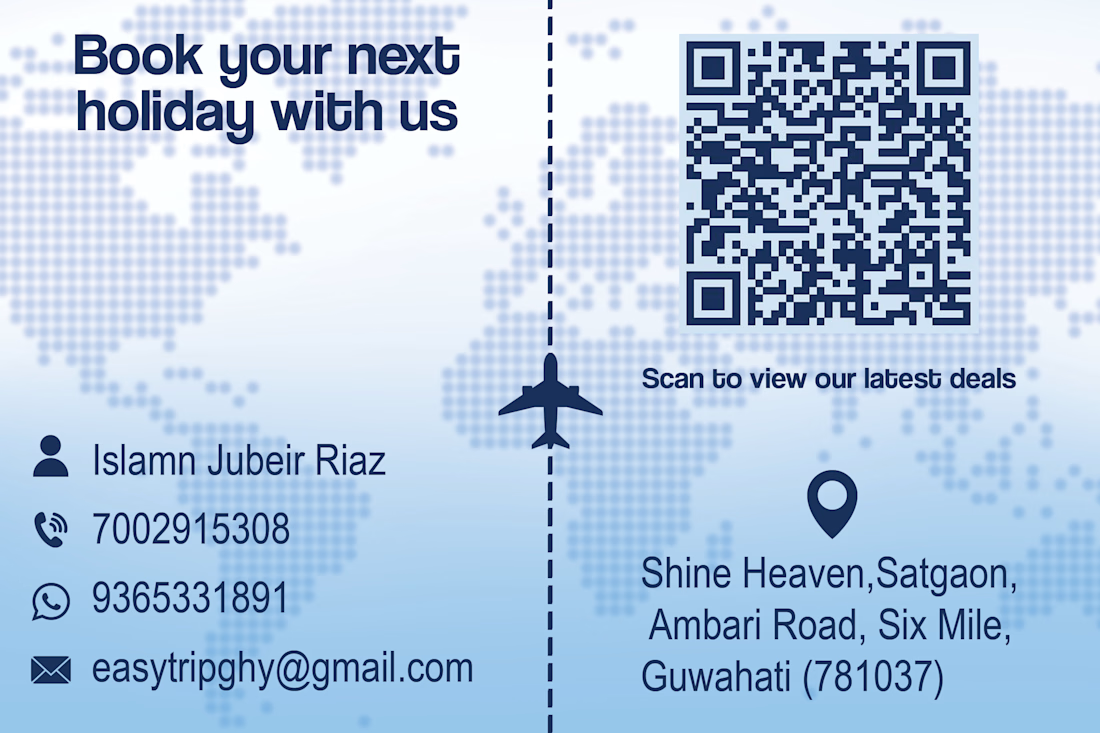
Designed a clean and professional business card for Easy Trip, a travel brand focused on making travel simple and accessible. ✈️
I used a soft blue travel-inspired visual direction with a world map background, airplane elements, and a clear information hierarchy to balance brand identity with practical business information.
The front focuses on the brand and tagline, while the back brings together the contact details, location, and QR code in an easy-to-scan layout.
Project: Easy Trip — Business Card Design
Role: Graphic Designer
Focus: Branding • Layout Design • Print Design • Visual Identity
#GraphicDesign #BusinessCardDesign #Branding #PrintDesign #TravelBranding #VisualIdentity #GraphicDesigner #Contra



i'd pick the map side. the airplane path makes it feel like travel