The network for creativity
Join 1.25M professional creatives like you
Connect with clients, get discovered, and run your business 100% commission-free
Creatives on Contra have earned over $150M and we are just getting started
Back to feedPost

If you are a product designer, developer or PM this paper is definitely worth your time!

Your design system’s primary user is no longer human.
Figma’s latest whitepaper confirms that systems are shifting from visual guidelines to functional APIs for machines. When AI builds your UI, ambiguity becomes a bug.
To adapt, we must treat tokens and metadata as the actual...
lnkd.in
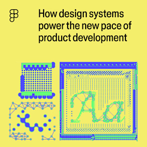
How design systems power the new pace of product development
AI has made design systems more important than ever—is yours ready to meet the moment?
The network for creativity
Join 1.25M professional creatives like you
Connect with clients, get discovered, and run your business 100% commission-free
Creatives on Contra have earned over $150M and we are just getting started











Related posts


Follow for More Job posts!

React Bits & Lovable. Just try this cool stuff! 👍
#prototyping #uiux #nocode


Love this stack Alona! React Bits + Lovable is such a powerful combo for rapid prototyping. No-code/low-code but still keeping that custom UIX feel - that's the sweet spot! Have to try this cool stuff indeed. Great share! 👍

Every SaaS launch video runs on the same skeleton: a hook, the product reveal, three benefits, a call to action.
So I built that skeleton once. SaaS Product is a 10-second, four-scene promo template for any digital product.
Nimble, a productivity app. HalalFX, a Premiere plugin. Lengw, a language-learning app. Three brands, one animation, nothing re-keyframed.
What you edit:
Every line of copy is live text, not outlines
The product screenshot and each logo sit in their own layers, sized to be swapped
Every editable layer is named "Edit …" so you know what is safe to touch
The motion stays exactly the same
Best for landing pages, product launches and social ads.
@SVGator
Amaizing dear


