The network for creativity
Join 1.25M professional creatives like you
Connect with clients, get discovered, and run your business 100% commission-free
Creatives on Contra have earned over $150M and we are just getting started
Back to feedPost

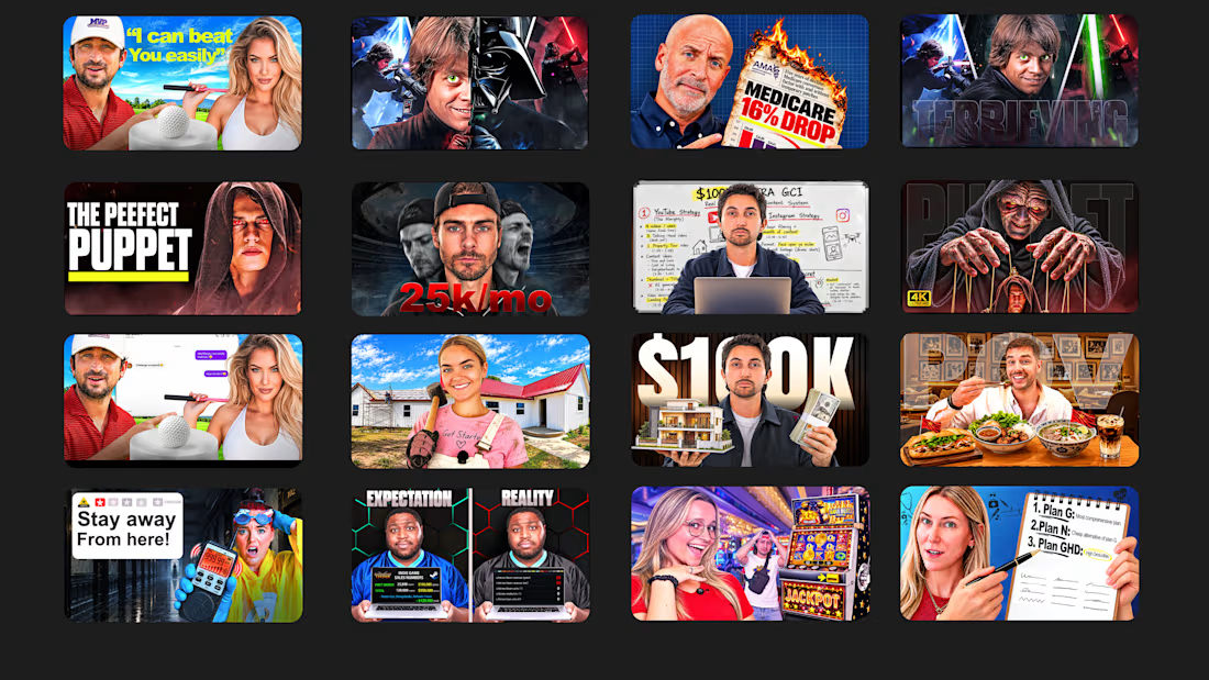
Recent thumbnails I've designed for clients 🖌️
Which one do you like the most?
BTW, commissions are open.
The network for creativity
Join 1.25M professional creatives like you
Connect with clients, get discovered, and run your business 100% commission-free
Creatives on Contra have earned over $150M and we are just getting started











Related posts

My Recent Work -- Showreel




🖐️ Yep, that's me!
Your business deserves so much MORE than pretty design.
So grateful for my talented team that makes this possible ♥️


So true! Design that doesn't convert is just decoration. Love how you lead with business goals first. Amazing mindset! 🙌

YouTube thumbnail isn't just a photoshop design, its a visual identity and storytelling in 16:9 ratio frame.
Okay guys ,Some amazing thumbnails that i made this month and i made so many thumbnails but i selected this are the thumbnails which are my favourite.
I just made it for my passion. I take some amazing creators and made these thumbnails after researching their audience type and market.
Because if you still think thumbnails aren't important then you target wrong audiences.
Even 2.5x CTR increases your sales and income.
Others wise If you are a serious creator then DM open for commission.
Let me share your thoughts. I'm open for your feedback.
#YoutubeThumbnail#thumbnails#finance thumbnail