The network for creativity
Join 1.25M professional creatives like you
Connect with clients, get discovered, and run your business 100% commission-free
Creatives on Contra have earned over $150M and we are just getting started
Back to feedPost

A film from last year. One of my first attempts at bringing an idea to life through filmmaking.
Looking back at it now, I can see so many things I'd approach differently. My understanding of cinematography, editing, color, sound and storytelling has evolved quite a bit since then.
But I still wanted to share this piece, not because I think it's perfect, but because every creative journey has a starting point, and this one is part of mine.
I'd genuinely love to hear your thoughts. Whether it's the cinematography, editing, colour grading, sound design, pacing or storytelling...tell me what works, what doesn't, and what could have been better.
I'm especially interested in feedback from fellow filmmakers, editors, colourists and all the people who appreciate the craft.
There's always something new to learn, and I'd love to see this work through a fresh pair of eyes. 🥤

The network for creativity
Join 1.25M professional creatives like you
Connect with clients, get discovered, and run your business 100% commission-free
Creatives on Contra have earned over $150M and we are just getting started

Related posts

Hi everyone 👋
I made Rewind 📼, a VHS skin for the Video.js v10 player. I wanted it to feel like a night at an old video store.
🎬 I created 7 original films, each with its own story, cast and mood.
🖼️ I designed every poster in Midjourney.
🎥 I made a short scene for every film in Higgsfield.
💻 I designed the website and the player, and built them with Claude.
✨ What you can do:
📚 Browse a shelf of 3D tapes that turns as you scroll
📼 Hover a box and the cassette slides out
🍿 Open a full-screen preview of each film
🎛️ Use the cassette as the control bar: the tape is the seek bar, the reels show what's left
📺 Watch in HD, vintage VHS, black & white, red or green
🌙 Switch to dark mode
Works with a keyboard, stays readable over any video, easy to tap on a phone, and calms down with reduced motion.
Everything here, the films, posters, scenes, website and player, was made by me 💛

Oh wow, Nigar! You went like two extra miles with your project! ❤️🔥

Pull into the drive-in and save three spots for your friends. 🚘
I built LOT 66, a custom Video.js v10 skin for the Contra challenge. Start a live watch room...


09 XL — From a Portrait to a Visual Story.
This one started with a simple black-and-white portrait, but I wanted to give it a little more personality. I began experimenting with contrast, grain, and shadows to build a raw, almost cinematic atmosphere.
Then came the fun part — playing around with typography, adding the black strip across the eyes, and using minimal details like 09 and XL to give the composition a subtle editorial feel.
Once the poster came together, I placed it in a real-world bus stop mockup to see how it would live outside the screen.
A little experimentation, a few happy accidents, and lots of tiny adjustments later — this was the result.


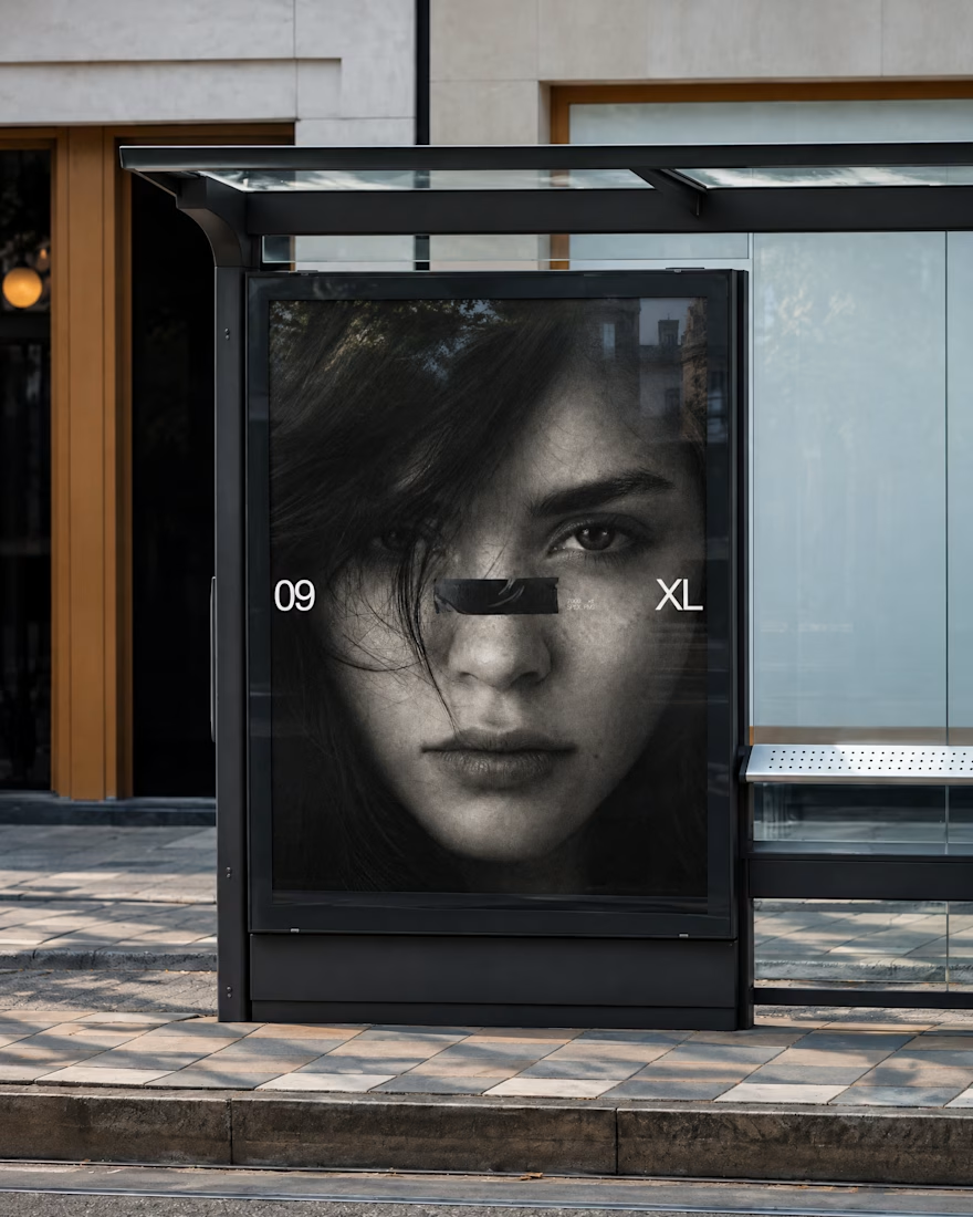
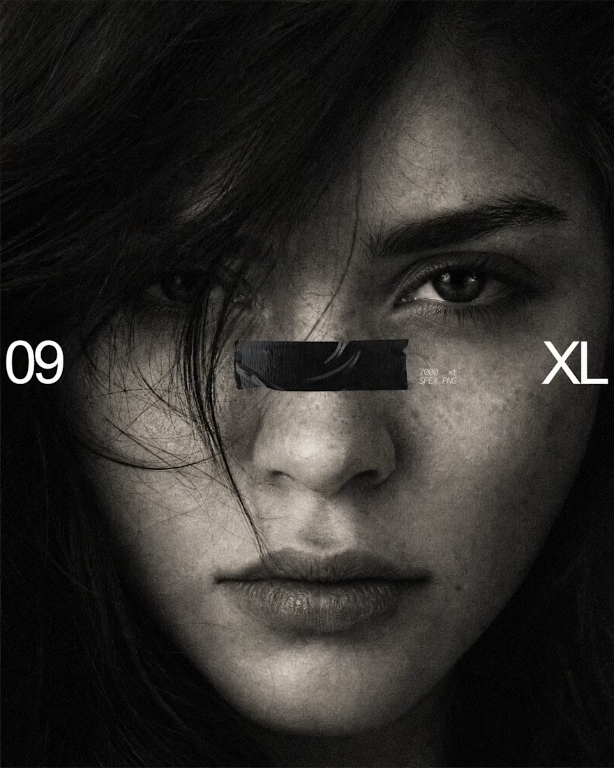

The black bar across the eyes with 09 and XL on the sides turns a simple portrait into a bold poster, and the bus stop mockup shows it works at street scale. Is the grain added in Photoshop or part of the original photo?

