The network for creativity
Join 1.25M professional creatives like you
Connect with clients, get discovered, and run your business 100% commission-free
Creatives on Contra have earned over $150M and we are just getting started
Back to feedPost
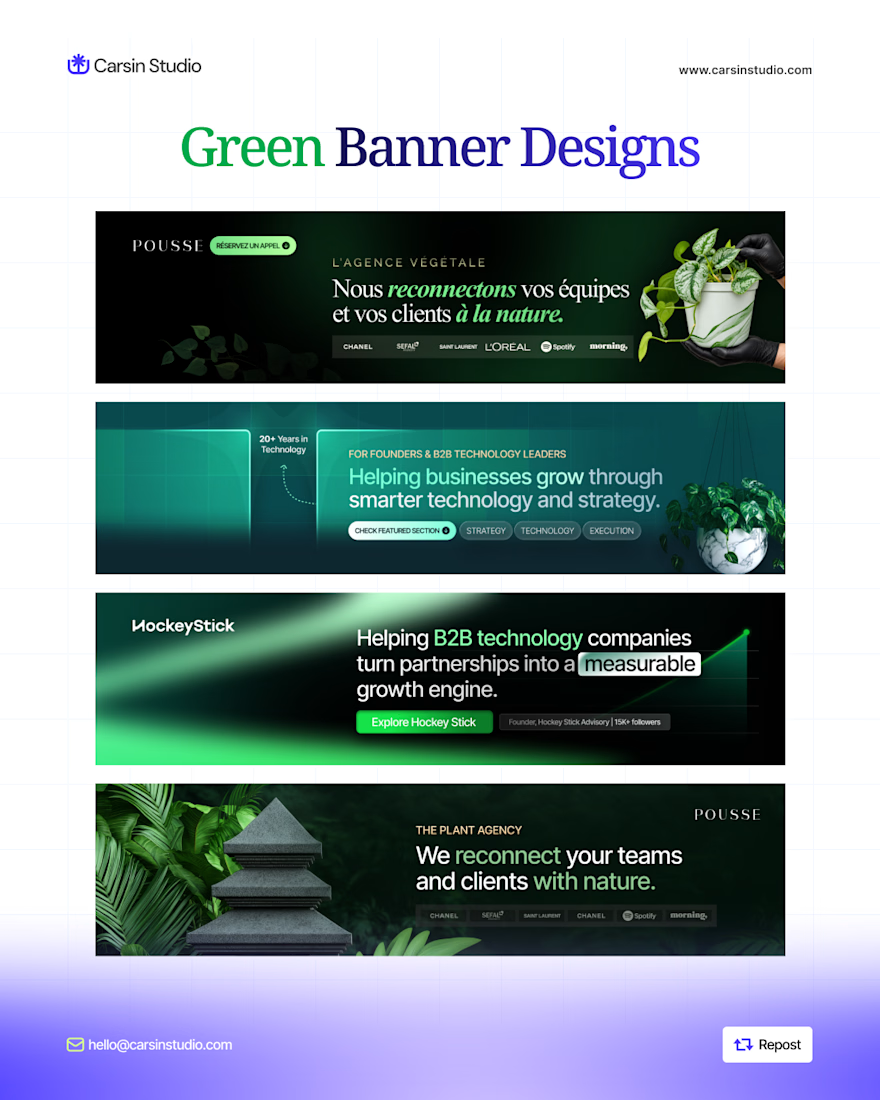
New LinkedIn banner designs, built around one goal: making the value clear at a glance.
From YouTube creators to healthcare businesses and SaaS brands, every banner needs a clear message, the right visual direction, and a reason for the audience to care.
My approach is simple: understand the audience, lead with the outcome, use visuals that support the message, and make the next step obvious.
Good design should look great, but it should also communicate with purpose.
Open to 2 more LinkedIn branding projects this week. 💜

Good call building each banner around one clear message.


Thank you Rafee

The stacked reel shows the range nicely, and "Get More Patients" is a very clear promise in one glance. How do you plan the left side so the profile photo never covers the text?
The network for creativity
Join 1.25M professional creatives like you
Connect with clients, get discovered, and run your business 100% commission-free
Creatives on Contra have earned over $150M and we are just getting started



Related posts

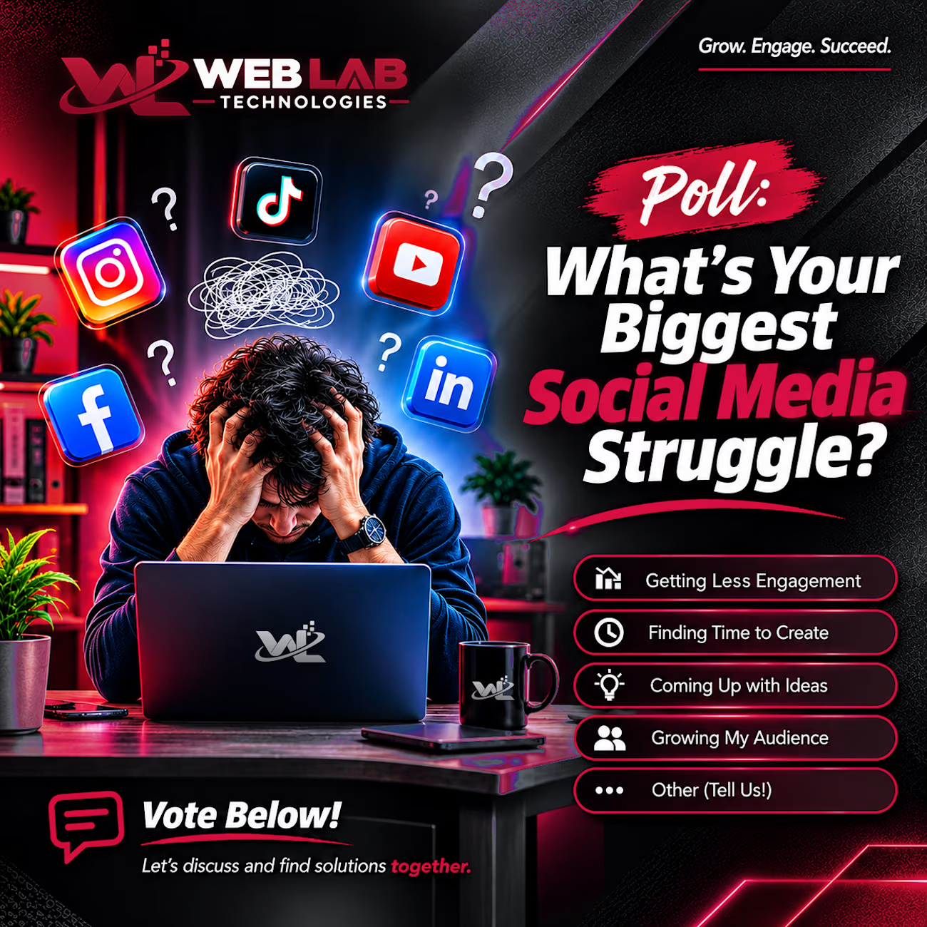
Social media is an important part of growing a business, but staying consistent and keeping an audience engaged can be challenging.
This poll design was created by Web Lab Technologies to highlight some of the most common struggles faced by businesses, marketers, and content creators.
The concept uses bold typography, a dark background, and contrasting red accents to capture attention while keeping the message clear. The interactive-style layout encourages people to share their experiences and join the conversation.
The goal is simple: create content that feels relevant to the audience and gives people a reason to engage.
Services: Social media design, graphic design, content marketing, digital branding.
Looking for social media designs that communicate your message clearly and connect with your audience? Let's work together.
#SocialMediaDesign #GraphicDesign #DigitalMarketing #ContentCreation #BrandIdentity
A collection of recent LinkedIn banner designs, all with one thing in common: GREEN. 💚
Different brands, different messages, different visual directions, but one goal: making each profile communicate its value clearly.
I'm starting the week ready to take on new LinkedIn branding projects.
If your LinkedIn profile needs a visual upgrade, let's work together.