The network for creativity
Join 1.25M professional creatives like you
Connect with clients, get discovered, and run your business 100% commission-free
Creatives on Contra have earned over $150M and we are just getting started
Back to feedPost

🚀 Why are more DTC brands choosing Replo?
After working on multiple Shopify and eCommerce projects, I've found that building a high-converting landing page isn't just about having a great design.
It's about having the right combination of speed, flexibility, and conversion-focused tools.
Here are a few reasons I love using Replo:
⚡ Build faster — Launch custom landing pages without starting from scratch.
🎨 Design freedom — Create pixel-perfect experiences while keeping full creative control.
📈 Conversion focused — Build with proven sections, layouts, and CRO principles in mind.
🛍️ Shopify integration — Seamlessly connect landing pages with the Shopify ecosystem.
📱 Responsive by default — Create experiences that look great across desktop, tablet, and mobile.
For DTC brands, speed matters. The ability to test, iterate, and launch new experiences quickly can make a huge difference.
Replo isn't just about building pages faster — it's about building better experiences that are designed to convert.
What's your experience with Replo? 👇


The network for creativity
Join 1.25M professional creatives like you
Connect with clients, get discovered, and run your business 100% commission-free
Creatives on Contra have earned over $150M and we are just getting started
Related posts

Designed a premium audio e-commerce storefront for VickMix 🎧
From the bold headphone hero section to product listings, audio technology highlights, and a clean product-focused layout, every section is designed to showcase the products and make browsing effortless.
What do you think of this design? Would you keep the minimalist look or make it more colorful? 👇


I'd keep it minimal. The grey palette lets the headphones do the talking.
A clean design. A seamless shopping experience. A Abaya Shopify store built around the brand. ✨
What do you think of this Jennifer Shopify storefront redesign?
What would you improve or keep as it is? 👇

Well Structured Layout that match the Abaya product Style. Keep up the great Work💯

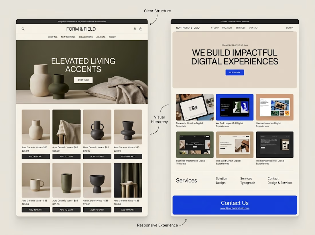
A website can look beautiful and still be difficult to use.
That's something I keep in mind when exploring both Shopify store design and Framer website design.
Although the platforms serve different purposes, some design principles apply to both:
→ Clear navigation helps visitors find their way.
→ Strong visual hierarchy makes important information stand out.
→ Thoughtful page structure creates a natural flow.
→ Responsive layouts help the experience work across screen sizes.
→ Clear calls to action help visitors understand what to do next.
The goal isn't simply to make a website look impressive.
It's to make the experience clear, useful, and easy to navigate.
I'm continuing to explore how these principles can be applied across different types of websites and projects.
What matters most to you when visiting a website, its visual design, its usability, or a combination of both?


Well said. Usability first, then visuals. Clear navigation wins me every time. 🙌