The network for creativity
Join 1.25M professional creatives like you
Connect with clients, get discovered, and run your business 100% commission-free
Creatives on Contra have earned over $150M and we are just getting started
Back to feedPost



The network for creativity
Join 1.25M professional creatives like you
Connect with clients, get discovered, and run your business 100% commission-free
Creatives on Contra have earned over $150M and we are just getting started











Related posts

Working on another website design + dev project.
We added some cool coloroma interactive components there. How does it look?


A tight deadline, a lot of screens, and an AI web demo to bring together.
For this Upwork project, I designed the UI in Figma using a consistent layout system to keep the work clear and deliver on time.
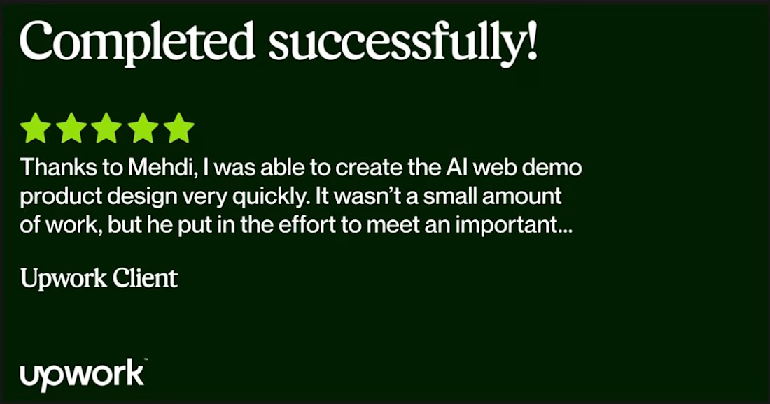
The client’s feedback says it best:
“Thanks to Mehdi, I was able to create the AI web demo product design very quickly. It wasn’t a small amount of work, but he put in the effort to meet an important deadline.”
Need help turning a complex web product into clear screens? Let’s talk.
More of my work: https://elkhatiri.com/

Congrats on the 5 star review Mehdi, nice win.