The network for creativity
Join 1.25M professional creatives like you
Connect with clients, get discovered, and run your business 100% commission-free
Creatives on Contra have earned over $150M and we are just getting started
Back to feedPost


The network for creativity
Join 1.25M professional creatives like you
Connect with clients, get discovered, and run your business 100% commission-free
Creatives on Contra have earned over $150M and we are just getting started



Related posts

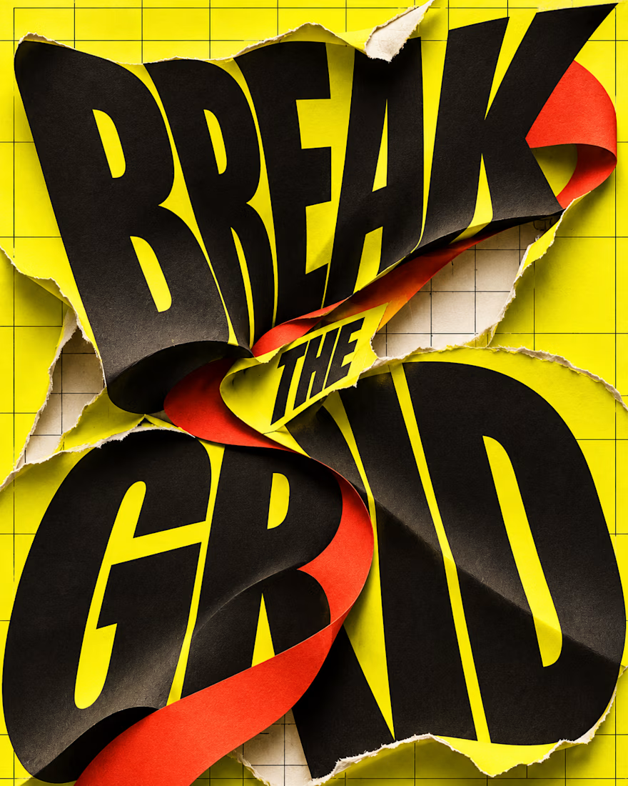
What happens when typography refuses to stay inside the grid?
BREAK THE GRID — an AI-generated visual experiment combining oversized lettering, torn-paper textures and bold colour. The words become the action: bending, tearing and breaking through the layout.
Controlled structure or creative chaos—which draws you in?

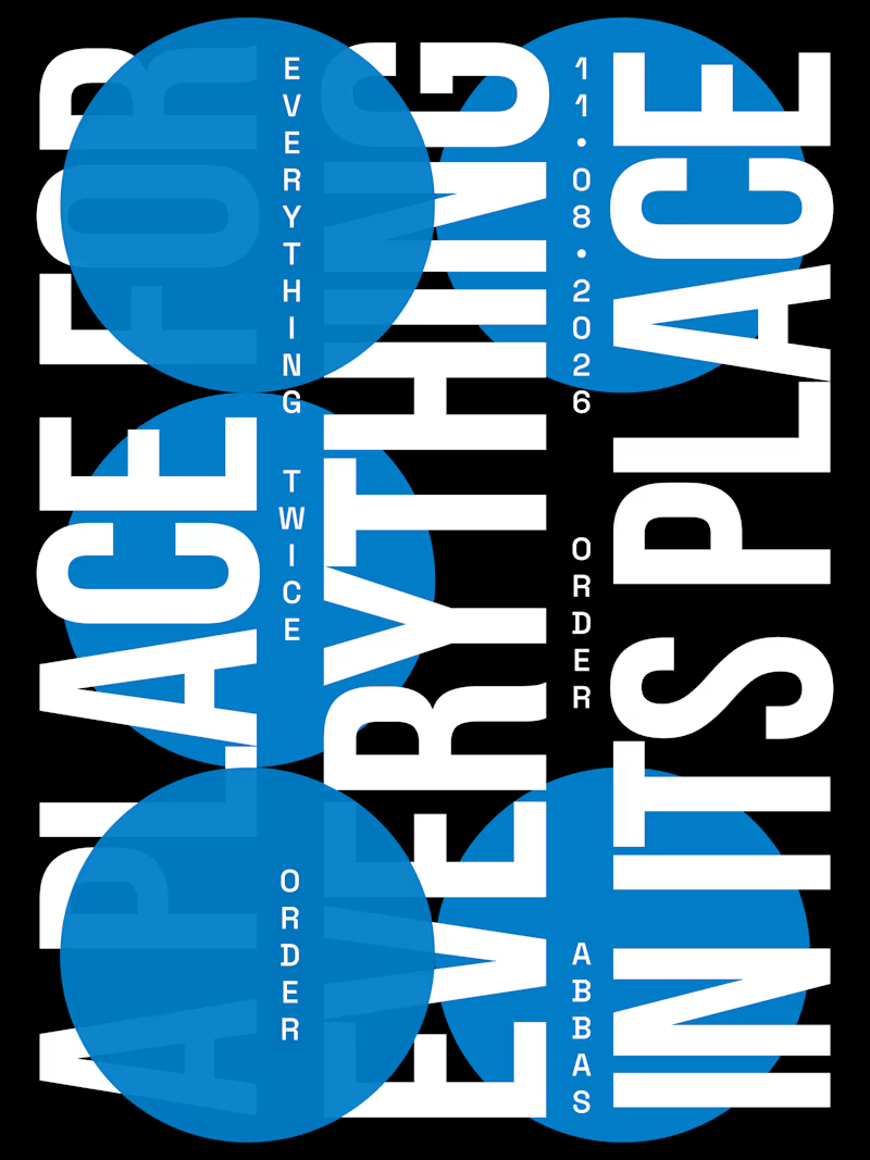
Day-02 of Poster Design
Style: Swiss International | Word: Order
The Quote i used i from benjamin franklin.
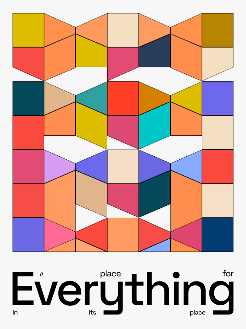
"A place for everything, everything in its place."
If someone ask you a question that 'define design in a single quote'
This is the perfect one to say.
Which design do you like?


3 voted
38%
5 voted
62%
8 votes
Closed


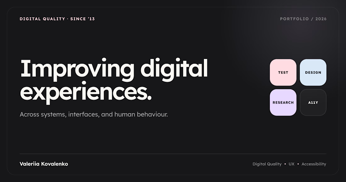
I’ve been working on different projects for a while, but only recently felt ready to bring them together in a portfolio. I decided to combine Codex and Framer to see what I could build.
Somewhere along the way, I realised the design was probably more influenced by the Promova app than I’d initially noticed.
I wanted to keep the layout simple and avoid cramming too much into it. I’ve also been getting more into accessibility and preparing for the CPACC certification, so I’ve been paying closer attention to typography and readability. I went with Lexend for the site.
So here’s my little portfolio — a collection of UX research and design projects, finally brought together.



Congrats on bringing it all together!