The network for creativity
Join 1.25M professional creatives like you
Connect with clients, get discovered, and run your business 100% commission-free
Creatives on Contra have earned over $150M and we are just getting started
Back to feedPost


The network for creativity
Join 1.25M professional creatives like you
Connect with clients, get discovered, and run your business 100% commission-free
Creatives on Contra have earned over $150M and we are just getting started









Related posts

New mobile app design for a ticketing app
check it out 🌎 https://tixtango.com
I am available for work
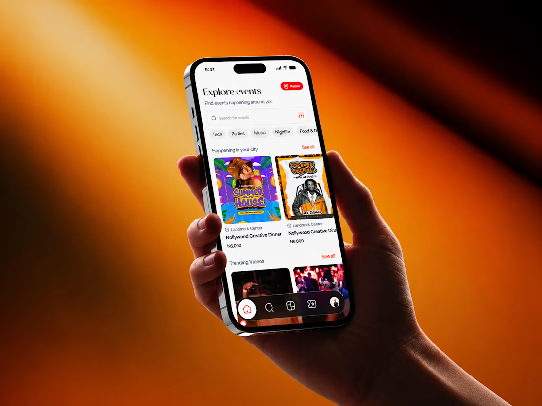
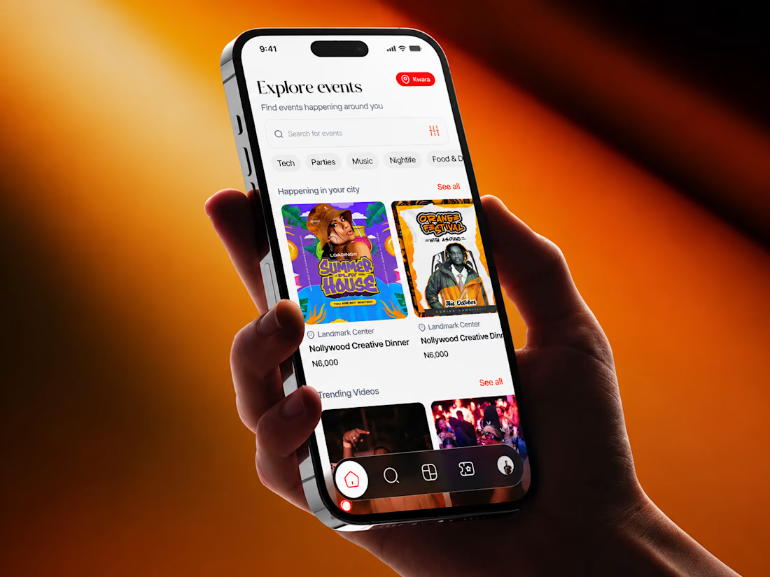
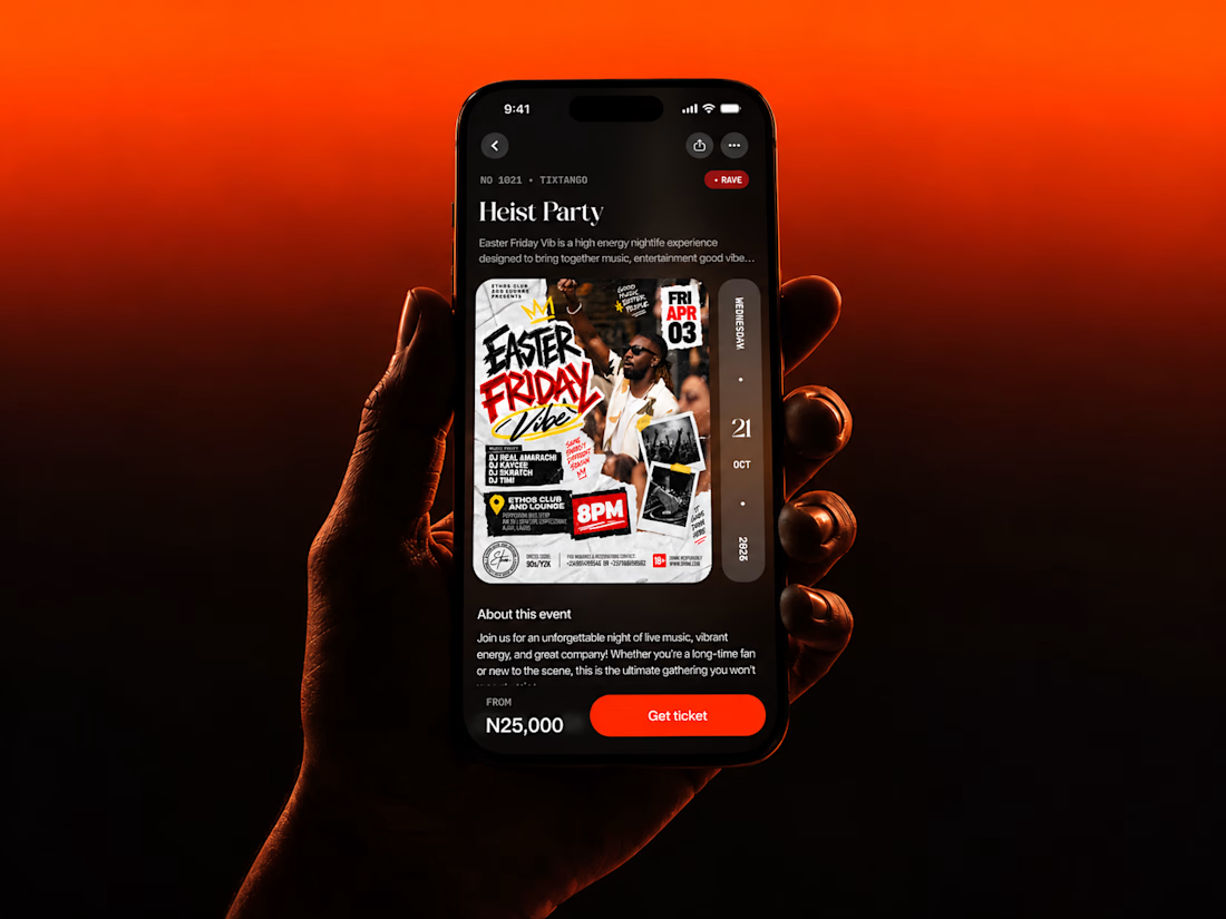
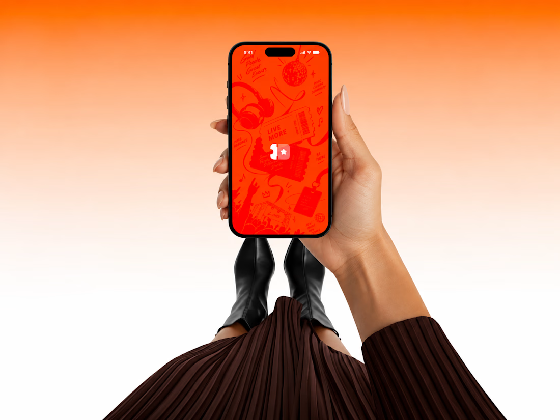

Fire design Ozenua! 🚀 TixTango looks super energetic - that orange to red gradient really pops and fits the event/ticketing vibe perfectly. Love the clean card layout on Explore and the dark mode detail screen. Presentation with the hand mockups is on point. Best of luck, hope you land some great gigs!

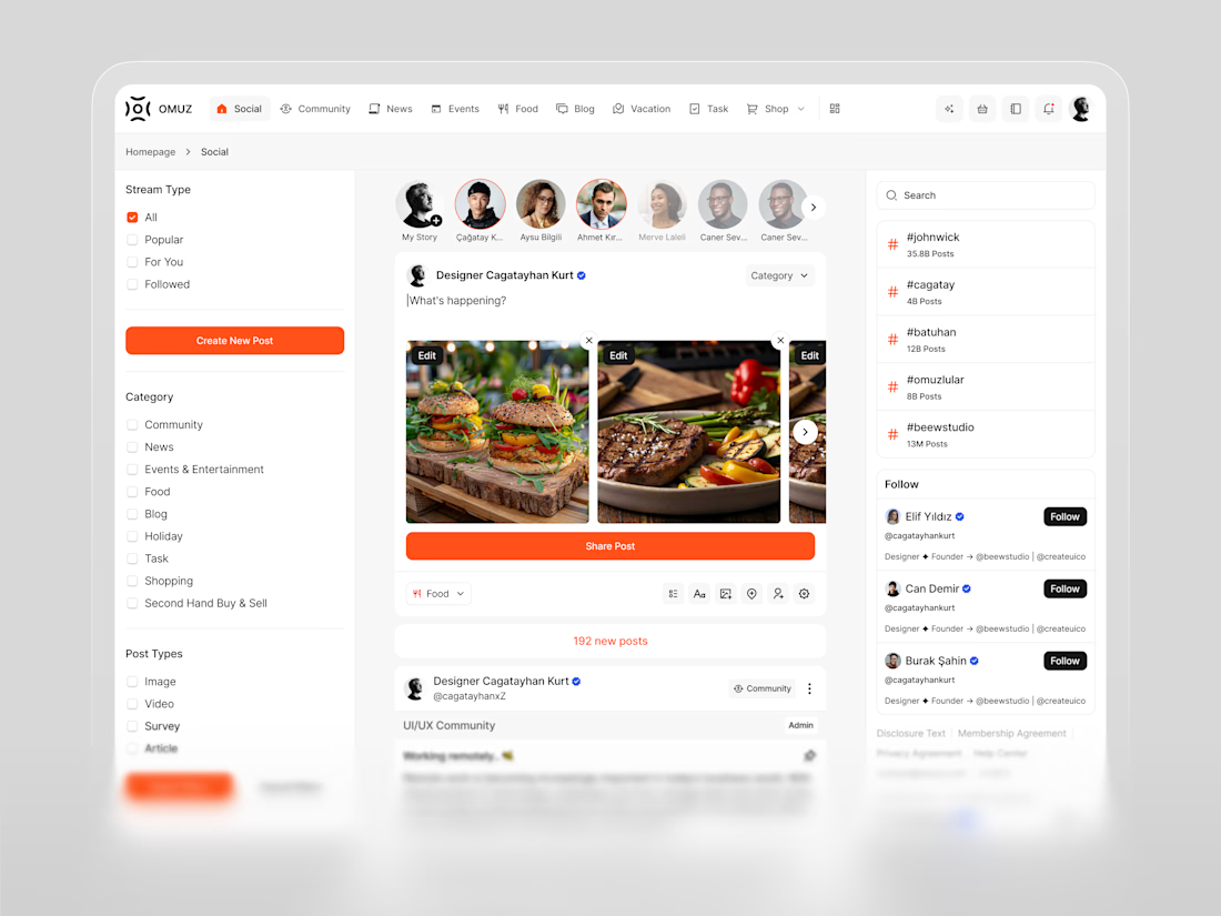

The stream type and category navigation structure this really well. A super-app lives or dies on its feed organization, and this one looks thoughtfully laid out.

Here's a snapshot of my latest update for my app Stepper:
- added animations and polished visuals, including accessibility.
- switched from Google Maps to Apple Maps.
- added analytics to track funnels, screen views, and retention, while keeping users anonymous.


