The network for creativity
Join 1.25M professional creatives like you
Connect with clients, get discovered, and run your business 100% commission-free
Creatives on Contra have earned over $150M and we are just getting started
Back to feedPost
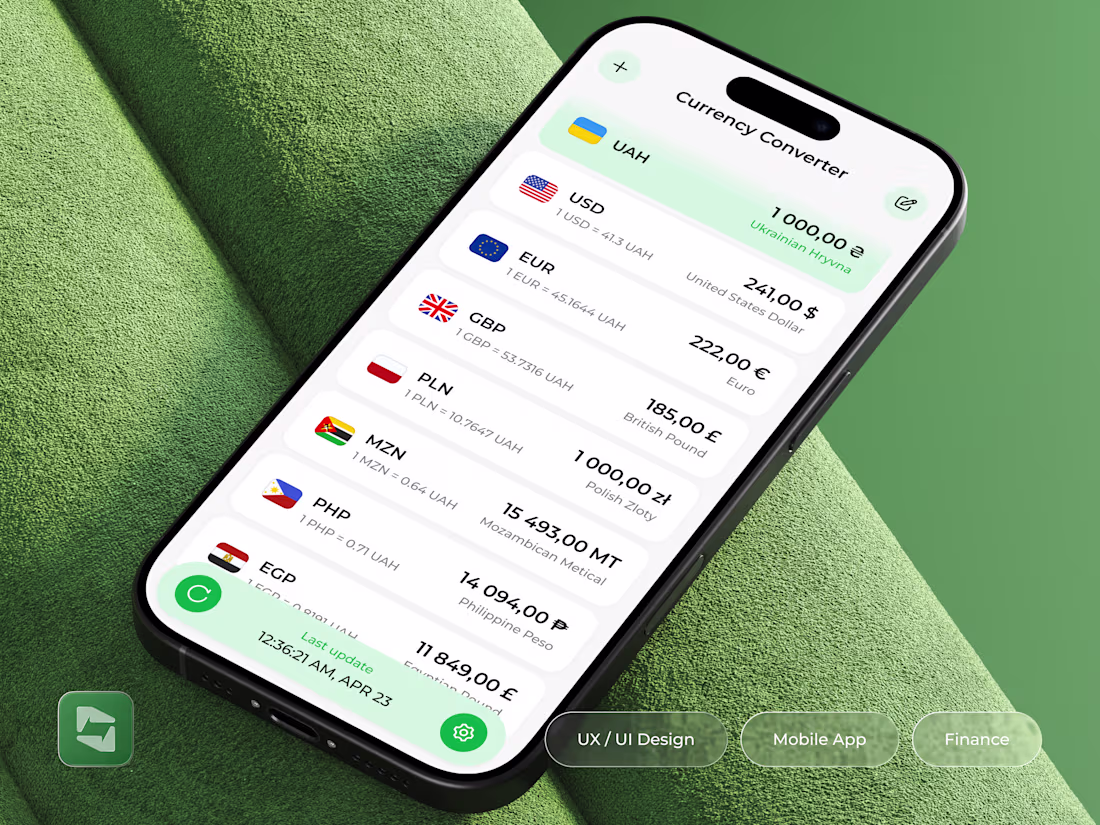
Taste Test
GOing for B, Strong concept and execution, Looking forward to seeing more amazing work from you!
Thanks
Premium look with great usability. 💯
Thanks
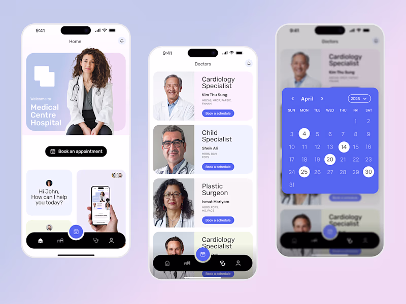
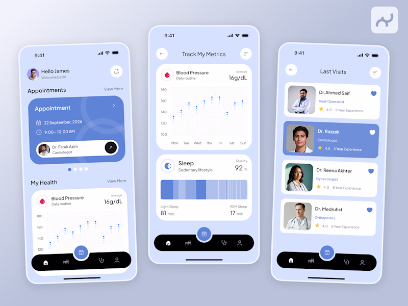
Voted B. The dark nav with color-coded health data reads immediately and the doctor profile cards on the third screen feel more modern and trustworthy. Option A is clean but doesn't give patients enough reason to explore further.
Valid point
The network for creativity
Join 1.25M professional creatives like you
Connect with clients, get discovered, and run your business 100% commission-free
Creatives on Contra have earned over $150M and we are just getting started
Related posts
Amazing!
👋 Hey, we’re Lynksen.
We build digital products and websites that don’t just work - they win hearts.
For 5+ years, we’ve been the go-to team for startups and brands chasing big ideas - turning raw sparks into products that fuel millions of daily clicks, swipes, and sign-ups.
We move fast, combining product thinking, clear UX, and real business needs to create smooth, high-converting products for brands ready to make an impact.
👉 Have a project idea? We are available for new projects hello@lynksen.com or DM us!
post is awesome love the person who edited it lol
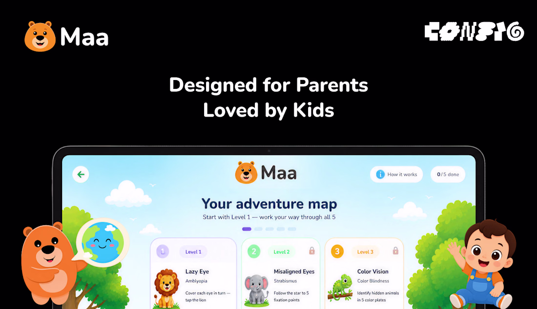
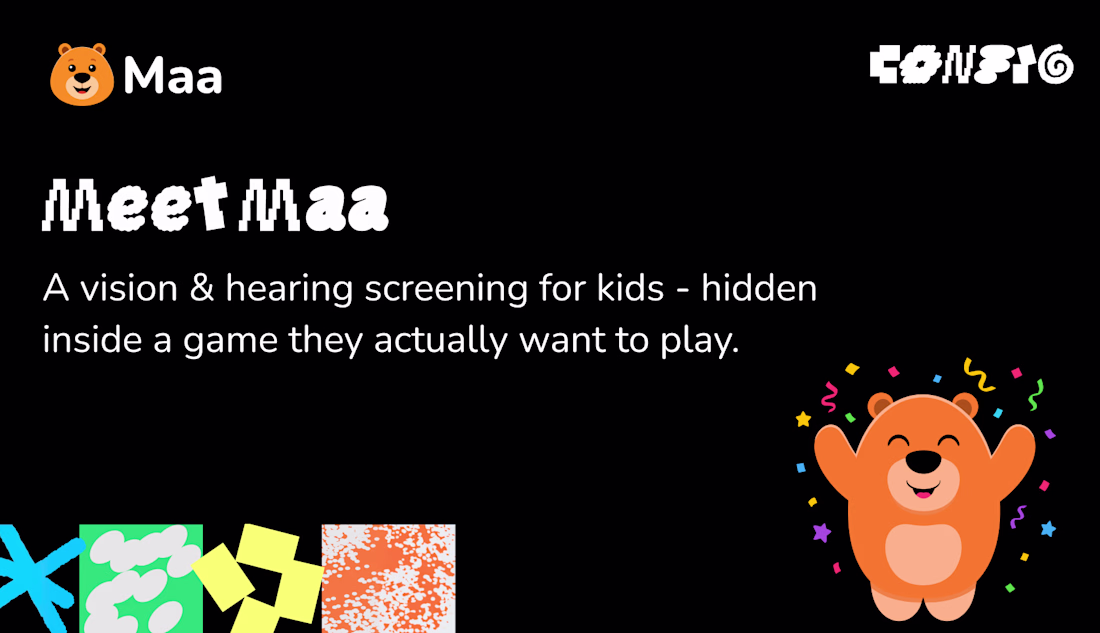
Hi creatives! 🐻
For #ConfigMakeathon, I built Maa - a free vision & hearing screening for children, hidden inside a game.
Here's the problem: most childhood vision and hearing issues are treatable - but only if caught before age seven. After that, the window quietly closes. Yet screening means a specialist, a cost, a city. So millions of children are never checked in time.
Maa changes that. A child plays five simple games – covering one eye like a pirate, tapping a lion, listening for animals – while their eyes and ears are gently checked. Any device. Three minutes. In their language.
At the end, a clear report: what we noticed and what to ask a doctor. A screening, never a diagnosis - but often, a beginning.
One choice shaped everything: no camera measurement. Because a test must work the same on a cheap device as an expensive one. Every child, screened equally.
Designed with Figma agents, illustrated with Figma AI, and built entirely in Figma Make.
See early. See the future. 🐻
Project Link:
https://limb-flock-48563307.figma.site
#configmakeathon
Love this idea!
Trending
Claude
Claude has entered the design space. How are you using Claude Design?
Contra University
Learn from expert creatives how to earn more using next-gen AI tools.
MagicPath
The canvas is infinite, and exploration is becoming the workflow. How are you using MagicPath?
creativeaiflow
Creative AI workflows are evolving. What tools do you use, and what are their strengths and weaknesses?
freelancerlife
Freelancer life is wins, pivots, and everything in between. What’s yours right now?