The network for creativity
Join 1.25M professional creatives like you
Connect with clients, get discovered, and run your business 100% commission-free
Creatives on Contra have earned over $150M and we are just getting started
Back to feedPost

ReachmoreCRM Website Redesign & Conversion-Focused Optimization
I redesigned the ReachmoreCRM website with a strong focus on modern UI, clear messaging, user experience, and conversion.
The goal was to create a website that not only looks professional but also helps visitors quickly understand the platform, its value, and why they should take the next step.
What I improved:
• Modern, professional website design
• Clearer messaging and content structure
• Stronger calls-to-action
• Improved product/service presentation
• Better visual hierarchy for easier navigation
• Conversion-focused sections
• Mobile-responsive experience
• Trust-building elements and testimonials
• Improved user journey from visitor to potential customer
The result is a cleaner and more strategic online presence designed to build trust, communicate value, and turn website visitors into leads and customers.
This project showcases my experience in website design, conversion optimization, sales funnels, CRM-focused businesses, and digital marketing strategy.

The network for creativity
Join 1.25M professional creatives like you
Connect with clients, get discovered, and run your business 100% commission-free
Creatives on Contra have earned over $150M and we are just getting started

Challenges
View all


Related posts


In recent days I’ve been practicing designing around an image.
Sometimes an image can have great potential and reinforce the message we want to convey. I’m not saying this is the correct way to prepare a strategy, it’s simply an exercise. As a result, I created these three hero section designs, which I’ve published in the Figma community where they can be freely used for experimentation.
If you use them, I’d love to see the outcome, so make sure to tag me!


So beautiful


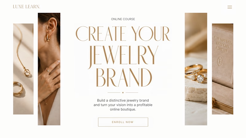
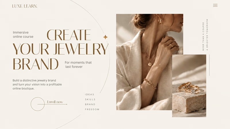
Same course. Same content. But two completely different feelings ✨
Which version would you choose?
27 voted
59%
19 voted
41%
46 votes
Closed

Option 2 is more practical ❤️❤️



Nice