The network for creativity
Join 1.25M professional creatives like you
Connect with clients, get discovered, and run your business 100% commission-free
Creatives on Contra have earned over $150M and we are just getting started
Back to feedPost
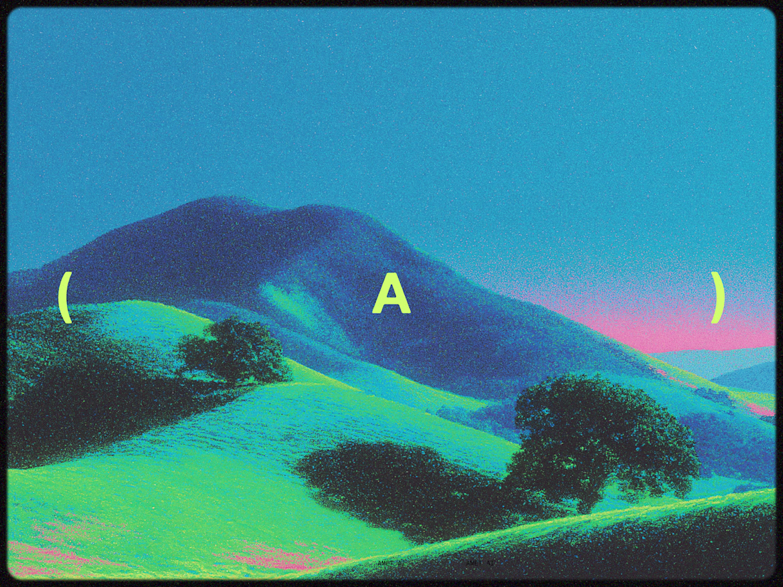
Results are in. 170 amazing people voted in the logo experiment.
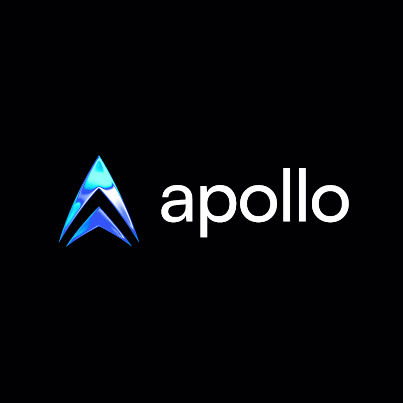
Option A simplifies the shape and adds a shader effect for a more futuristic feel. To me, the shape reads better and more timeless this way.
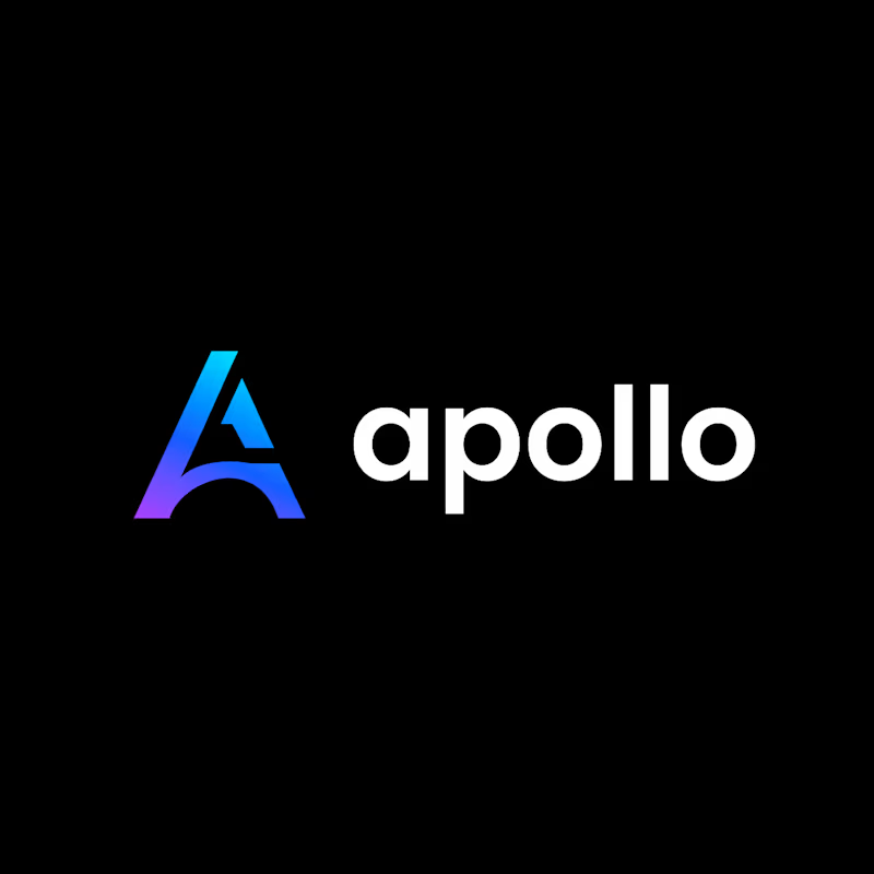
Option B is our existing logo, which I designed a few years ago and felt was due for an overhaul.
Thanks to everyone who weighed in. I'm leaning toward Option A as our new logo. Any final thoughts?
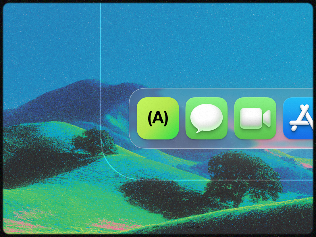
Which logo hits harder, and why? Running a quick community test for some brand work.
117 voted
69%
53 voted
31%
170 votes
Closed
The network for creativity
Join 1.25M professional creatives like you
Connect with clients, get discovered, and run your business 100% commission-free
Creatives on Contra have earned over $150M and we are just getting started
Related posts
looks awesome !!
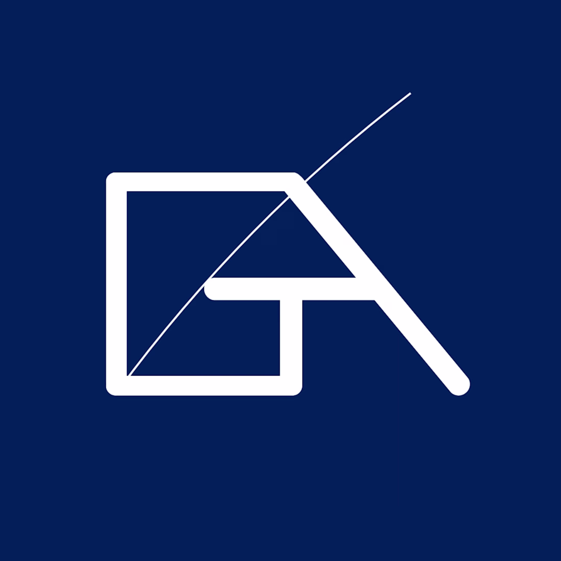
Hey everyone, I designed this simple and elegant logo for General Aerostructures Corporation.
Trying something interesting today.
Same design, same content—two different themes.
Dark feels stronger and more intense,
light feels clean and effortless.
Which one works better for you?
6 voted
46%
7 voted
54%
13 votes
Closed
Nice!
Trending
Claude
Claude has entered the design space. How are you using Claude Design?
Contra University
Learn from expert creatives how to earn more using next-gen AI tools.
creativeaiflow
Creative AI workflows are evolving. What tools do you use, and what are their strengths and weaknesses?
portfolioreview
The best portfolios tell a story, not just show a grid. Share yours for feedback.
freelancerlife
Freelancer life is wins, pivots, and everything in between. What’s yours right now?