The network for creativity
Join 1.25M professional creatives like you
Connect with clients, get discovered, and run your business 100% commission-free
Creatives on Contra have earned over $150M and we are just getting started
Back to feedPost


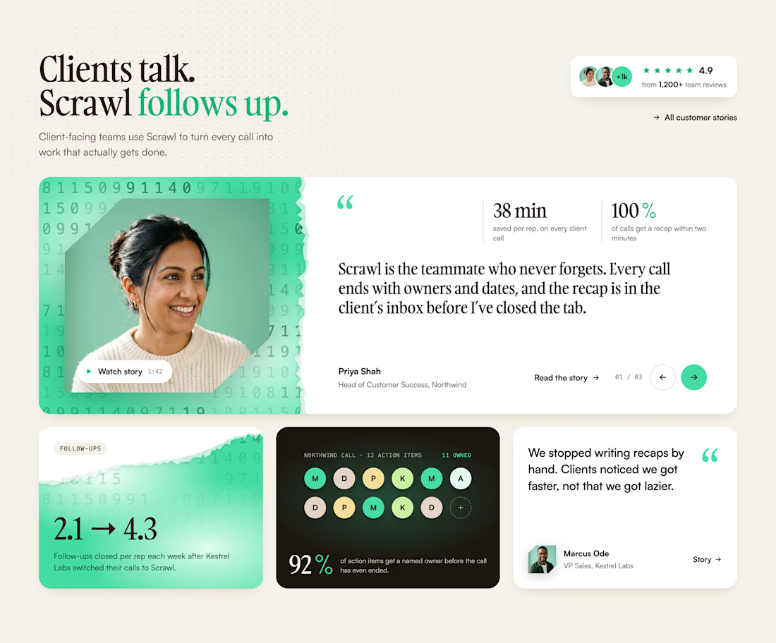
un-used concept exploration

good work!!

Wonderfull dear

Really inspiring work.

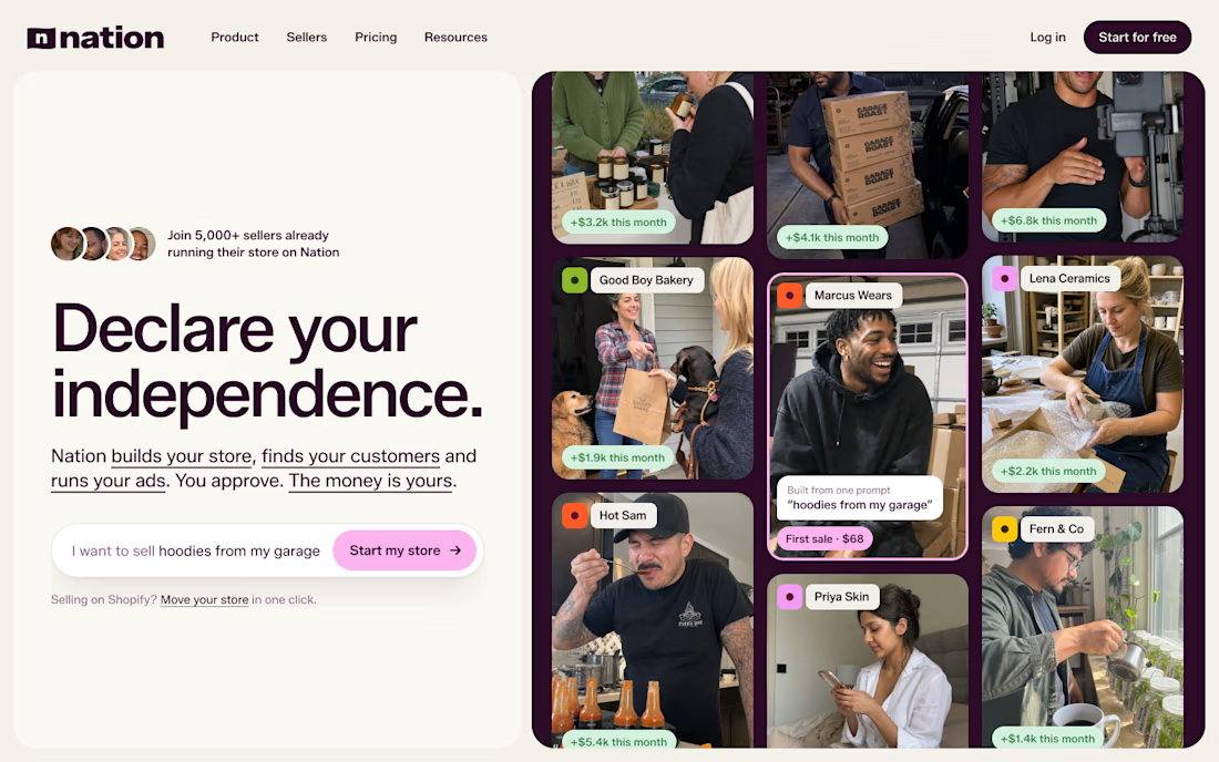
The "Declare your independence" hero line is a bold statement, and pairing it with the seller stories on the side sells the concept well. Shame it stayed a concept, this one deserved a real launch.


Great concept Agustin❤️
The network for creativity
Join 1.25M professional creatives like you
Connect with clients, get discovered, and run your business 100% commission-free
Creatives on Contra have earned over $150M and we are just getting started








Related posts

New hero exploration 🧞♂️🌀
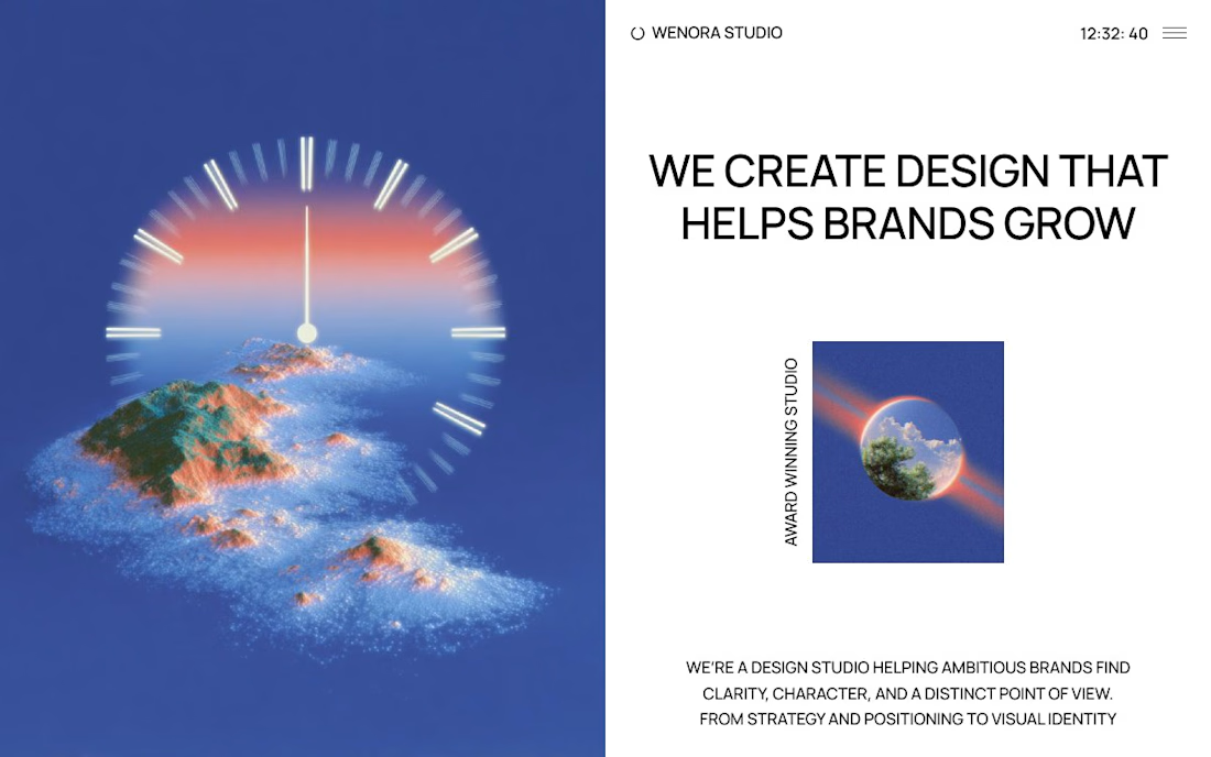
That surreal clock face melting into the sunset island is such a memorable hero visual, Geronimo. Pairing it with the WE CREATE DESIGN THAT HELPS BRANDS GROW statement makes the promise feel bold and concrete.

AI made exploration much cheaper for me
i'm not sure it made the work more enjoyable.
i enjoyed manually exploring different directions
even when it took a lot of effort
once i had a solid foundation,
new screens came together pretty easily
now i can generate a dozen directions and get something functional quickly
but it's often almost unusable.
most of my work comes afterward:
rearranging things,
discarding bad ideas,
removing generated slop...
feeling like this limping little guy
protecting you from the slop
That limping little guy protecting us from the slop is painfully relatable, Anton. I feel the same: generating a dozen directions is cheap now, but the rearranging, discarding and de-slopping afterward is where the real craft lives.