The network for creativity
Join 1.25M professional creatives like you
Connect with clients, get discovered, and run your business 100% commission-free
Creatives on Contra have earned over $150M and we are just getting started
Back to feedPost

A creative way to showcase the number of slots available for new project. Made in Framer for creative agencies, portfolios and marketing websites. Grab it for your project. You can customise the number of slots by changing the variant in project.

The network for creativity
Join 1.25M professional creatives like you
Connect with clients, get discovered, and run your business 100% commission-free
Creatives on Contra have earned over $150M and we are just getting started





Related posts


Gorge · Built for Visuals
A distinctive way for illustrators, designers, and visual artists to showcase their work, build their identity, and create an online presence that feels uniquely theirs.


A little peek at the project I started this week.
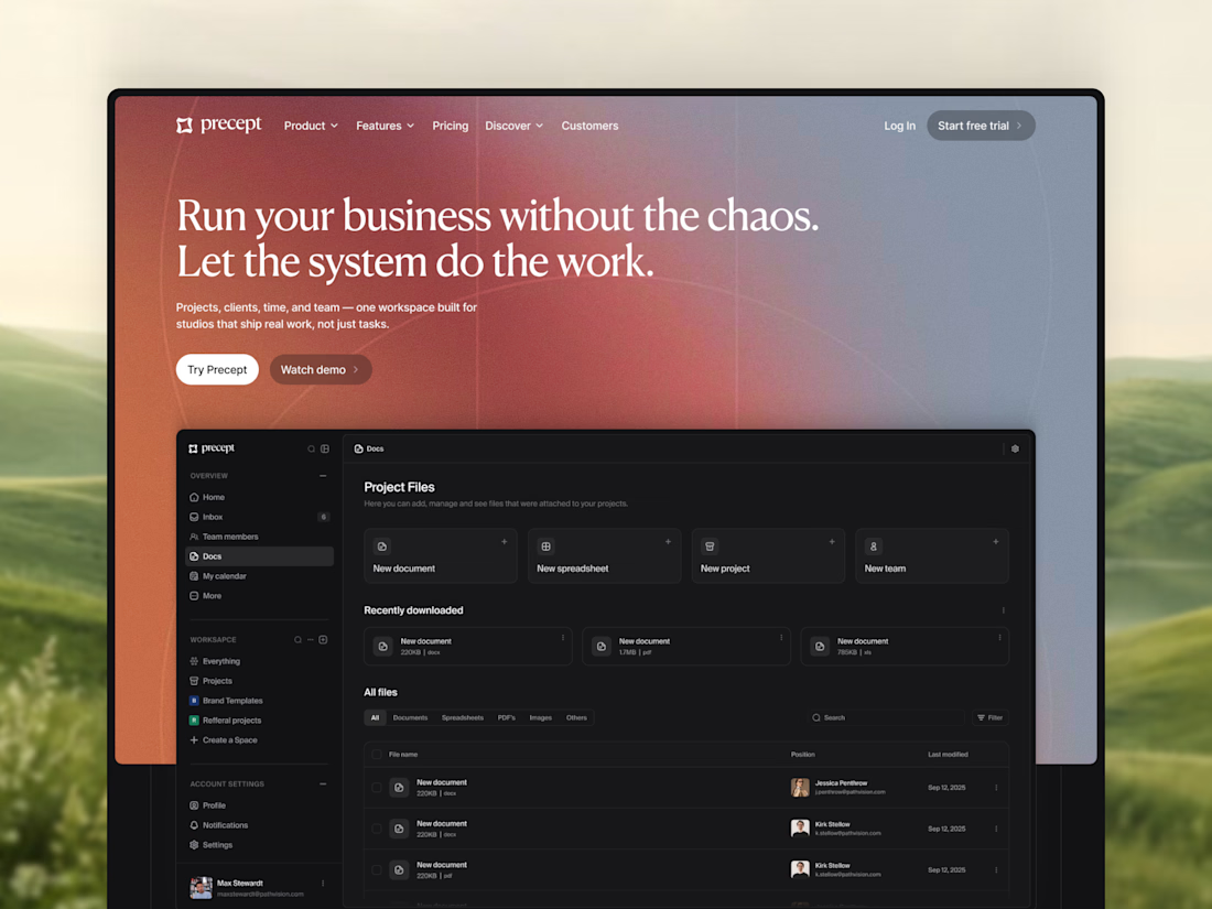
A new hero section for Precept — a project management tool for creative agencies and studios.
Designed in Figma, with development in Framer planned next.
Very excited to see the whole thing come together 🔥


Modern, modern, modern

For me personally, an intro/loading screen is a must for every website I make.
Same with a subtle blur when opening a modal. Just blur, no dark overlay. It makes the site feel more premium imo.
Wdyt? What's your favorite detail on your own sites?


Top-notch design.