The network for creativity
Join 1.25M professional creatives like you
Connect with clients, get discovered, and run your business 100% commission-free
Creatives on Contra have earned over $150M and we are just getting started
Back to feedPost

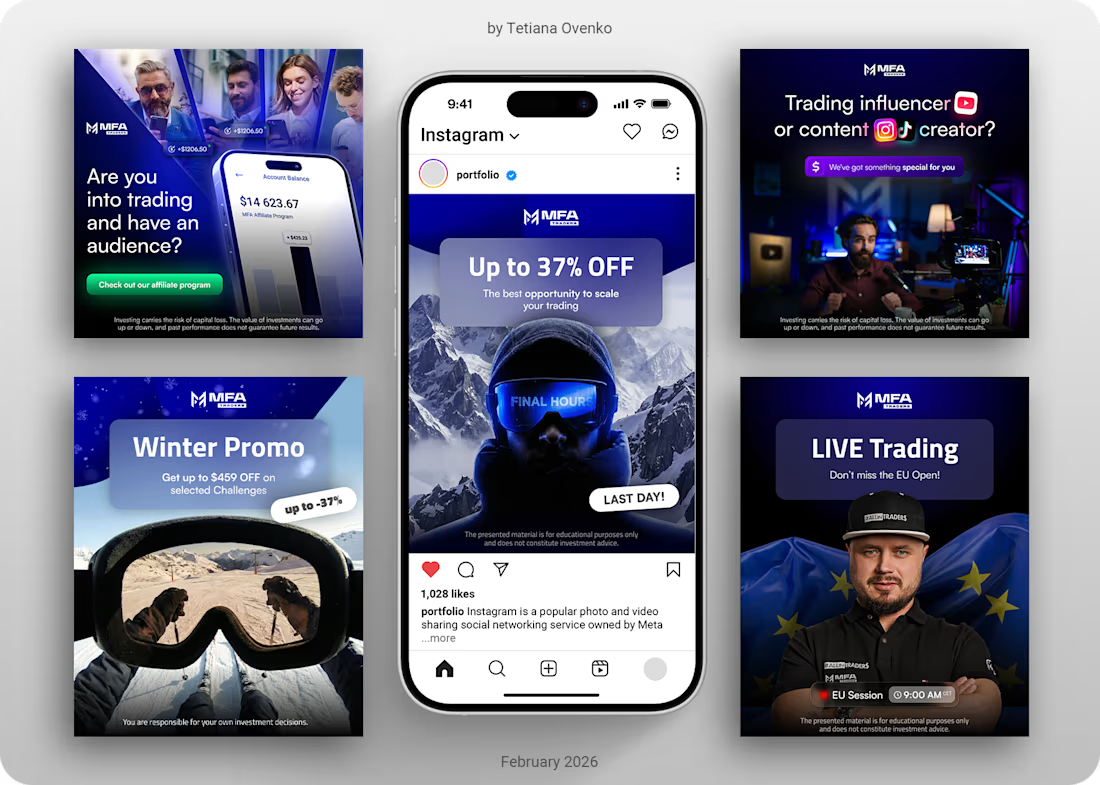
Social Media Designs for MFA Traders


The network for creativity
Join 1.25M professional creatives like you
Connect with clients, get discovered, and run your business 100% commission-free
Creatives on Contra have earned over $150M and we are just getting started





Related posts

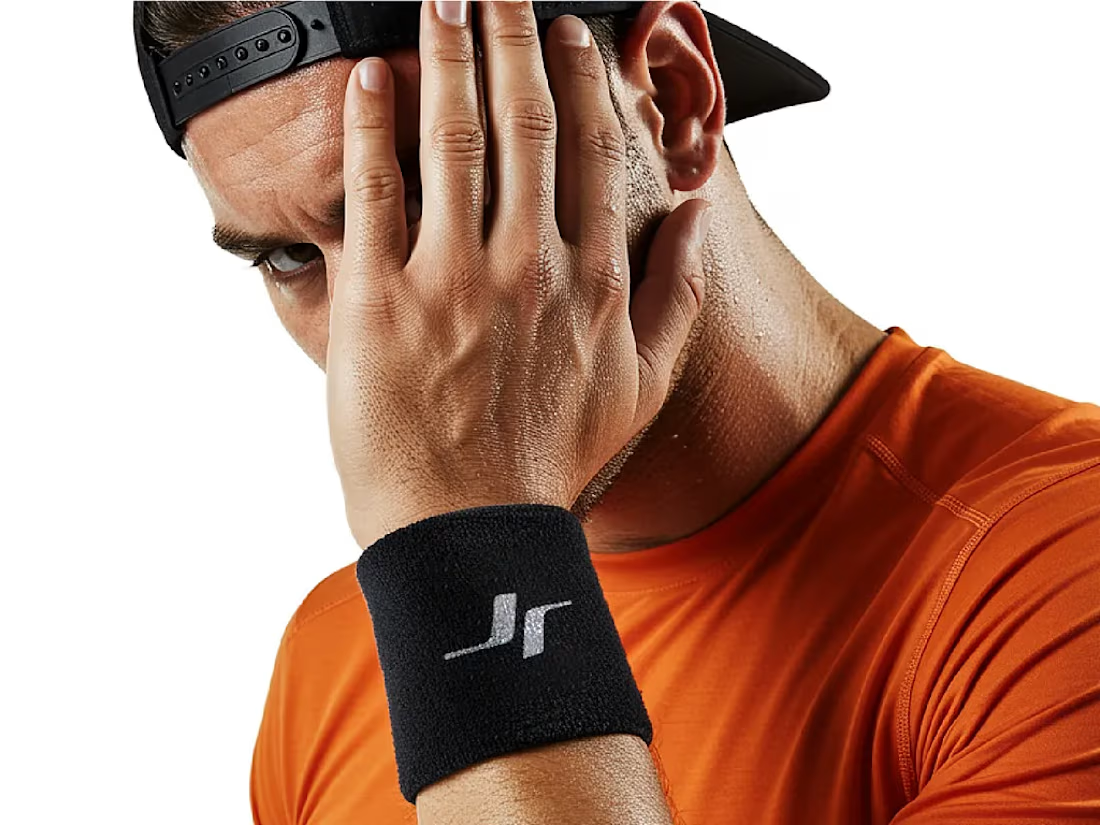
Jordan Reid - Sportswear Brand Identity



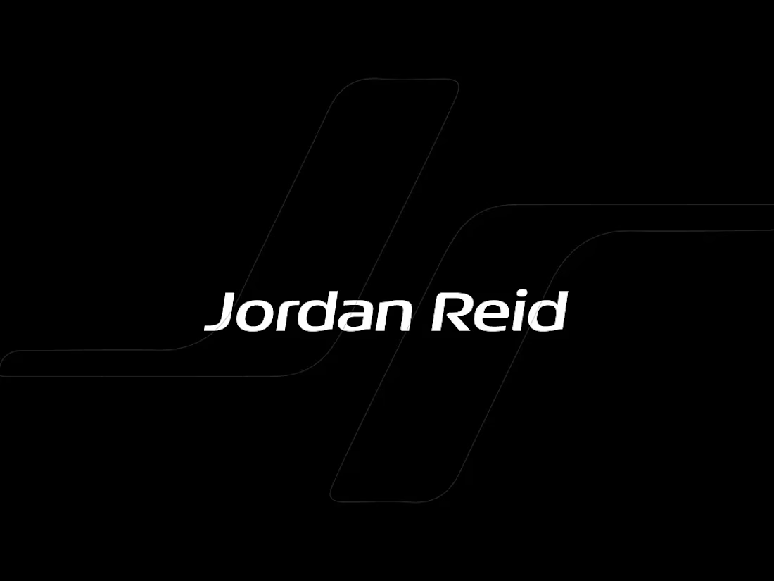

Like the logo direction

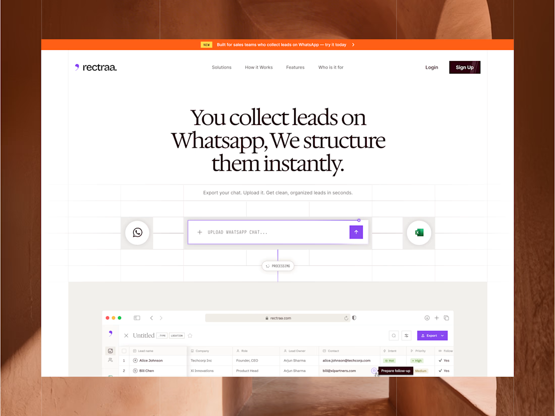
Rectraa helps sales teams extract, classify and organize leads collected through WhatsApp. I designed and developed its marketing website to explain the product clearly, demonstrate its workflow and encourage visitors to try it.
Project information:
Role: Website Designer & Framer Developer
Scope: Website strategy, UI design, responsive design and development
Tools: Figma and Framer
Deliverable: Responsive SaaS marketing website


High end design

5 fonts on one website is a cry for help.
Every extra typeface is a new voice arguing in the same room. Pick two — one with character, one that shuts up and works — and commit.
Typography isn't decoration. It's the tone of voice your brand speaks in before a single word is read.


Pick two and commit is the right call. Which pairing do you reach for most on web projects?