The network for creativity
Join 1.25M professional creatives like you
Connect with clients, get discovered, and run your business 100% commission-free
Creatives on Contra have earned over $150M and we are just getting started
Back to feedPost
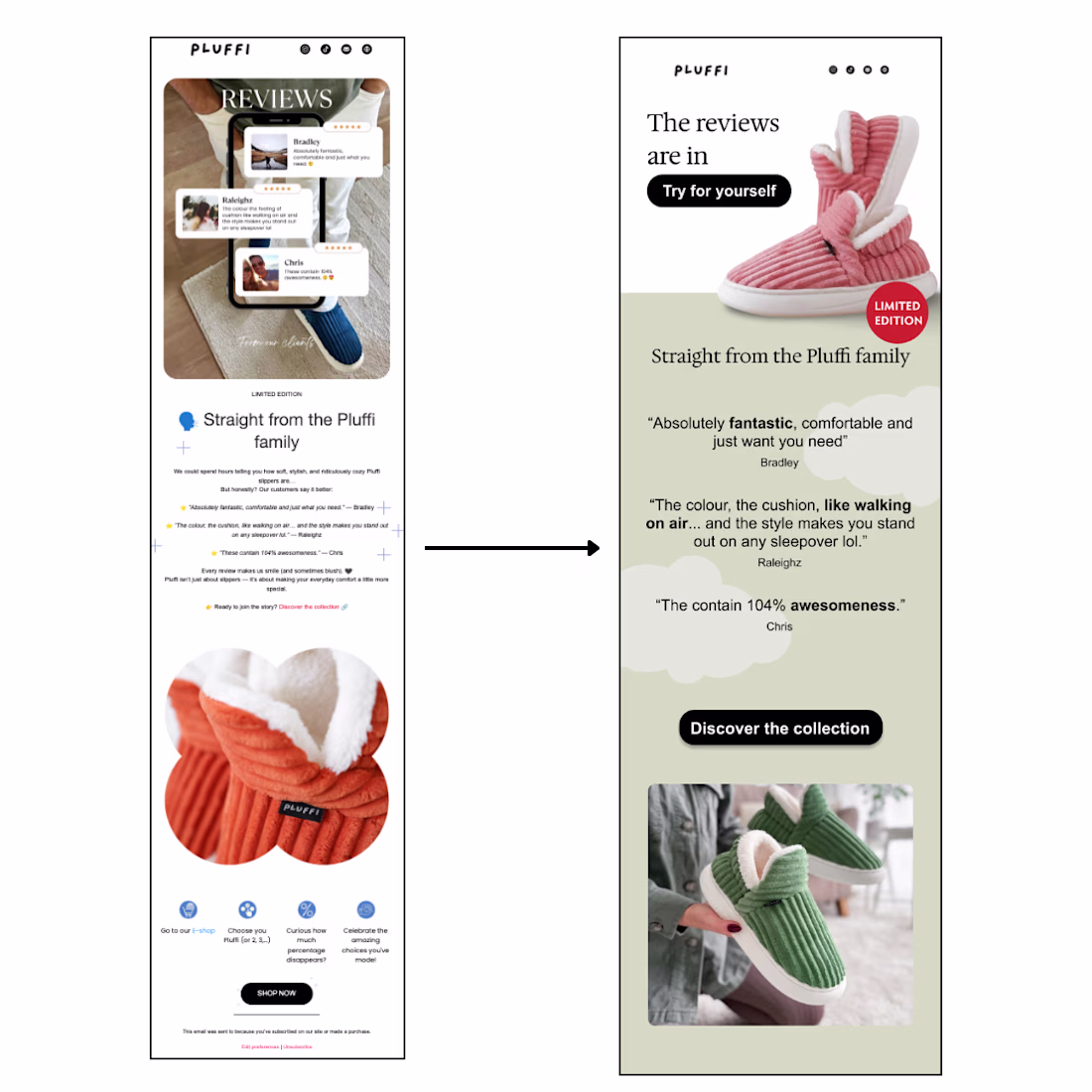
Analyzing this Pluffi email reveals a common conversion killer in email marketing: the buried call-to-action.
When CTAs appear after extensive content, we create what's called "decision fatigue." Users process multiple pieces of information before understanding what action to take, leading to higher abandonment rates.
Here's how I fixed it:
- Most important information (CTA) appears first, supporting content follows
- Users see value proposition → social proof → conversion opportunity in logical sequence
- Simplified design reduces mental processing, improving decision-making speed
- Thumb-friendly navigation with multiple conversion touchpoints
Reviews build trust, but when they precede the CTA, they can overwhelm rather than persuade. My redesign leverages social proof as a conversion accelerator rather than a barrier.
The network for creativity
Join 1.25M professional creatives like you
Connect with clients, get discovered, and run your business 100% commission-free
Creatives on Contra have earned over $150M and we are just getting started
Trending
Claude
Claude has entered the design space. How are you using Claude Design?
Contra University
Learn from expert creatives how to earn more using next-gen AI tools.
creativeaiflow
Creative AI workflows are evolving. What tools do you use, and what are their strengths and weaknesses?
portfolioreview
The best portfolios tell a story, not just show a grid. Share yours for feedback.
freelancerlife
Freelancer life is wins, pivots, and everything in between. What’s yours right now?