The network for creativity
Join 1.25M professional creatives like you
Connect with clients, get discovered, and run your business 100% commission-free
Creatives on Contra have earned over $150M and we are just getting started
Back to feedPost

One of the most important parts of Mirror 360 was the email their users receive. I never made an email design like this so it was challenging at first.
I’ve always had this mindset that if you break something into smaller pieces, you can figure it out and that's how I decided to approach this task as well.
First of all however I called one of my mentors to ask what tool he’d recommend. I was told to try @Stripo , so I went straight there and got to work.
A few weeks later, 15+ emails came out of it.
Reflection emails. Authentication flow. Marketing templates. It was actually looking good.
That experience reinforced something I believe more and more: Good design principles transfer across mediums. Once you understand hierarchy, typography, color, and rhythm, you can literally create anything anywhere.
That’s also why having a designer on a monthly retainer can be so valuable for startups. Having someone who can jump into new problems with you and figure them out as the product evolves can be the change your business needs.


The network for creativity
Join 1.25M professional creatives like you
Connect with clients, get discovered, and run your business 100% commission-free
Creatives on Contra have earned over $150M and we are just getting started
Related posts

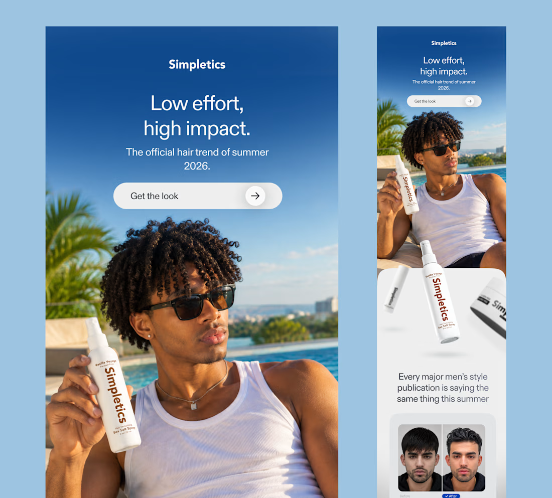
𝗦𝗶𝗺𝗽𝗹𝗲𝘁𝗶𝗰𝘀 | 𝗘-𝗰𝗼𝗺𝗺𝗲𝗿𝗰𝗲 𝗘𝗺𝗮𝗶𝗹 𝗗𝗲𝘀𝗶𝗴𝗻
A product image and a "𝗕𝗨𝗬 𝗡𝗢𝗪" button are not enough for a good product. A compelling story is necessary to pique people's curiosity.
I created an e-commerce marketing email for Simpletics, a men's haircare company, with the theme "𝙇𝙤𝙬 𝙚𝙛𝙛𝙤𝙧𝙩, 𝙝𝙞𝙜𝙝 𝙞𝙢𝙥𝙖𝙘𝙩."
The objective was to launch the brand's sea salt spray through a lifestyle-driven campaign that 𝙚𝙣𝙜𝙖𝙜𝙚𝙨 𝙘𝙤𝙣𝙨𝙪𝙢𝙚𝙧𝙨, 𝙥𝙞𝙦𝙪𝙚𝙨 𝙩𝙝𝙚𝙞𝙧 𝙘𝙪𝙧𝙞𝙤𝙨𝙞𝙩𝙮, 𝙖𝙣𝙙 𝙥𝙧𝙤𝙢𝙤𝙩𝙚𝙨 𝙥𝙧𝙤𝙙𝙪𝙘𝙩 𝙚𝙭𝙥𝙡𝙤𝙧𝙖𝙩𝙞𝙤𝙣.
𝗛𝗲𝗿𝗲'𝘀 𝗵𝗼𝘄 𝗜 𝗮𝗽𝗽𝗿𝗼𝗮𝗰𝗵𝗲𝗱 𝗶𝘁:
𝗟𝗶𝗳𝗲𝘀𝘁𝘆𝗹𝗲-𝗹𝗲𝗱 𝘀𝘁𝗼𝗿𝘆𝘁𝗲𝗹𝗹𝗶𝗻𝗴: An aspirational summer visual sets the tone and introduces the product naturally.
𝗖𝗹𝗲𝗮𝗿 𝘃𝗶𝘀𝘂𝗮𝗹 𝗵𝗶𝗲𝗿𝗮𝗿𝗰𝗵𝘆: A strong headline, concise supporting copy and prominent CTA guide the reader through the message.
𝗦𝗼𝗰𝗶𝗮𝗹 𝗽𝗿𝗼𝗼𝗳: A reference to men's style publications and a before-and-after comparison reinforce the relevance of the hair trend.
𝗣𝗿𝗼𝗱𝘂𝗰𝘁 𝗺𝗲𝗿𝗰𝗵𝗮𝗻𝗱𝗶𝘀𝗶𝗻𝗴: Individual product sections communicate benefits and help subscribers discover the right products for their hair.
𝗖𝗼𝗻𝘃𝗲𝗿𝘀𝗶𝗼𝗻-𝗳𝗼𝗰𝘂𝘀𝗲𝗱 𝘀𝘁𝗿𝘂𝗰𝘁𝘂𝗿𝗲: Strategic CTA placements and a clear product routine create natural opportunities for further engagement.
The result is an email campaign that balances brand storytelling, product education and conversion-focused email design 𝒘𝒊𝒕𝒉𝒐𝒖𝒕 𝒐𝒗𝒆𝒓𝒘𝒉𝒆𝒍𝒎𝒊𝒏𝒈 𝒕𝒉𝒆 𝒓𝒆𝒂𝒅𝒆𝒓.
Designed in Figma with attention to visual hierarchy, brand consistency and mobile-first email design.
𝗟𝗼𝗼𝗸𝗶𝗻𝗴 𝗳𝗼𝗿 𝗮𝗻 𝗘𝗺𝗮𝗶𝗹 𝗗𝗲𝘀𝗶𝗴𝗻𝗲𝗿 𝗳𝗼𝗿 𝘆𝗼𝘂𝗿 𝗲-𝗰𝗼𝗺𝗺𝗲𝗿𝗰𝗲 𝗼𝗿 𝗗𝗧𝗖 𝗯𝗿𝗮𝗻𝗱?
I design engaging, on-brand email campaigns that make products easier to discover and give subscribers a reason to take action.
Let's make your emails work harder.




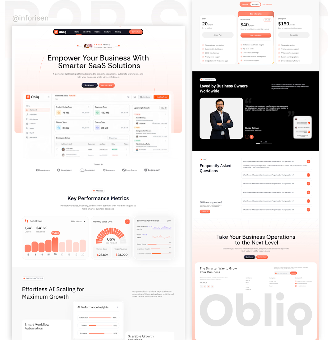
Good SaaS website design starts with understanding a busy workday.
You open your laptop to check who’s in today, find a document and see what’s coming up. Those everyday tasks shaped our latest design.
We brought employee details, attendance, documents and schedules into a clear dashboard. On the website, visitors get a closer look at the product and a simple way to book a demo.
At Inforisen, we turn product ideas into websites and interfaces that feel familiar from the first visit.
Have a SaaS idea? We’d love to help you bring it to life. Let’s talk.
#Inforisen #SaaSWebsiteDesign #UIUXDesign #DashboardDesign



Created a welcoming and engaging email campaign for Glow & Grace, a fictional skincare brand. The project combines persuasive email copywriting with an elegant visual layout to introduce the brand, connect with new subscribers, and encourage product discovery.

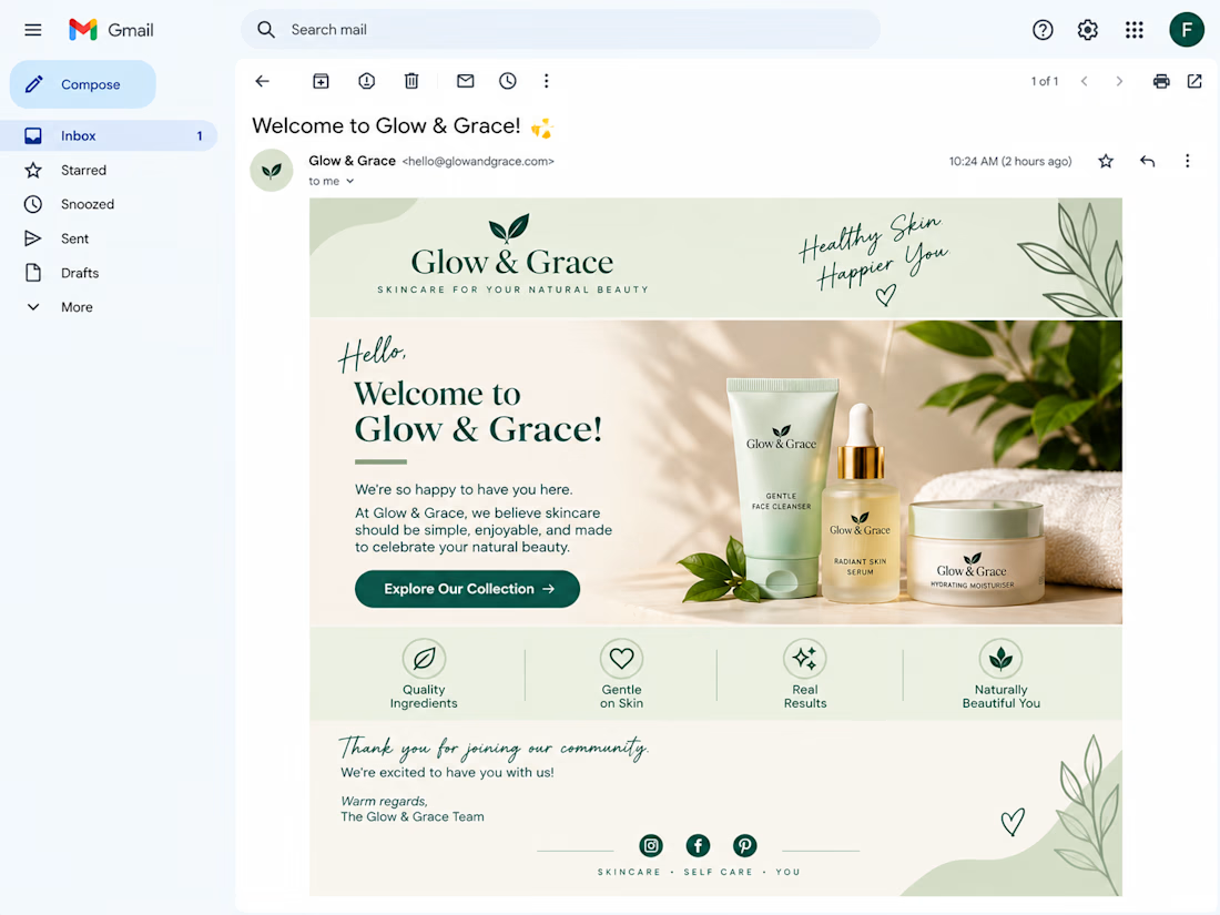

The dark green CTA pops nicely against the soft sage palette, you can't miss it. Did you try a second button near the footer for people who read all the way down?