The network for creativity
Join 1.25M professional creatives like you
Connect with clients, get discovered, and run your business 100% commission-free
Creatives on Contra have earned over $150M and we are just getting started
Back to feedPost
If your beauty ads look like basic white-background catalog shots, people will scroll past them instantly. High-end cosmetics require dramatic visual storytelling to catch scrollers mid-scroll.
Look at my latest commercial concept poster for a luxury makeup line. Every single layer is designed to look premium:
Central Circular Focus: The unique text frame wraps around the product, creating an un-skippable visual anchor right in the middle.
Ambient Neon Lighting: The glowing pink backdrop circles give the product a sleek, modern, and expensive look.
Blurred Petal Depth: The soft blurred cherry blossom petals floating across the canvas add a professional camera depth-of-field trick.
📬 Ready to transform your beauty product photos into high-converting visual assets?
#GraphicDesign #CosmeticsBranding #ProductAd #EcommerceMarketing #BrandIdentity

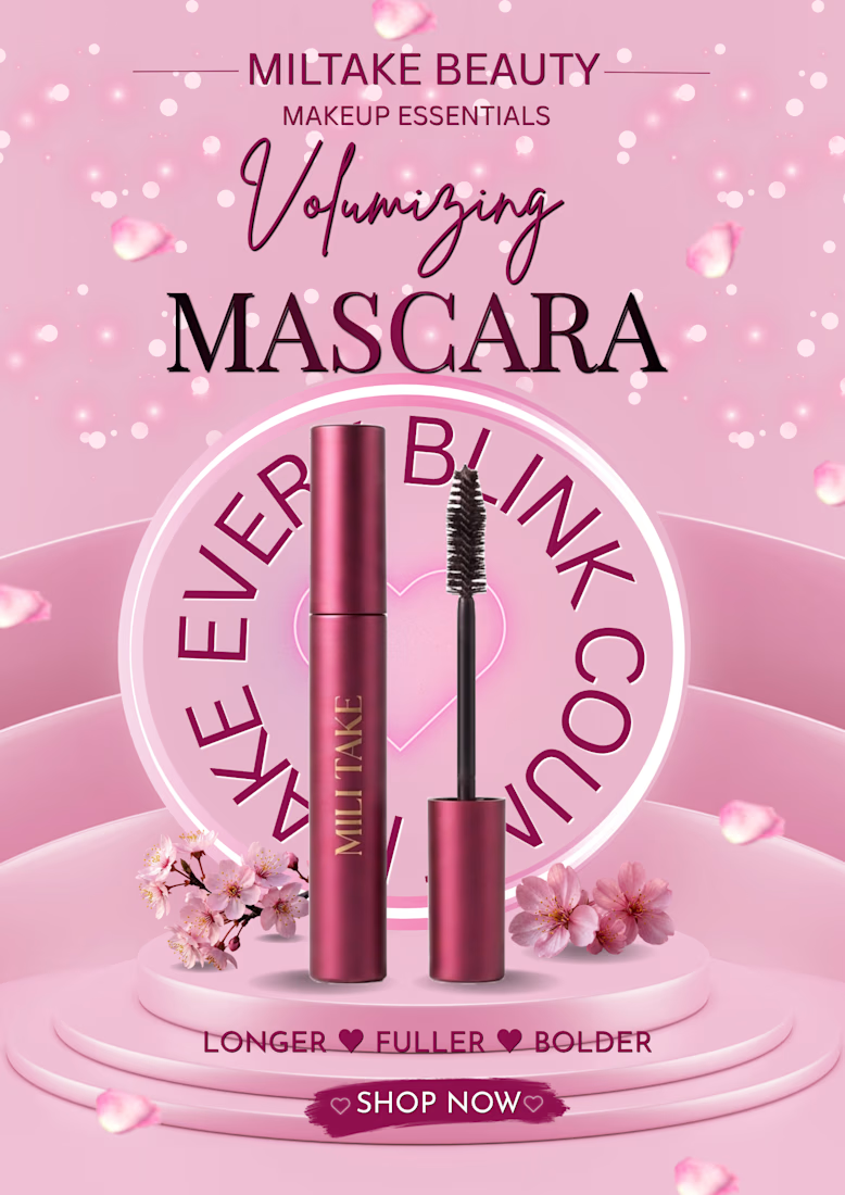

The circular lockup is doing the anchoring, but it's also the first thing that breaks in a 1:1 or story crop — the ring needs the full canvas to close. Did you build a square variant where the type runs as an arc instead of a full circle?

"That's a really sharp observation! You are completely right—the full circular badge works best on the portrait cover.
The network for creativity
Join 1.25M professional creatives like you
Connect with clients, get discovered, and run your business 100% commission-free
Creatives on Contra have earned over $150M and we are just getting started

Challenges
View all


Related posts

My Top Featured Projects on @Contra Labs 🔥
⚡| NEXVOLU
⚡| HYDRUM VEIL
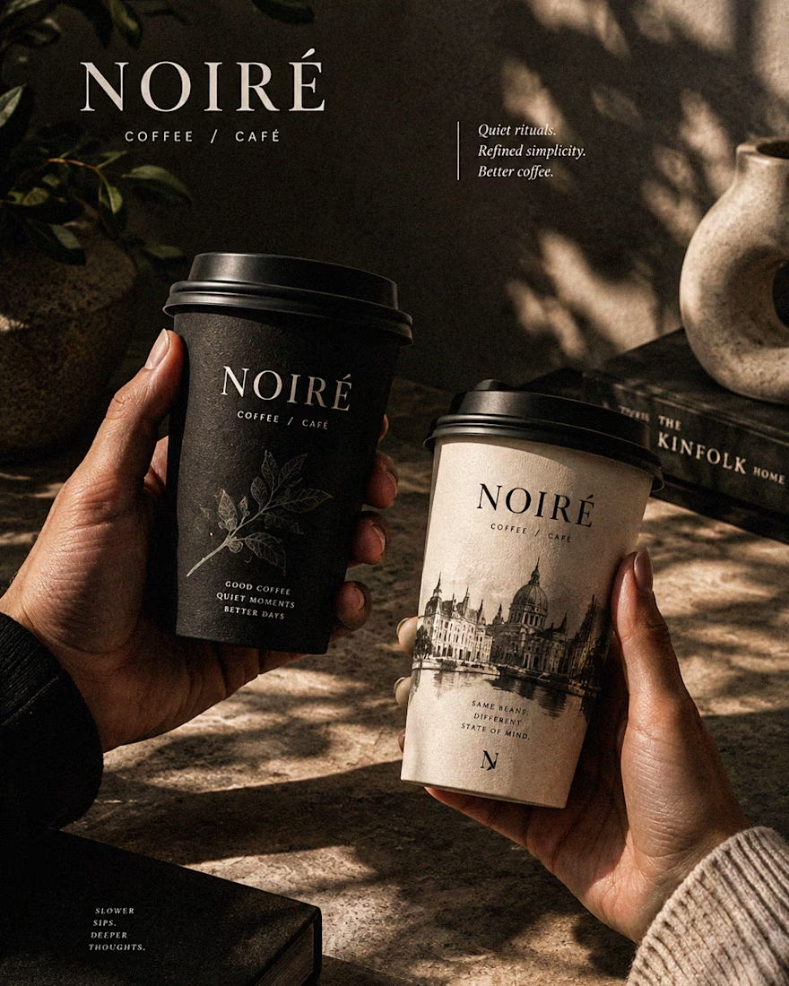
⚡| NOIRÉ
Each project explores a different direction, but the goal stays the same: build brands that stand out.
Which project is your favorite?
Drop the name below 👇


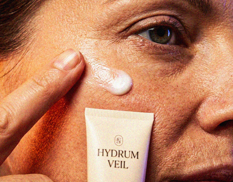
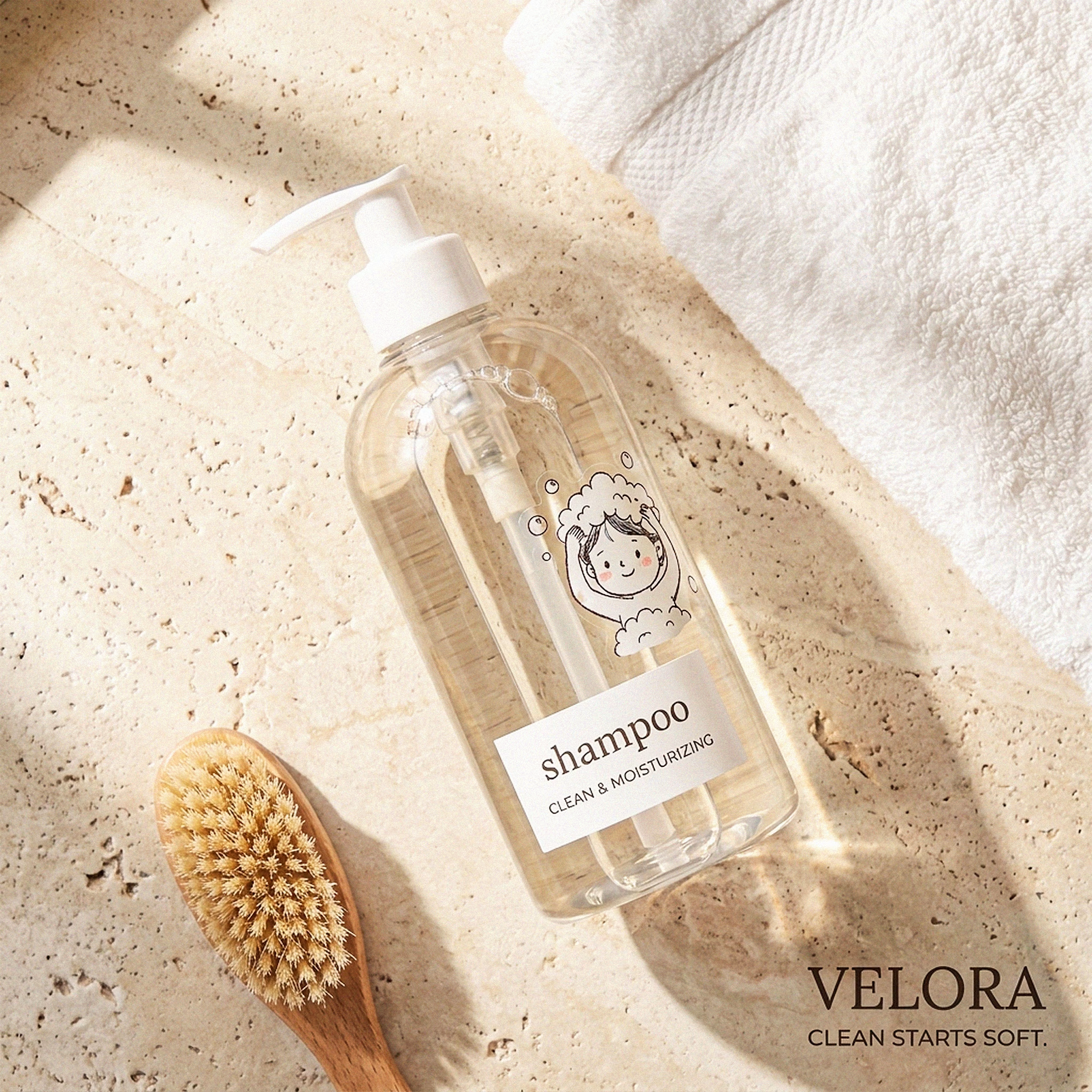

These are 🔥 Mine are all fav 🙌
Congo for Featured on @Contra HQ & @Contra Labs ... 😍

Luxury Lighting E-commerce Website Design for Modern Home Decor
A modern luxury lighting e-commerce website concept crafted to showcase premium statement pieces through a refined, immersive, and editorial-inspired digital experience. The design combines warm ambient lighting, bold typography, cinematic imagery, and clean minimalist layouts to create a sophisticated online presence for a high-end home decor brand. Every element is thoughtfully designed to enhance product storytelling, improve user engagement, and deliver a seamless shopping experience across all devices.


really nice design

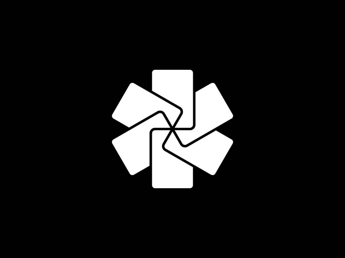
Symbol Mark direction for Lethal Setup, a subscription publication with strategy guides for a competitive trading card game. In card games, a lethal setup is the position on the table that ends the game.
The symbol I'm designing for them is made of cards. I drew them with the proportions of a real trading card, and placed them in sequence, the way cards go down one after another during a turn.
That way it looks like a structure. I thought it fit the second word of the name, the setup.

I really love this logo mark