The network for creativity
Join 1.25M professional creatives like you
Connect with clients, get discovered, and run your business 100% commission-free
Creatives on Contra have earned over $150M and we are just getting started
Back to feedPost

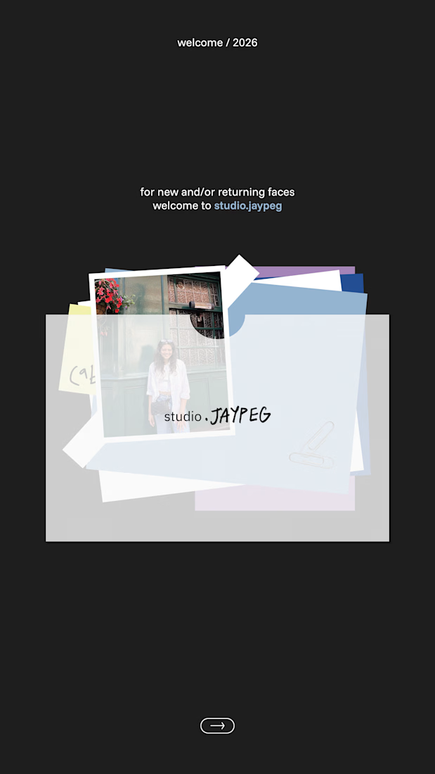
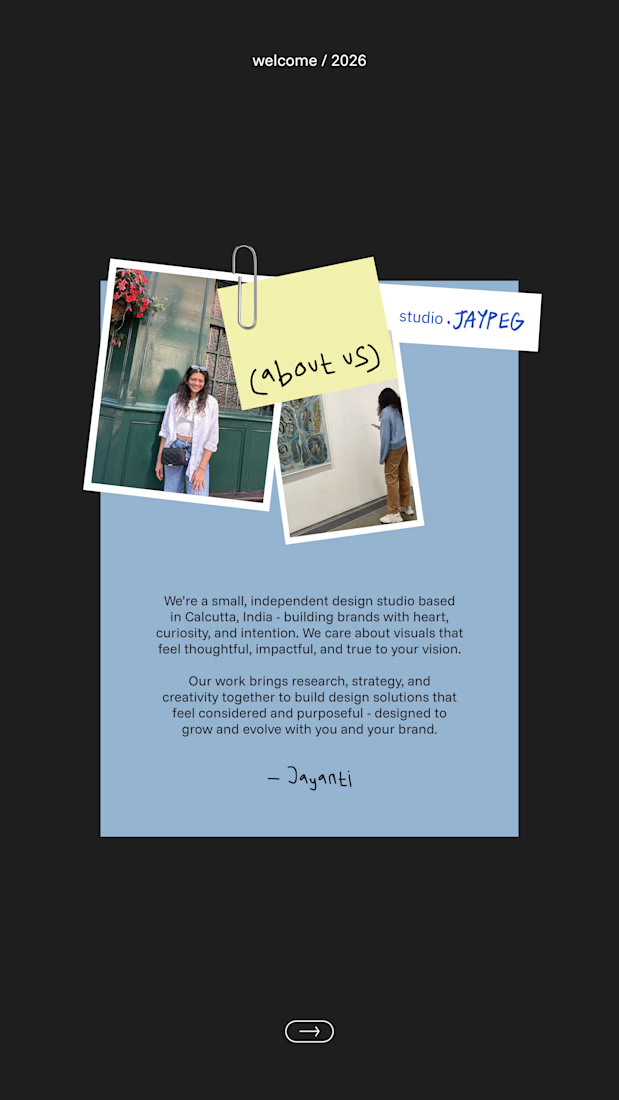
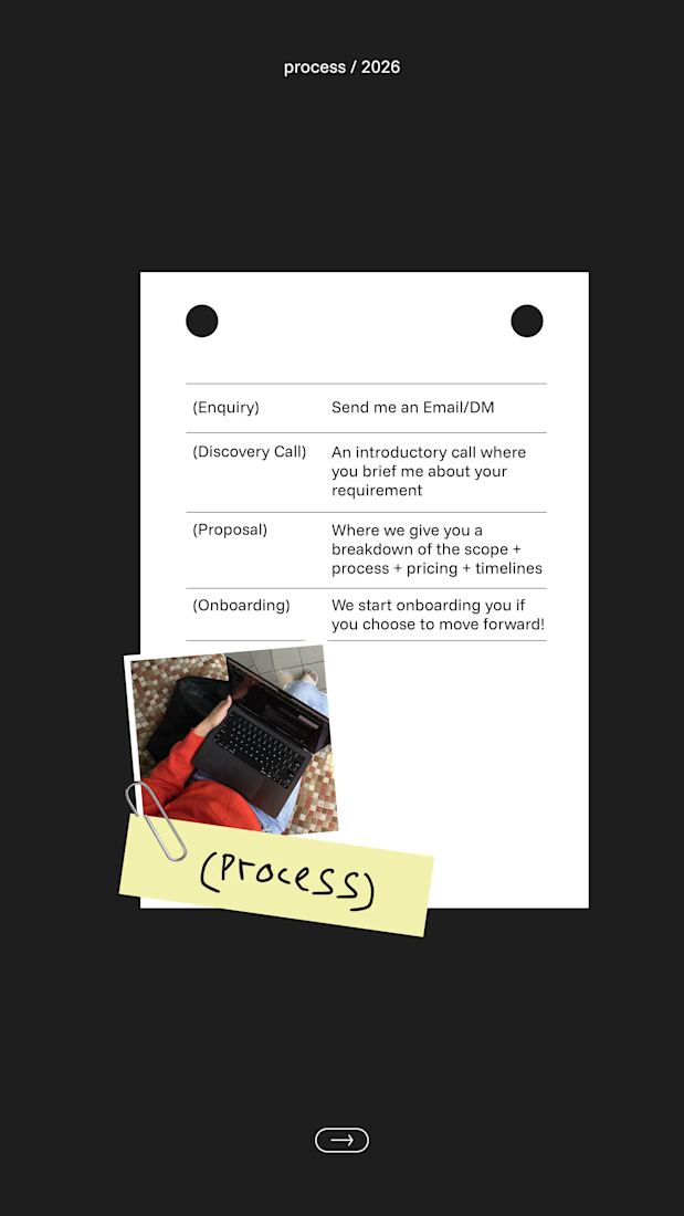
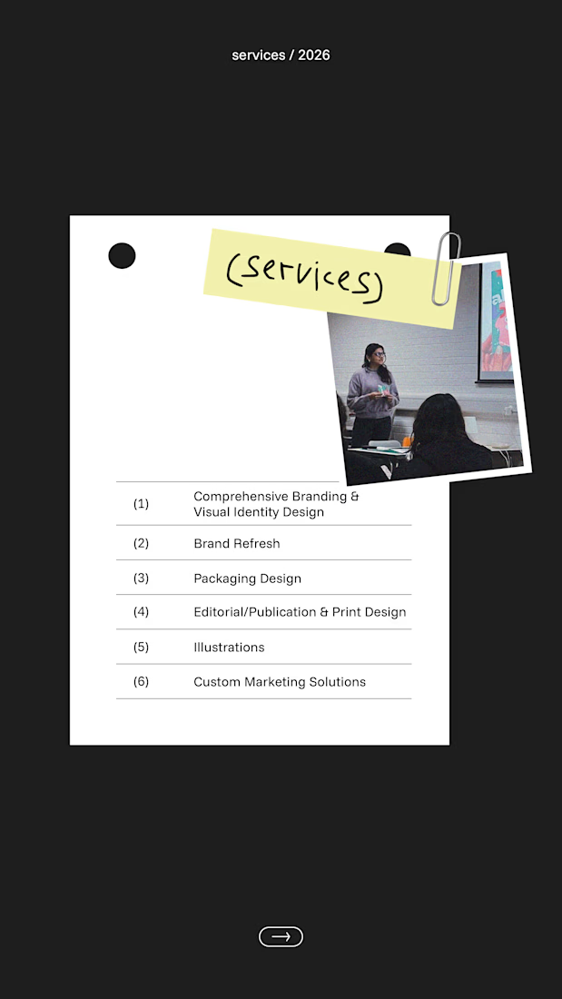
Now booking clients for 2026 🚀
Got a project in mind? Get in touch and we'll create something special together!
The network for creativity
Join 1.25M professional creatives like you
Connect with clients, get discovered, and run your business 100% commission-free
Creatives on Contra have earned over $150M and we are just getting started





Related posts


A calm, editorial landing page for an architecture studio, built around daylight and materials. We'd love to hear your thoughts! 🏛️


The warm timber slats against the pale page feel calm. Did you build the motion in Jitter?

High-end tattoo studios lose countless creative hours to administrative friction - vague DM inquiries, misaligned expectations around placement and sizing, awkward price negotiations, and the costly industry standard of consultation no-shows.
The Dusk & Needle booking experience replaces that disorganized back-and-forth with clarity from the very first touchpoint, setting firm boundaries around artist time and filtering out tire-kickers before a single message is exchanged.
By requiring clients to define their vision clearly and commit upfront, the experience protects the studio's calendar while giving serious clients total transparency on timing and costs before they ever walk through the door. It bridges the gap between client imagination and artist feasibility, ensuring every consultation begins with aligned expectations and mutual respect for the craft.
100% created in Lovable, 0% Figma 🤯
🖥️ 📱View on Desktop or Mobile: https://duskandneedle.lovable.app


Marea — Private Yacht Charter
Booking a yacht sounds simple.
Until a guest wants a sunset dinner for six.
Now someone has to check availability, coordinate the yacht and chef, confirm the menu, collect dietary requirements, arrange the extras, and keep an eye on the weather.
For a small charter business, that can mean a lot of back-and-forth before a booking is actually confirmed.
So I built Marea around a simple idea:
The guest should choose the experience. Marea should handle the coordination.
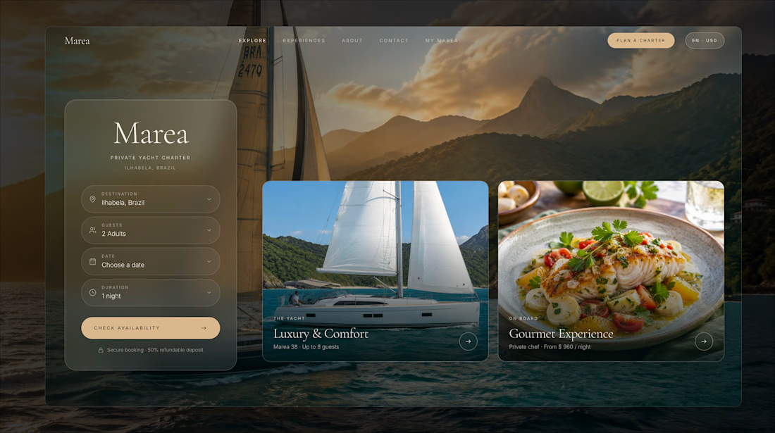
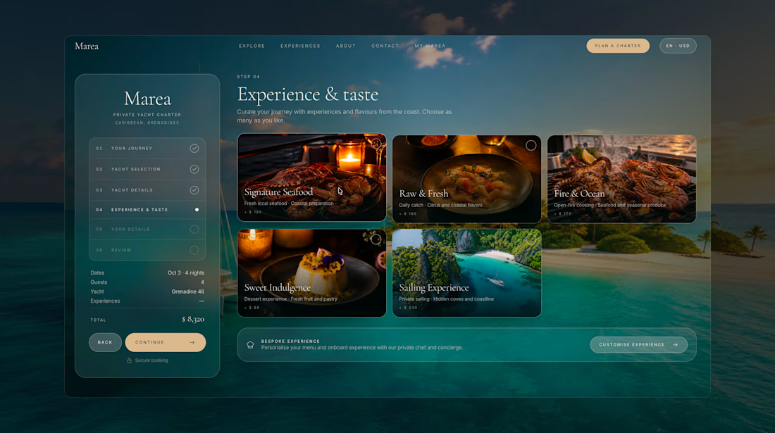
Instead of starting with a long inquiry form, guests can build their trip visually, choosing the destination, date, yacht, experience, dining options, and preferences through one guided flow.
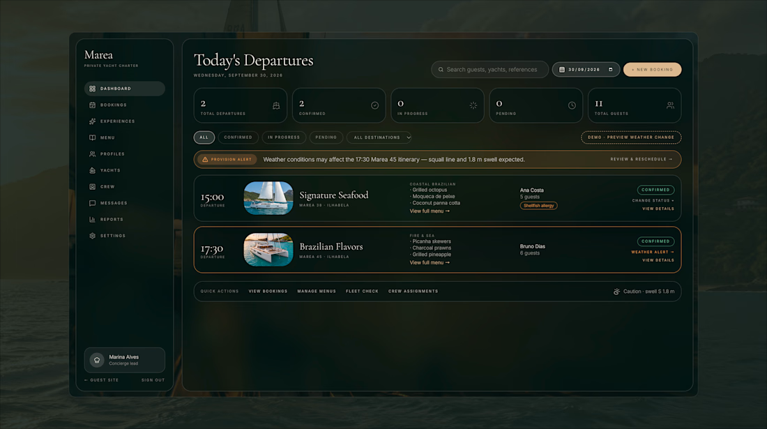
Behind the scenes, the concierge gets everything they need in one place: guest details, preferences, special requests, payment, and trip status.
And because sailing doesn't always go according to plan, Marea also brings weather and rescheduling into the booking experience.
One booking. Boat, chef, dinner, and everything in between.


This is stunning, sign me up, where do I book?! 😅


