The network for creativity
Join 1.25M professional creatives like you
Connect with clients, get discovered, and run your business 100% commission-free
Creatives on Contra have earned over $150M and we are just getting started
Back to feedPost

Sometimes the biggest improvement isn't adding something new.
It's removing something unnecessary.
Cleaner layouts usually make stronger websites.
The network for creativity
Join 1.25M professional creatives like you
Connect with clients, get discovered, and run your business 100% commission-free
Creatives on Contra have earned over $150M and we are just getting started



Related posts

The original site made visitors work too hard. Navigation was broken, pages were heavy with text, and basic information about the property was difficult to find. Visitors left before they understood what Skyline Towers offers.
I rebuilt the site structure around what visitors come to find, fixed the navigation, and cut long copy into short, scannable sections paired with strong visuals. The site is now easy to move through and tells the property’s story at a glance.


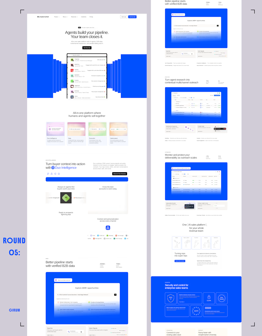
Time to give another landing page a new look. Round 05.


So good

A website launch isn't just about making everything look good. It's about making sure everything actually works.
There are so many small details that can easily be overlooked during the excitement of launching a new website, but they can make a big difference to the user experience and overall performance.
I'd personally pay extra attention to mobile testing, redirects, and forms. A beautiful website means little if visitors can't navigate it or take action.
What's one website launch mistake you've encountered that should never be overlooked? 👇


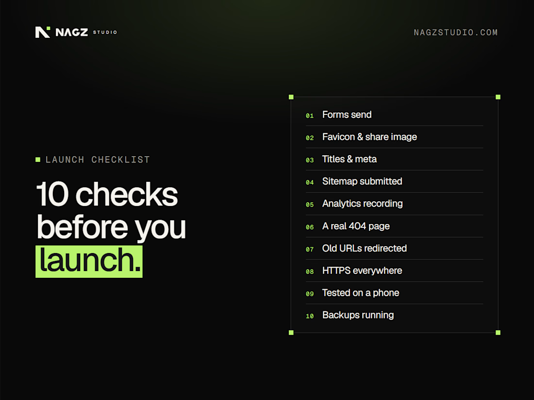
10 checks before you launch
Launching a site this week? Run through these first:
Every form sends, and you receive the email
Favicon and social share image are set
Page titles and meta descriptions are written
The sitemap is submitted in Google Search Console
Analytics is recording...