The network for creativity
Join 1.25M professional creatives like you
Connect with clients, get discovered, and run your business 100% commission-free
Creatives on Contra have earned over $150M and we are just getting started
Back to feedPost

The upgraded Edward OS 👍 workspace dashboard bridges discovery, research synthesis, and execution in a single cyber-navy interface. I built Edward OS to consolidate my discovery, UX research, and interface design pipeline into one dark-mode system.
I’d love to gather feedback from design leaders, technical founders, and product managers:💯
How does your current team manage the handoff between user research insights and wireframing and prototyping execution?💯
If you were testing this workspace, what custom guardrails (e.g., brand guidelines, design system tokens) would you want automated first?

The network for creativity
Join 1.25M professional creatives like you
Connect with clients, get discovered, and run your business 100% commission-free
Creatives on Contra have earned over $150M and we are just getting started











Related posts


SES AI is a battery technology company accelerating the energy transition through AI-powered material discovery, battery development, manufacturing, and management.
SES AI approached us with a website redesign driven by its new “All-in on AI” strategy. As AI became central to the company’s work across safety, manufacturing, and science, the existing website still focused primarily on its battery-hardware side. We redesigned the experience to clearly communicate the three AI pillars, while making the website simpler, more direct, and easier to navigate.


This looks insane. The robotic arm with the battery cell is such a strong visual. Love how clean you kept it despite it being AI heavy.

$15,000 from one browser game takes 1 to 15 million plays.
I did the math because my first web game, built with Claude Code, went live on CrazyGames today.
Bolt Pit is a Three.js arena shooter. It has earned $0 so far, because CrazyGames keeps ads off during the Basic Launch test, which runs until November 5.
Only games with good numbers get a Full Launch, and that's where the ad revenue share starts.
The formula:
Revenue = sessions × ads per session × eCPM ÷ 1,000 × your share
eCPM is what advertisers pay per 1,000 ads. CrazyGames allows at most one midgame ad every 3 minutes. The share isn't public, and reports range from 40% to 60%, so I used 50%. The rest are my assumptions, based on reported ad rates:
Low: 1 ad per session, $2 eCPM = $1 per 1,000 plays. You need 15 million plays.
Mid: 2 ads, $5 eCPM = $5 per 1,000 plays. You need 3 million plays.
High: 3 ads, $10 eCPM = $15 per 1,000 plays. You need 1 million plays.
One developer reported about €1.20 per 1,000 CrazyGames plays across eight older games. That's the low case, so I plan around the middle at best.
Is 3 million plays realistic?
CrazyGames reported 320 million play sessions a month this October. Poki says it has 100 million players a month. The players exist. Retention and session length decide which line you land on.
That's the bigger reason I'm here. I have Unity games in progress that were meant for the App Store. On the App Store, I'd only find out if people come back after paying for players.
So the new plan is web first, App Store later:
Launch on CrazyGames and Poki, where test players are free.
Tune retention and session length on real data.
If a game becomes a hit on the web, take it to the app stores.
Both portals' exclusivity rules cover only the web, so the app stores stay open.
I'm also skipping CrazyGames' exclusivity bonus. It pays 50% more for two months if your game stays off other web portals, and I want to test on Poki too.
Getting a Claude Code build accepted took six fixes, including a static build, relative paths, no Google Fonts and cutting the size from 20.5 MB to 12.4 MB. One known bug is still live: on landscape phones the start button sits below the fold.
I'll post the real numbers as they come in. Play it here:
https://crazygames.com/game/bolt-pit

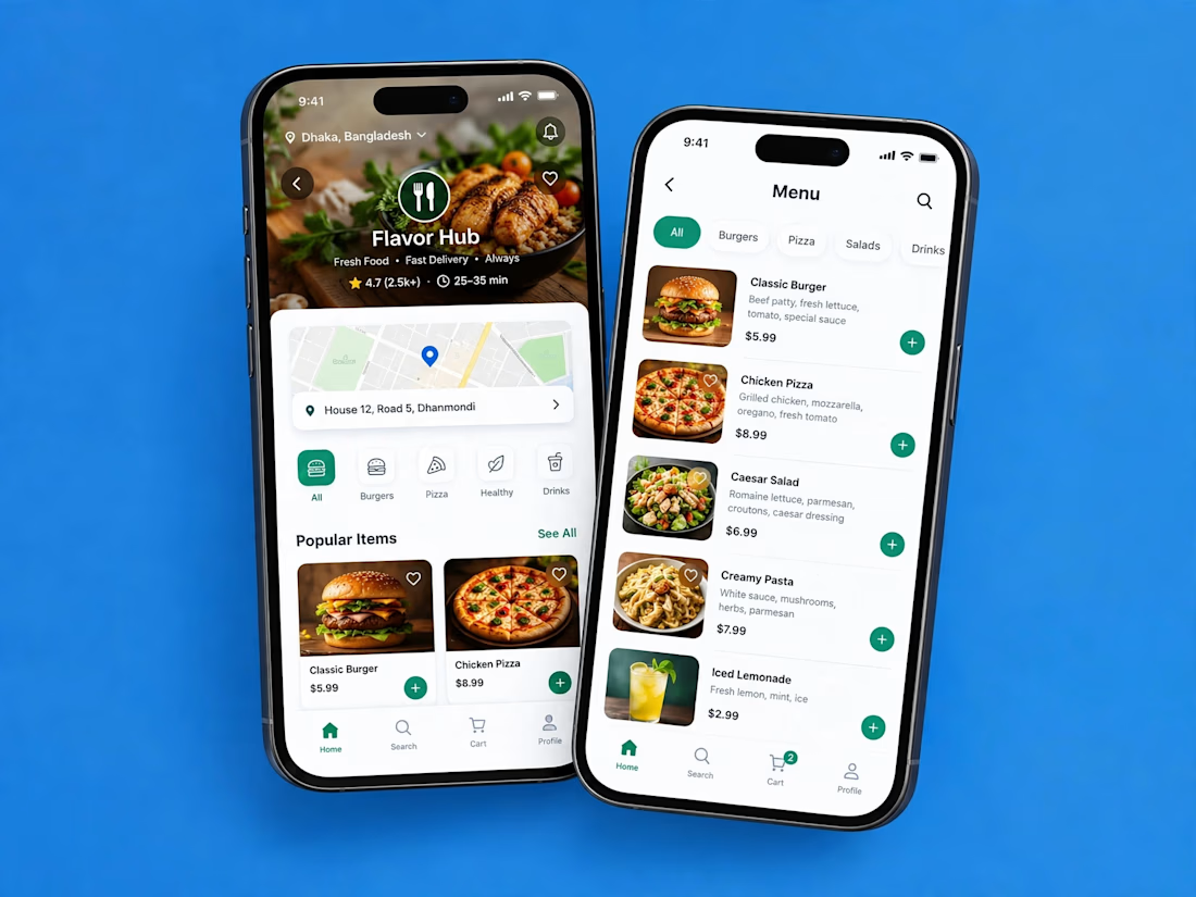
A clean and modern food delivery app concept designed with a focus on simple navigation, clear layouts, and a smooth user experience.
Designed in Figma.

Love how clean and intuitive this feels, the navigation looks super smooth and the layout is really well balanced