The network for creativity
Join 1.25M professional creatives like you
Connect with clients, get discovered, and run your business 100% commission-free
Creatives on Contra have earned over $150M and we are just getting started
Back to feedPost

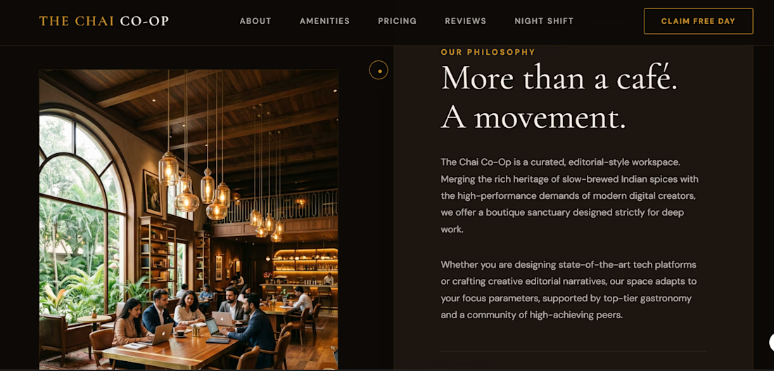
An AI-generated dark luxury website for "The Chai Co-Op" — a co-working café


The network for creativity
Join 1.25M professional creatives like you
Connect with clients, get discovered, and run your business 100% commission-free
Creatives on Contra have earned over $150M and we are just getting started





Related posts



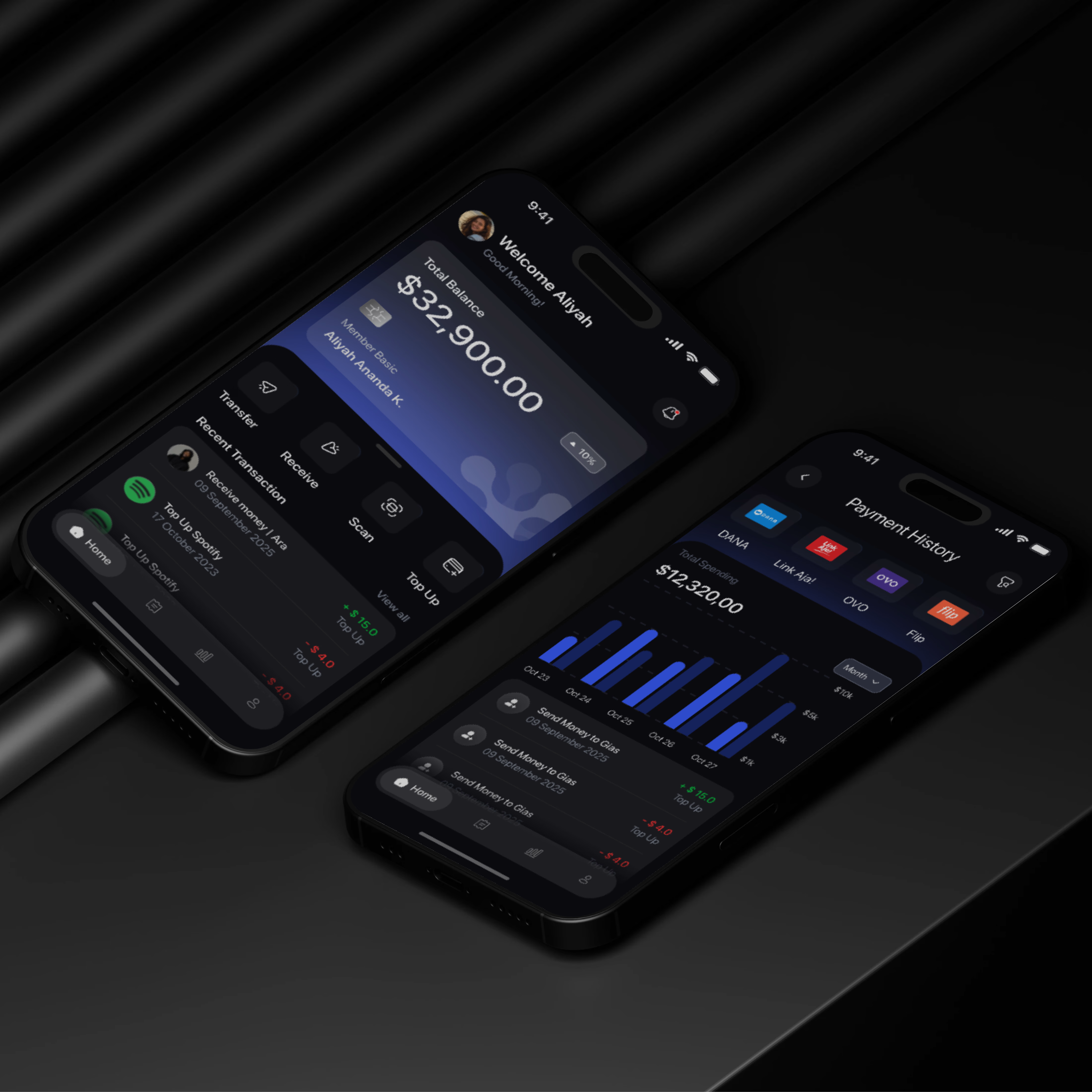

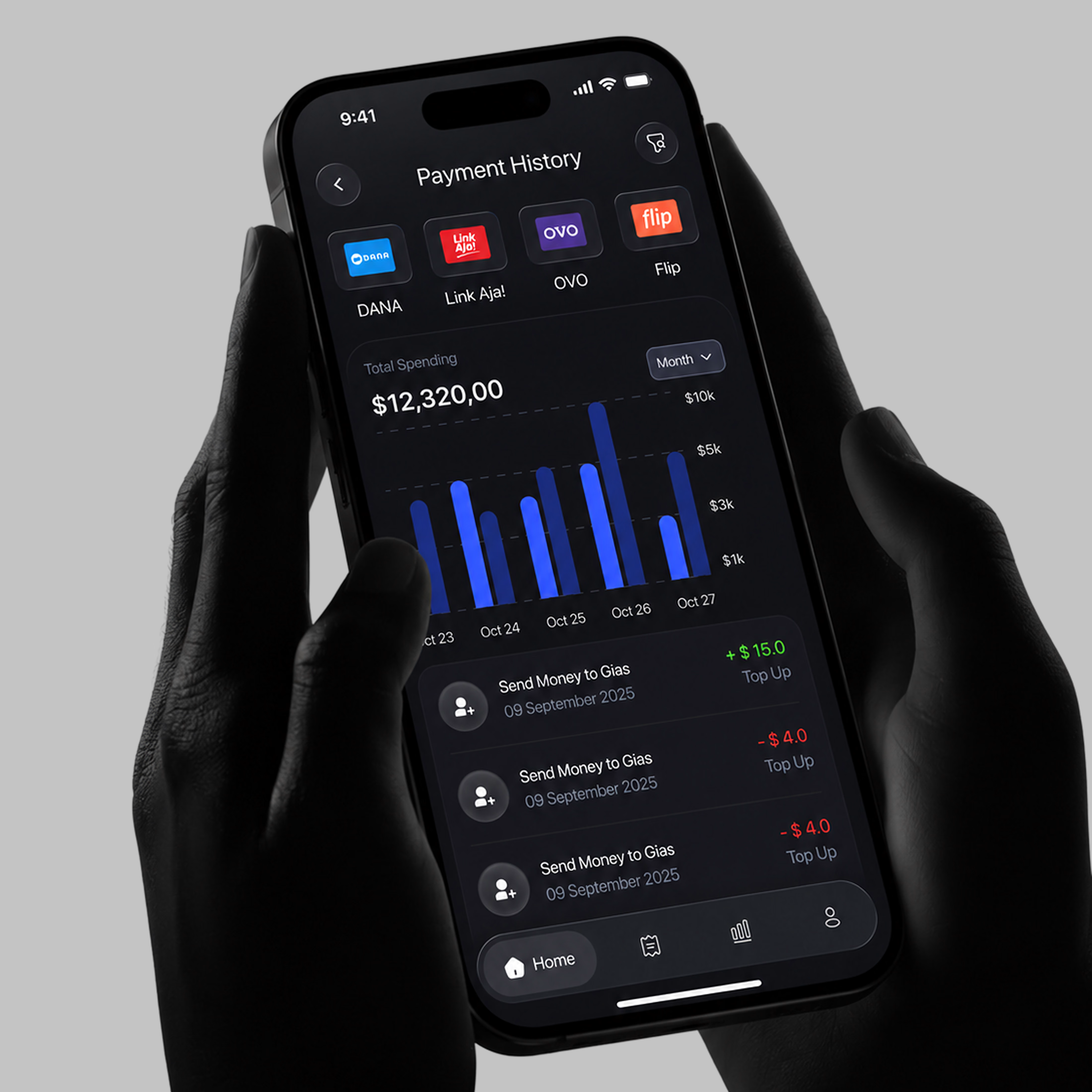

A little sneak peek at what I’ve been working on!

I wanted to test whether Invideo Editor’s AI timeline agent could replace hours of manual node compositing in After Effects to create a cinema-grade VFX shot from raw mobile footage.
How I built it:
The Footage: Raw 4K 60fps night plate of NYC with neon signs, streetlamps, and a wet puddle reflection.
Agent Direction: Using a prism refraction photo as a reference, I directed the agent in Ultra Mode to author a single custom shader that extracts luminance highlights, stretches them into 55° upward trails, and applies a spectral RGB dispersion gradient across the edges. It also layered a Screen composite and generated a procedural cyberpunk HUD tracking overlay.
Human Refinements: I manually used the exposed Inspector sliders to fine-tune the Highlight Threshold to 0.68 (isolating the Radio City marquee, streetlamps, and puddle reflection while eliminating building clutter) and dialed the Trail Length to 140 with an exponential falloff taper.
Editable Project Timeline:
👉 https://invideo.io/share/Chromatic-Stretch-GWJjyPAWPDb
Instagram Reel:
👉 https://www.instagram.com/p/DeB3NrJSbvd/
invideo Editor is free to try.
#invideocontrachallenge #invideoeditor #vfx #cinematography #aiagent


Dammn clean and perfect