The network for creativity
Join 1.25M professional creatives like you
Connect with clients, get discovered, and run your business 100% commission-free
Creatives on Contra have earned over $150M and we are just getting started
Back to feedPost
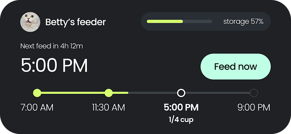
Interactive Smart Feeder Widget🐾
Fun fact: Despite all the interfaces I've built, somehow I’ve never designed a mobile widget before today. I put together this quick smart home concept to see how clean and functional I could make a hardware-linked micro-dashboard.
The layout bridges the gap between heavy IoT data and effortless user control right from the home screen.
The Details:
Linear Timeline: A sleek daily tracking bar that visually distinguishes completed feeds from upcoming ones (like the 5:00 PM 1/4 cup drop).
Quick Actions: A high-contrast "Feed now" button for instant, low-friction utility.
Hardware Status: A streamlined horizontal progress bar for real-time food storage tracking.
Let me know how you think it turned out for a first try! Would you go with a small or medium layout for this? 💬


Here's a picture for a closer look!
The network for creativity
Join 1.25M professional creatives like you
Connect with clients, get discovered, and run your business 100% commission-free
Creatives on Contra have earned over $150M and we are just getting started






Related posts



The purple gradients keep learning lively and fun.


would you let people record a little voice intro before each track?


Great job! Looks very clean 😮💨