The network for creativity
Join 1.25M professional creatives like you
Connect with clients, get discovered, and run your business 100% commission-free
Creatives on Contra have earned over $150M and we are just getting started
Back to feedPost

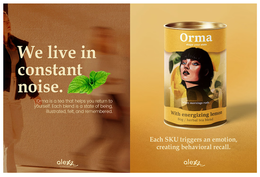
We live in constant noise. Orma is the antidote - a return to yourself.
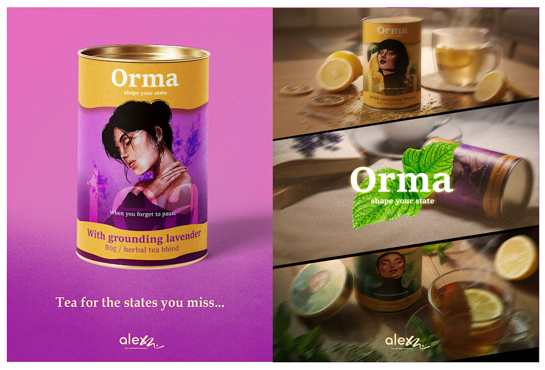
The premium tea category is saturated with minimalism - white boxes, delicate leaves, and predictable serif fonts. While elegant, this "sea of sameness" creates a visual blur for the consumer. The Brief: Create a visual identity for Orma that actively competes for attention. The goal was to shift the focus from ingredients (what is inside) to outcome (how you feel).
Orma is a visual interruption.
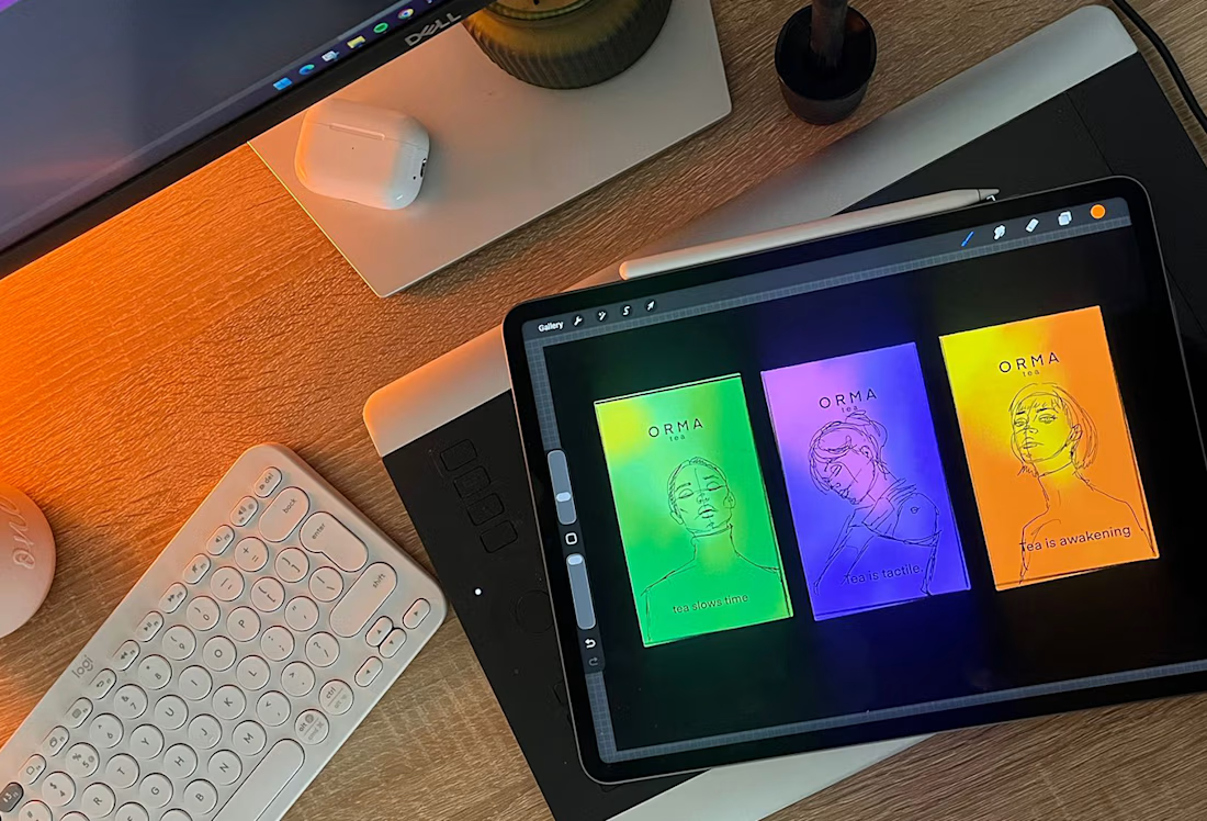
The design system turns the physical package into a behavioral cue, ensuring that the product is seen, felt, and remembered.



Loved the colors. The packaging design is perfect.
The network for creativity
Join 1.25M professional creatives like you
Connect with clients, get discovered, and run your business 100% commission-free
Creatives on Contra have earned over $150M and we are just getting started





