The network for creativity
Join 1.25M professional creatives like you
Connect with clients, get discovered, and run your business 100% commission-free
Creatives on Contra have earned over $150M and we are just getting started
Back to feedPost
Taste Test

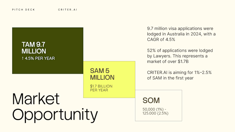
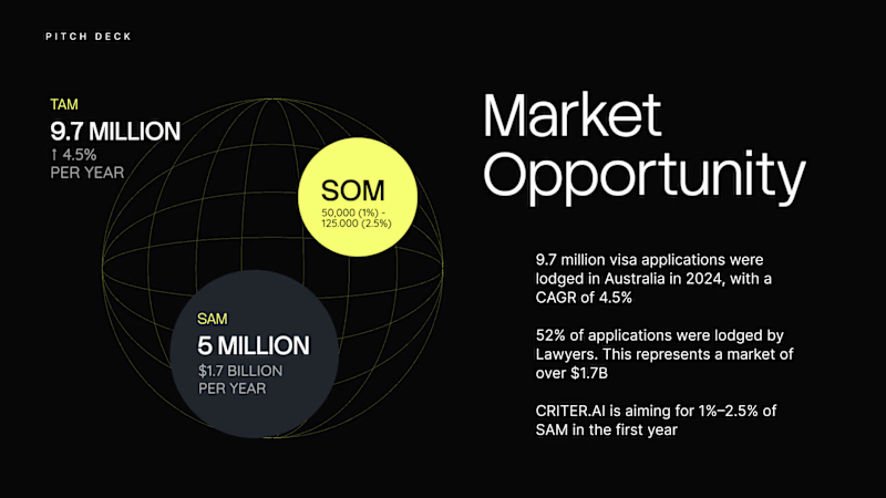
Two directions of showing Market Opportunities
Which one looks better?
5 votes
Ends in 1d

First one wins for me - the staggered layout makes the TAM > SAM > SOM flow instantly clear. Love the negative space and that lime accent against dark green. Pitch perfect!
Thanks Sagar. Well identified.
The network for creativity
Join 1.25M professional creatives like you
Connect with clients, get discovered, and run your business 100% commission-free
Creatives on Contra have earned over $150M and we are just getting started





Related posts

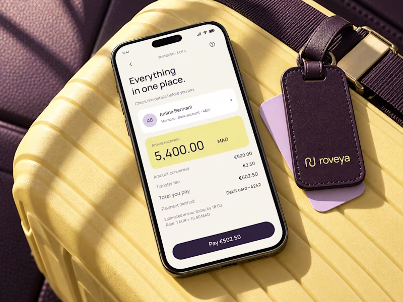
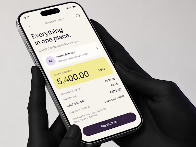
We're currently working on this animation for a mobile app. We're debating whether to use fall colors, like seasonal ones or stick with the app's current color scheme.
Community, which color scheme would you vote for?

8 voted
38%
13 voted
62%
21 votes
Closed

Option 2 was stunning🔥🔥🔥🔥



I voted for option V1


Which one you like more? Some Cavalry fun. :)
6 voted
55%
5 voted
45%
11 votes
Closed
Both look fun! 😍 Love how a little experimentation can lead to such creative results. Great work! 👏