The network for creativity
Join 1.25M professional creatives like you
Connect with clients, get discovered, and run your business 100% commission-free
Creatives on Contra have earned over $150M and we are just getting started
Back to feedPost

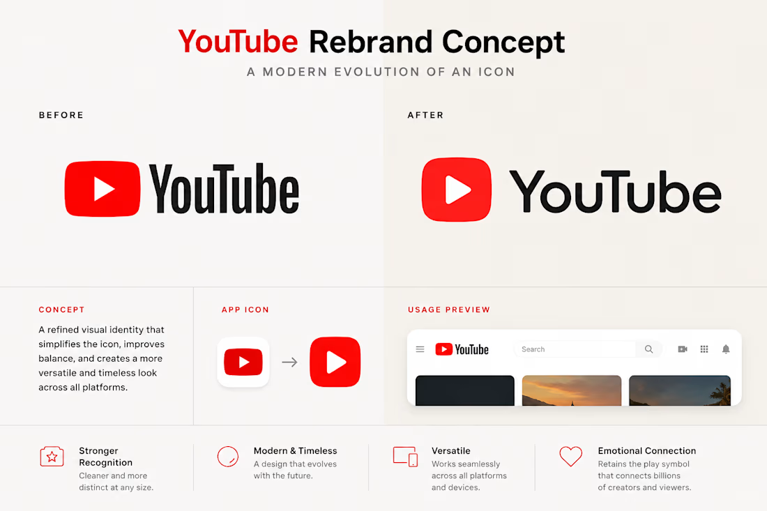
YouTube has one of the most recognizable logos on the internet.
So the challenge isn't to make it different.
It's to make it feel more refined without losing the recognition billions of people already have with it.
This concept explores a softer icon, cleaner proportions, and a more balanced wordmark while keeping the play symbol at the center of the identity.
The goal wasn't to reinvent YouTube.
It was to ask a simple question:
How much can a world-famous brand evolve before it stops feeling familiar?
I'd love to know what you think.
Would you keep the current identity, or move toward something like this?
The network for creativity
Join 1.25M professional creatives like you
Connect with clients, get discovered, and run your business 100% commission-free
Creatives on Contra have earned over $150M and we are just getting started

Challenges
View all


Related posts


A look at the identity we designed for Vetti, a dog health monitoring brand.
There’s a lot of data behind a product like this but the person using it just wants to know their dog is okay.
That’s the balance in the design with a connected dot system that feels precise and warm colors and photography that keep it close to what people care about.
Also, an excellent excuse to spend far too long choosing dog photos.


Wonder -- Visual Expressions


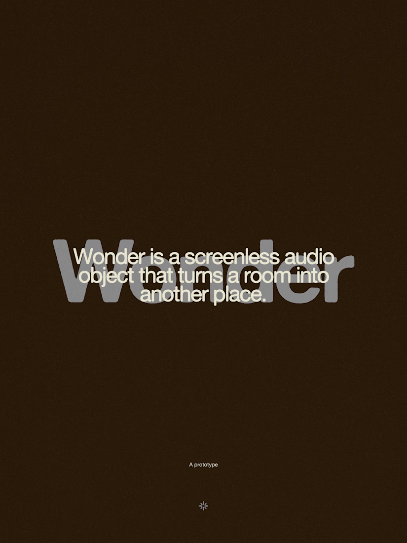




The restraint in the warm palette really lets the sound-object concept breathe—especially that shift from readable type to atmosphere.

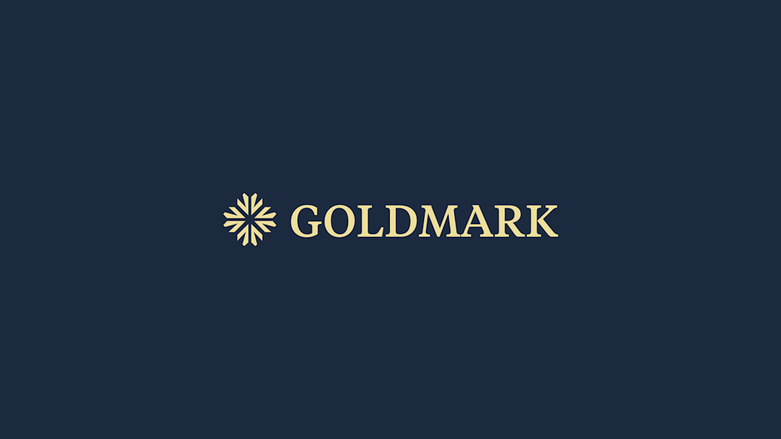
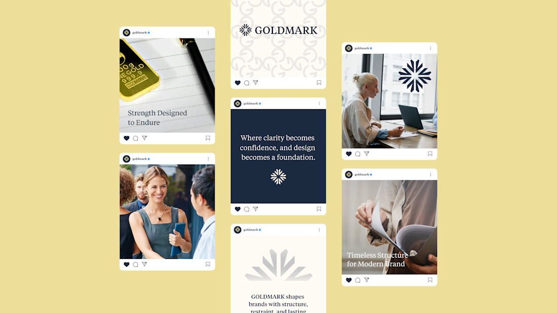
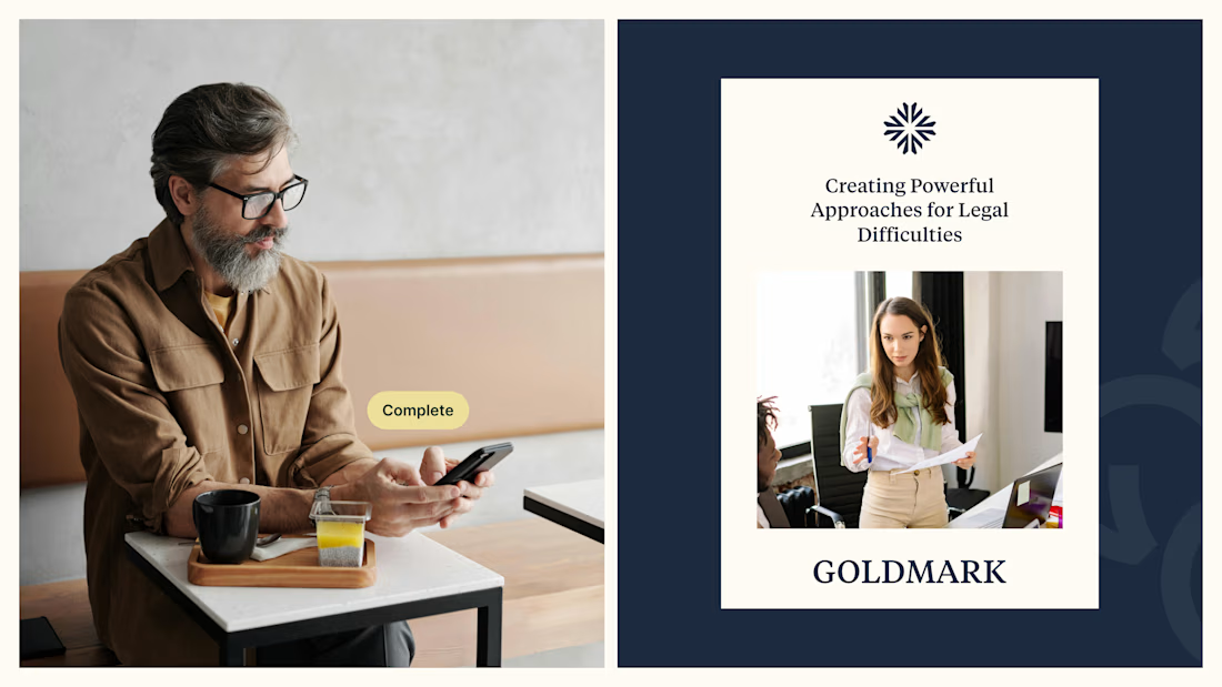
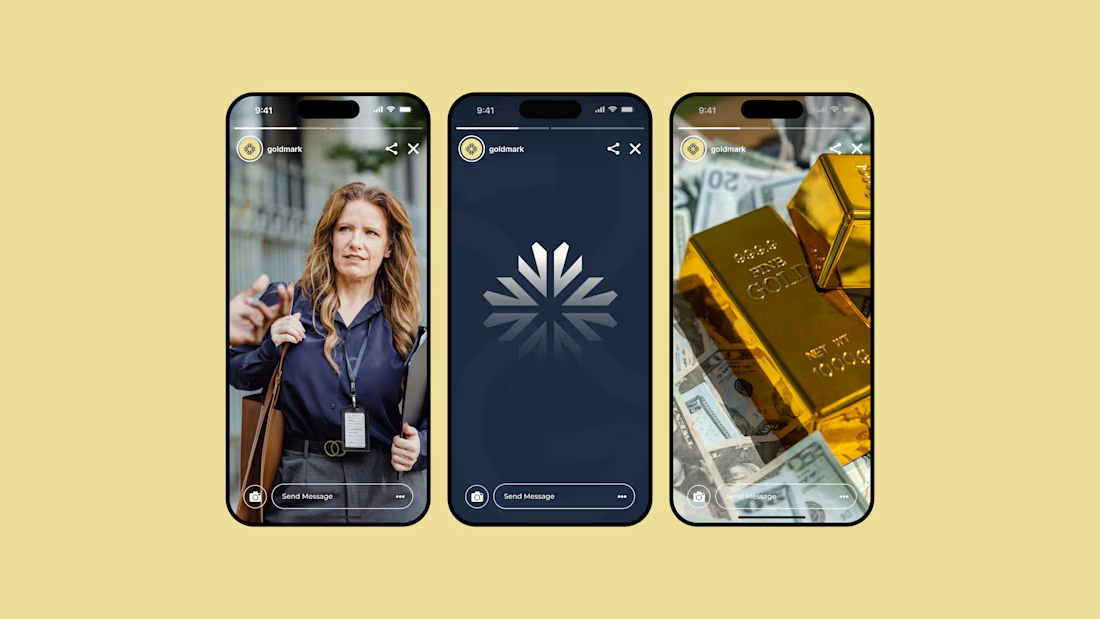
GOLDMARK - A refined identity for modern legal expertise. ✦
A complete branding exploration focused on building a visual language that feels premium, trustworthy, timeless, and confident.
The identity combines a distinctive symbol, elegant typography, and a deep navy + warm gold palette to create a sophisticated presence across digital and print applications.
Services: Brand Identity • Logo Design • Art Direction • Visual System
#BrandIdentity #BrandDesign #LogoDesign #VisualIdentity #Branding #GraphicDesign #ContraPortfolio