The network for creativity
Join 1.25M professional creatives like you
Connect with clients, get discovered, and run your business 100% commission-free
Creatives on Contra have earned over $150M and we are just getting started
Back to feedPost

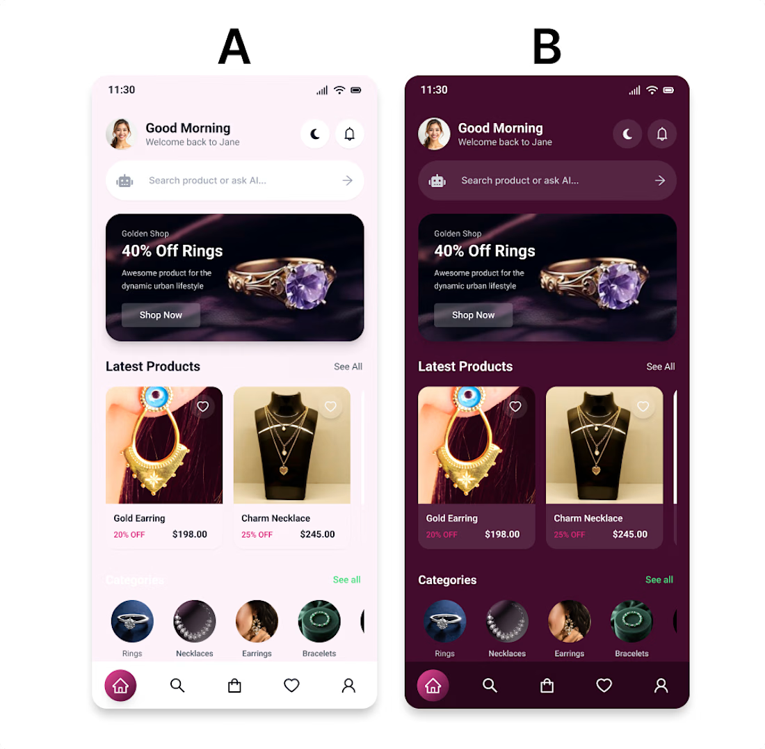
If you were shopping 🛍️for jewelry, which would you choose ?
A — Light Mode 🤍
B — Dark Mode 🖤
And more importantly—why? 👇
Light Mode or Dark Mode — which one would you choose? 👀
I explored two visual directions for the same jewelry e-commerce mobile app to see how color and contrast can change the overall shopping experience.
🤍 Light Mode
→ Soft, elegant & minimal
→ Feels clean and premium
→ Easy to browse products
🖤 Dark Mode
→ Bold & luxurious
→ Creates a more immersive experience
→ Makes jewelry imagery and highlights stand out
The goal wasn't just to make the interface look beautiful.
It was about creating a premium shopping experience while keeping usability, readability, product visibility, and visual hierarchy in mind.

The network for creativity
Join 1.25M professional creatives like you
Connect with clients, get discovered, and run your business 100% commission-free
Creatives on Contra have earned over $150M and we are just getting started











Related posts

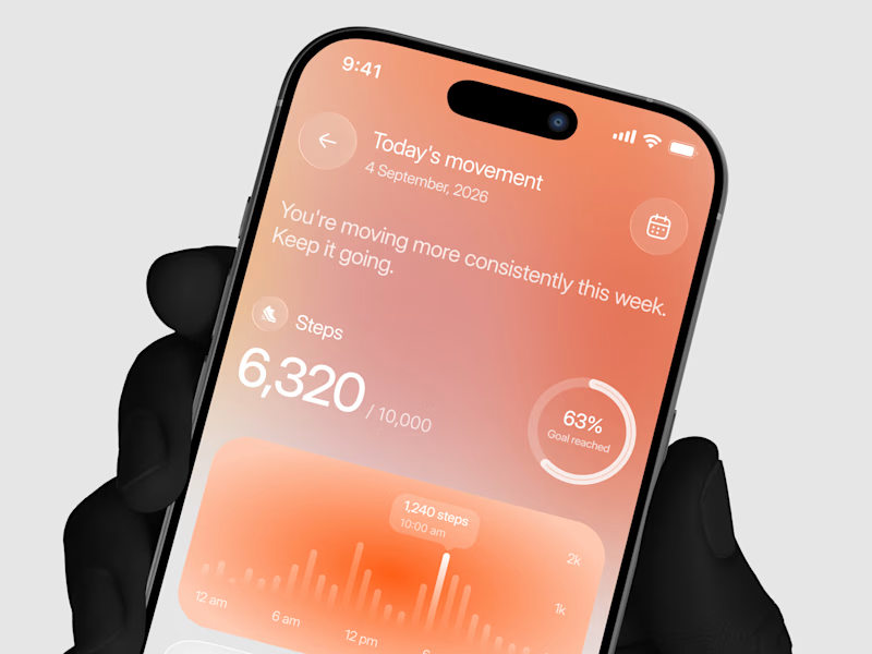
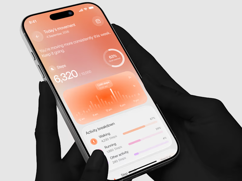
Designed a step tracking screen where you can see your daily progress and weekly trend in one glance.
Same screen, two shots. Which one would stop your scroll? 👀

11 voted
73%
4 voted
27%
15 votes
Closed

Exploring a clean, modern SaaS dashboard UI. Focused on simple layouts, smooth interactions, and a better user experience 🚀


i had to like this, it got my attention, very nice build mate.

AI Automation SaaS Website Design
AUTONIX is a modern AI automation SaaS website concept designed to help businesses streamline workflows, automate repetitive tasks, and manage AI agents more efficiently.
The design combines a clean, minimal interface with bold typography, futuristic visuals, interactive UI elements, and a seamless user experience. From AI-powered task automation to real-time productivity insights, every section is designed to communicate the value of intelligent automation in a clear and engaging way.
This project explores how thoughtful UI/UX design can make complex AI technology feel intuitive, accessible, and easy to use for modern businesses.
Services: SaaS Website Design, UI/UX Design, Landing Page Design, AI Product Design.