The network for creativity
Join 1.25M professional creatives like you
Connect with clients, get discovered, and run your business 100% commission-free
Creatives on Contra have earned over $150M and we are just getting started
Back to feedPost

Most websites don’t fail because of bad design. They fail because nobody checks how they look to machines.
We obsess over the human experience but forget that Google and AI crawlers see something completely different. Lately I’ve been asking myself: how do I actually look at my site the way a machine does?
Here are the tools I keep coming back to:
Google Lighthouse. Performance, SEO, accessibility. The basics, but still underrated.
HeadingsMap extension. Instantly shows your heading structure. A lot of beautiful sites are a semantic mess.
Ahrefs Site Audit. Practical for catching structural issues at scale.
Screaming Frog. Brutally honest about what your site is leaking in terms of crawlability.
Cloudflare Observatory and AI readiness tools. Good for understanding how machine-readable your site really is beyond classic SEO.
Most developers still optimize for ranking. But we are moving into a world where AI agents read, summarize and recommend sites directly. The question is not just about ranking, it is about whether your site can be understood without a browser. Not design, not branding. Just structure and clarity.
What tools are you using right now? What am I missing?

The network for creativity
Join 1.25M professional creatives like you
Connect with clients, get discovered, and run your business 100% commission-free
Creatives on Contra have earned over $150M and we are just getting started



Related posts

Your website is slow — and it's costing you customers before they even see your offer.
Google's own data says 53% of mobile visitors leave if a page takes more than 3 seconds to load. Portent found sites loading in 0–2 seconds convert far better than anything slower, and Akamai's research puts a 1-second delay at roughly 7% fewer conversions. For a small business website, that's not a technical detail — that's lost enquiries every single week.
The good news: most slow sites aren't slow because of hosting. They're slow because of five fixable things.
1. Images that were never resized. A 4MB photo uploaded straight from a camera becomes the whole page weight. Resize to the display size, compress it, and serve WebP — this alone often cuts load time in half.
2. Too many plugins doing the same job. I've opened WordPress sites running 40+ plugins — three slider plugins, two form plugins, four SEO tools. Audit ruthlessly: if a plugin isn't earning its place, remove it. One tool per job.
3. No caching or CDN. Without page caching, every visitor makes your server rebuild the page from scratch. A free Cloudflare setup plus a caching plugin is a 20-minute job that changes everything.
4. Fonts loading like it's 2015. Five font weights from Google Fonts, render-blocking. Use two weights max, font-display: swap, and host locally where you can.
5. JavaScript blocking the page. Chat widgets, tracking scripts, popups — all loading before your content. Defer what's below the fold and load scripts after the page renders.
Check your site against Google's Core Web Vitals: LCP under 2.5 seconds, interaction under 200ms, layout shift under 0.1. If LCP is over 4 seconds, start with images — that's the culprit in most sites I audit.
We've rebuilt and optimised 300+ WordPress and Shopify sites for small businesses in the UK, US and UAE, and the pattern is always the same: the slow sites aren't the cheap-hosting ones, they're the ones nobody ever audited.
Which of these five is slowing your site down right now? Drop a comment — or message me and I'll take a quick look.


Slow websites silently lose leads, so start with a technical SEO audit to identify speed bottlenecks, broken resources, and performance issues before they hurt conversions. Tools like SerpSpur can help uncover website issues and prioritize fixes before visitors leave.
Building an SEO SaaS? You might not need another expensive keyword API subscription.
A question for indie hackers and developers:
How do you currently access keyword data for your applications?
If you're building programmatic SEO pages, content research automation, keyword discovery tools, or an AI-powered marketing product, you probably need structured search data.
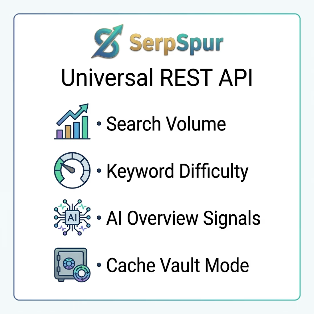
We developed the SerpSpur Universal REST API to make this workflow more flexible.
The API provides access to:
Search volume and historical trends.
Keyword difficulty and backlink competition.
CPC and advertising competition.
Search intent and parent topics.
Related keyword clusters.
SERP features and forum weakness signals.
AI Overview-related information.
Bulk keyword enrichment.
It also supports different research depths, from a single keyword to larger semantic clusters.
One feature worth exploring is the 30-day cache Vault mode: cached lookups cost credits, while cache misses return without a credit deduction.



Great work! I appreciate how clearly the design prioritizes usability without compromising its visual appeal.


Which homepage would make you more likely to explore the platform?
HackStack features bold typography, teal gradients, and a centered layout focused on AI tools and automation. DataVistaHQ uses purple accents, a split layout, and a prominent dashboard preview to introduce its business intelligence platform.
I would like your perspective on the visual design, clarity, and first impression. Which approach communicates its value more effectively and makes you want to take the next step?
Vote for your preferred design and share what influenced your choice: the colors, headline, layout, dashboard preview, or overall presentation.
#WebDesign #AIWebsites #UIUXDesign #SaaSDesign #TransformedDesign


2 voted
17%

10 voted
83%

12 votes
Closed

Visually, I lean toward DataVistaHQ, but the cognitive load is really high. The value proposition and the stats feel like they're competing for attention.
On the other hand, HackStack has a much better visual hierarchy. The value proposition and CTA group immediately give me a...