The network for creativity
Join 1.25M professional creatives like you
Connect with clients, get discovered, and run your business 100% commission-free
Creatives on Contra have earned over $150M and we are just getting started
Back to feedPost

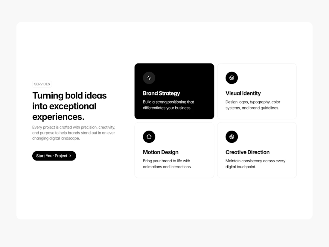
A minimal service section designed to help you showcase what you do without the clutter.
The network for creativity
Join 1.25M professional creatives like you
Connect with clients, get discovered, and run your business 100% commission-free
Creatives on Contra have earned over $150M and we are just getting started










Related posts


Are you struggling to highlight your expertise on your website?
Are your visitors leaving even before they reach the service section?
Introducing Luven, our new Framer template.
Built for architectural and interior lighting studios.
With editorial layouts, immersive imagery, bold typography, and subtle motion.
It makes for a premium website to guide visitors towards consultation enquiries.
• Conversion-focused homepage.
• Focusing on selected work, process, testimonials, and an FAQ section.
• Project case details with location, area, and visuals.
• Responsive layouts, enquiry forms, newsletter signup, and CTA.
Check the comment for the link.


Quick ux tip for features nobody uses
Cut a step before you add one. Look for the approval step only one role needs, or the field nobody fills in.
Remove it, then build only what's still missing.


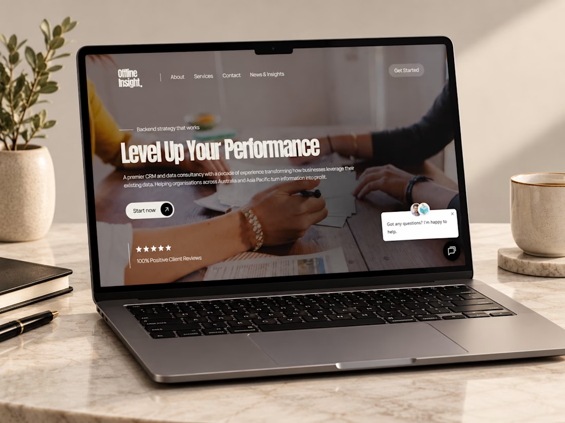
Just wrapped up this Webflow website project for Offline Insight, a CRM and data consultancy helping businesses simplify disconnected systems and make better use of their customer data.
For this one, I focused on making a technical service feel clear and approachable, cleaner messaging, stronger service structure, responsive layouts, and a smoother path from understanding the problem to booking a consultation.
I really like how the final experience balances technology, strategy, and simplicity.
Curious to hear your thoughts, does the website make a complex service feel easy to understand?
#Webflow #WebDesign #UIDesign #UXDesign #WebDevelopment #B2BWebsite #SaaSDesign #CRM #ResponsiveDesign #PortfolioProject #Contra

Ye le Jani Victor wali post ke liye copy-ready:
This looks genuinely polished, Victor! Making a CRM & data consultancy feel clear and approachable is not easy but you nailed it. Offline Insight website looks super clean and professional in Webflow + Figma. "Level Up Your Performance" hero is strong!