The network for creativity
Join 1.25M professional creatives like you
Connect with clients, get discovered, and run your business 100% commission-free
Creatives on Contra have earned over $150M and we are just getting started
Back to feedPost


The network for creativity
Join 1.25M professional creatives like you
Connect with clients, get discovered, and run your business 100% commission-free
Creatives on Contra have earned over $150M and we are just getting started







Related posts

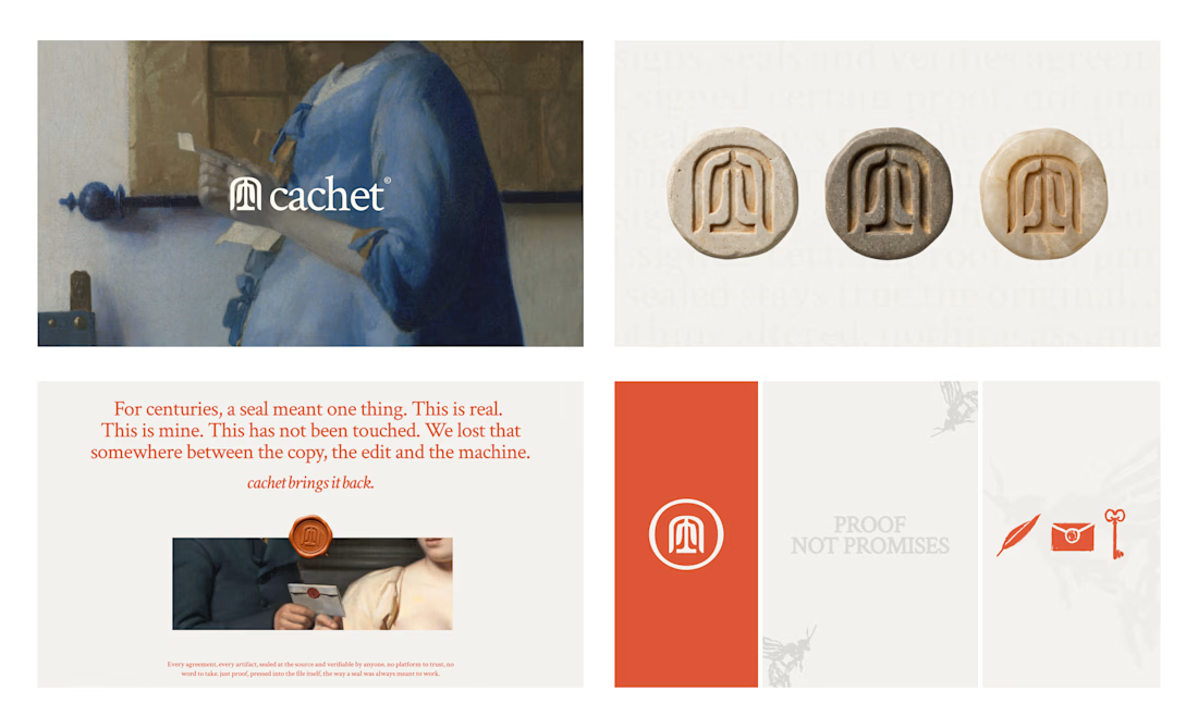
Cachet brand exploration.
Exploring patterns, textures, materials and hand-drawn illustrations

That's interesting I like it that's really unique ❤️❤️🎉🎉

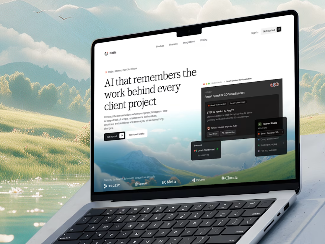
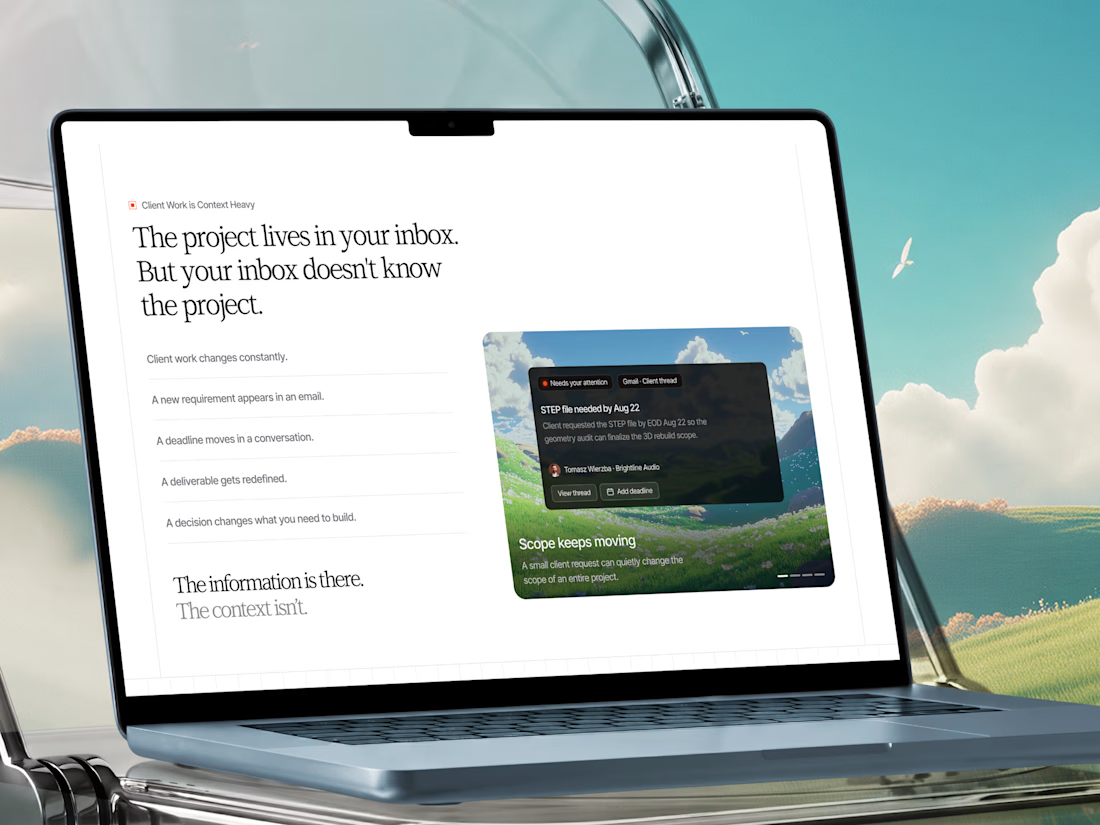
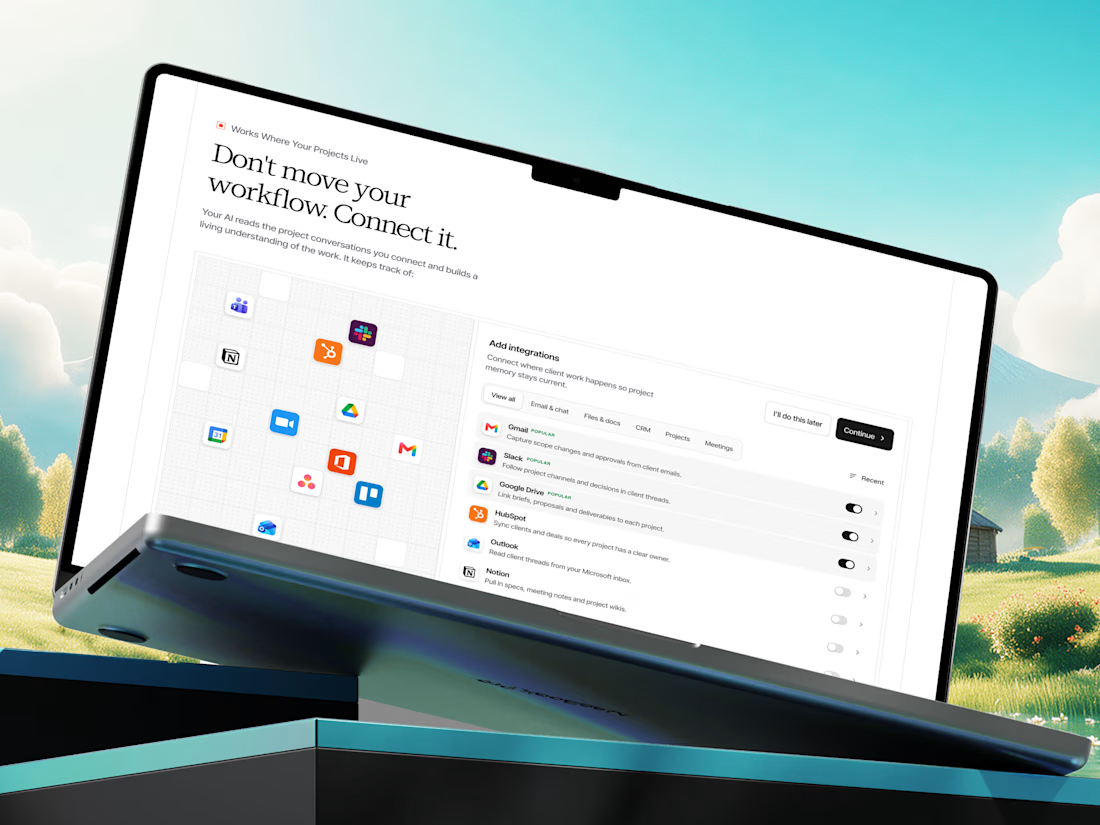
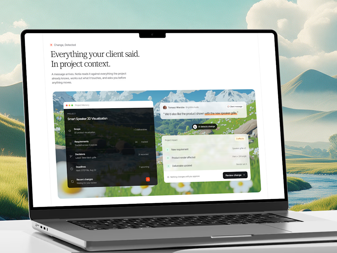
A few shots from our recent web design project for an AI Project Memory Platform.
Check it out
This project is a website and product experience for an AI-powered project memory platform built for freelancers, agencies, consultants, and client-service teams.
That's interesting project great job Fawaz🎉

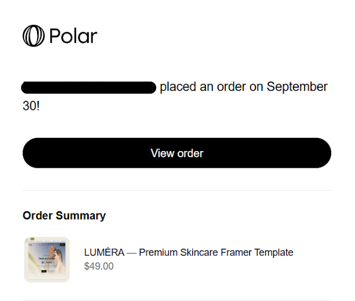
🎉 My first Framer template sale! 🥹
Luméra just got its first sale! One down, many more to go.
If you’re building a skincare or beauty brand,
check out Luméra and grab your copy. https://dub.sh/zdo4Fb7



first template sale on lumera, congrats. how long did the whole build take