The network for creativity
Join 1.25M professional creatives like you
Connect with clients, get discovered, and run your business 100% commission-free
Creatives on Contra have earned over $150M and we are just getting started
Back to feedPost

Wanted to build something that tries to push us past our traditional interaction patterns.
We are not the same, nor am I the same during the day, so why does software need to be the same for all of us.
Built a notes app with that actually adapts to you: reshapes based on how you're writing, feeling, and even where your eyes are looking
Sharing a small demo of one of the "hands-free" features of liminal notes
Try it out 👉 https://prompt-brain-78567713.figma.site
The network for creativity
Join 1.25M professional creatives like you
Connect with clients, get discovered, and run your business 100% commission-free
Creatives on Contra have earned over $150M and we are just getting started








Related posts

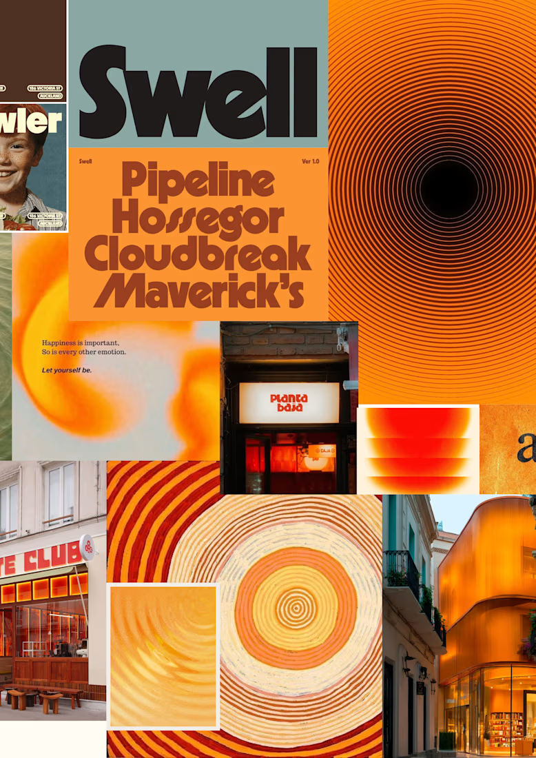
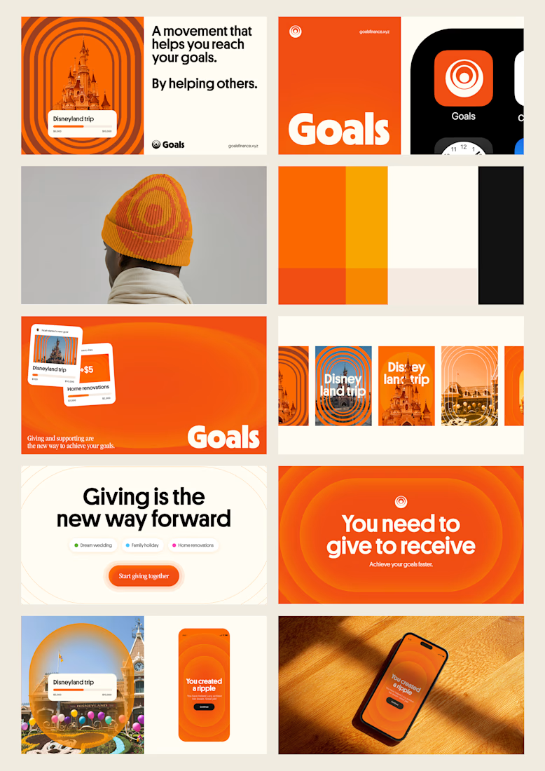
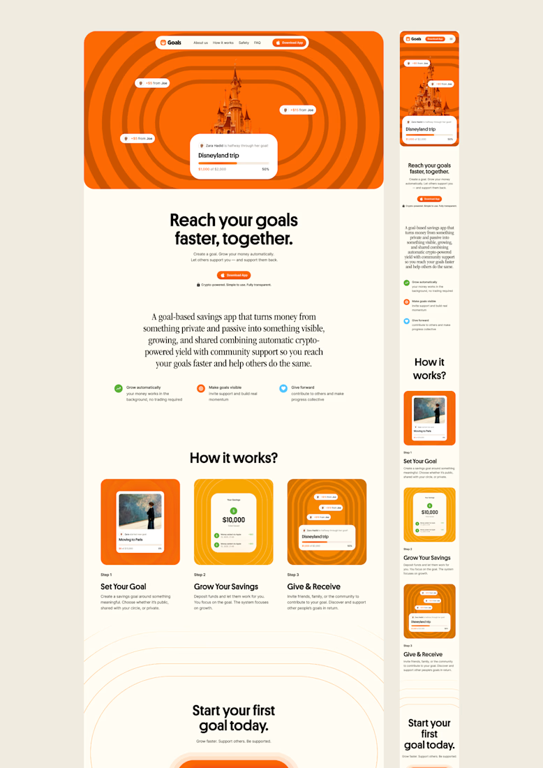
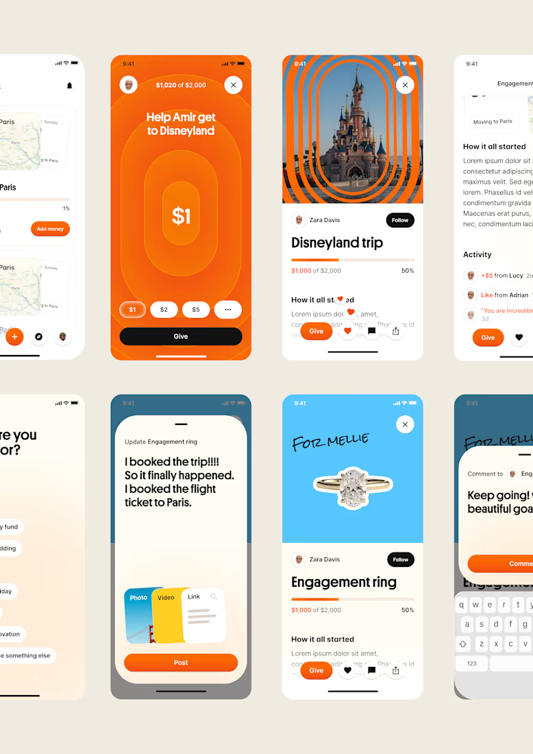
one of my favourite things about running a one-person studio is that nothing gets lost in translation.
the idea behind the brand is the same idea that shapes the website and the product.
no handovers, no starting from scratch, no trying to explain the vision to someone new.
a little look at how that came together for goals, from the first moodboard to the app ↓

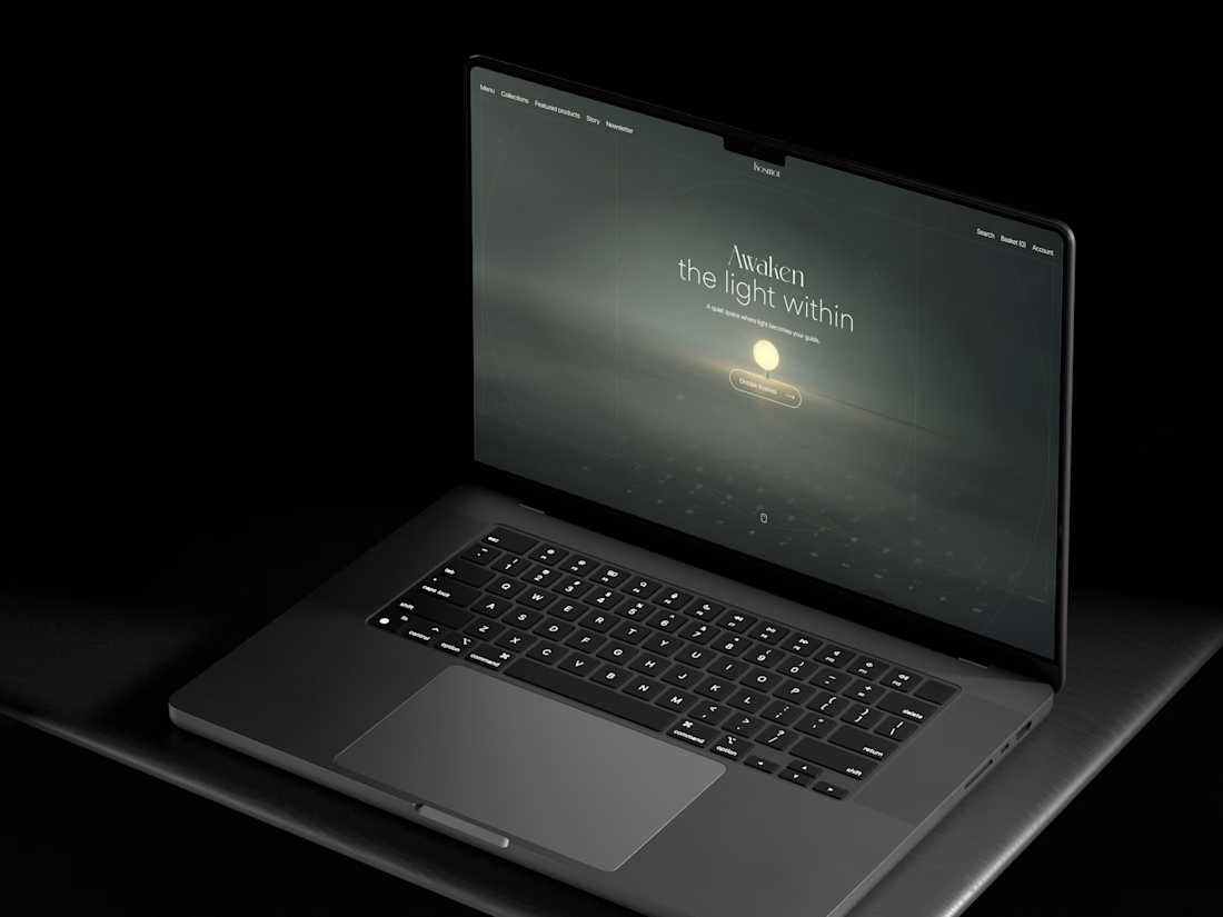
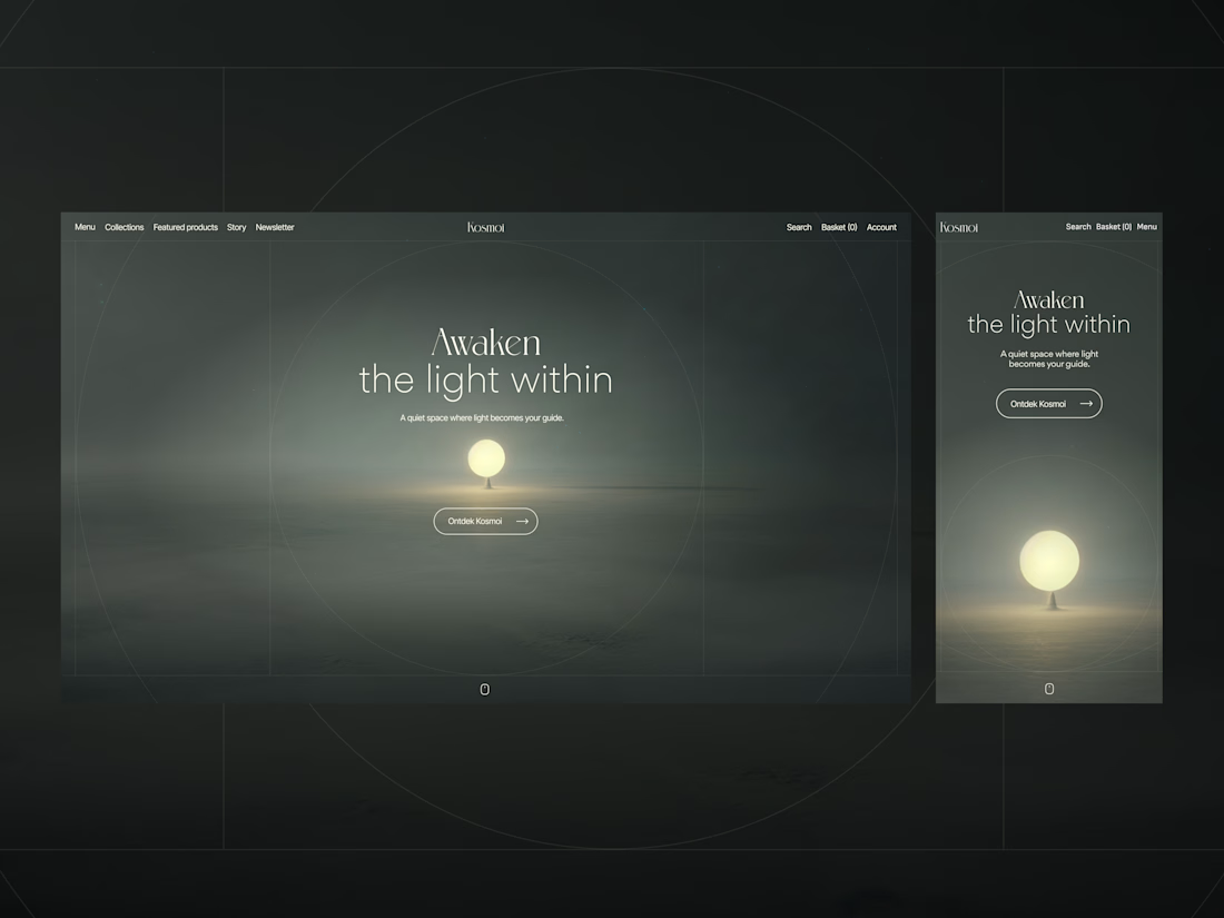
Not every hero section needs a lot of copy.
For this project, the client wanted a more unconventional e-commerce feel for a brand focused on meditation materials, so I let the visuals do most of the talking.
Sometimes less really does more, what do you think? 🤔


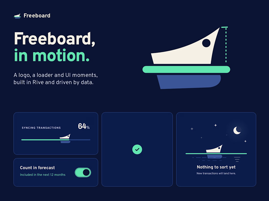
I'm bringing motion into Freeboard, and I'd love your eyes on it.
Freeboard is my finance app for people with irregular income. Its month map is made of water lines: income flows into a lake, spending flows out. Now the water moves. Glints drift downstream, uncertain income falls in drops, and the lake fills when the month arrives.
Small moments speak the same language: a switch that fills with water, a button that draws its check, a logo whose bow rides higher when your buffer grows. With reduced motion on, everything holds still.
Two questions:
1. Does the moving water help you read the map, or does it distract?
2. Which micro-interaction feels right, and which one is too much?
Built in Rive and CSS. Try the pieces live: freeboard.money/rive/water-lines/ and freeboard.money/rive/motion/


Great concept.