The network for creativity
Join 1.25M professional creatives like you
Connect with clients, get discovered, and run your business 100% commission-free
Creatives on Contra have earned over $150M and we are just getting started
Back to feedPost
I reached 64.3K Subscribers on YouTube! 🎉
Check out my YouTube


Thank You ❤️
The network for creativity
Join 1.25M professional creatives like you
Connect with clients, get discovered, and run your business 100% commission-free
Creatives on Contra have earned over $150M and we are just getting started











Related posts


Congrates!!

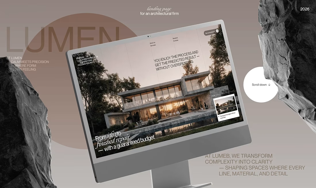
Lumen — UX/UI Design for a Premium Architecture Studio
Sometimes, the smallest details are what give a design its personality.
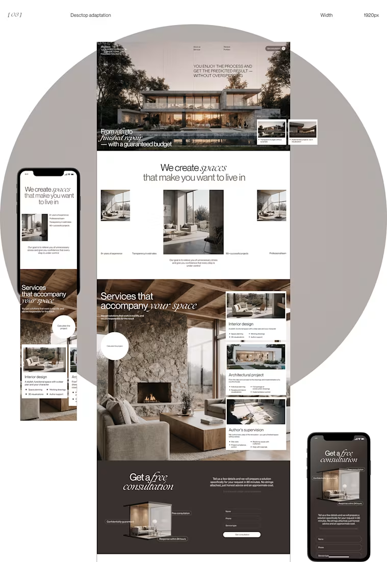
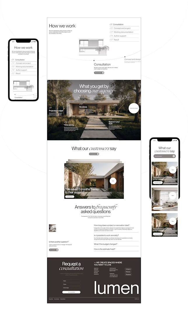
For Lumen, I found myself exploring how typography, architectural photography, colour, and layout could work together to tell a story before someone even starts reading.
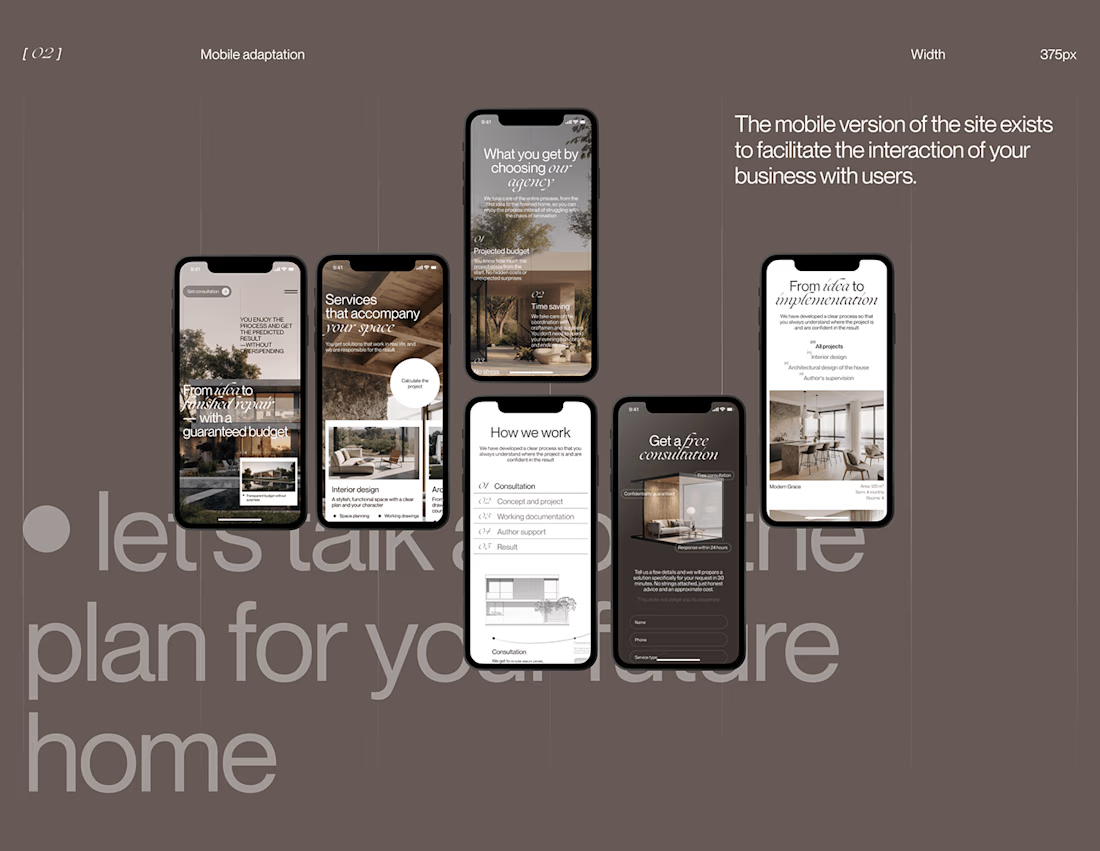
I played with oversized text, warm brown tones, editorial layouts, and a mobile experience that carries the same visual character as the desktop design.
I especially enjoyed putting the mobile screens together. Seeing the different sections come to life on a smaller screen made the whole concept feel more complete.
It's always interesting to see how different creative decisions can change the way people experience a brand.
What's one design detail that can make you appreciate a website even before you've explored everything?
#WebDesign #CreativeDesign #UIUXDesign #Architecture


i love this soooo wellllll, i just said welll with 4 l's thats how good this is

If everything on your website looks important, nothing feels important.
Most sites don't need more sections, more buttons or more colour.
They need fewer things competing for attention.
→ One clear CTA, not four
→ Real hierarchy, not bold everywhere
→ Whitespace, not filler
→ A strong heading, not a wall of text
→ Your boldest colour saved for the action that matters
Good design isn't about adding more.
It's about deciding what deserves attention.
Save this for your next project.
#WebDesign #UXDesign #UIDesign #DesignTips


Clear hierarchy turns attention into direction.