The network for creativity
Join 1.25M professional creatives like you
Connect with clients, get discovered, and run your business 100% commission-free
Creatives on Contra have earned over $150M and we are just getting started
Back to feedPost

A simple idea for devs.
Integrate a real-time theme selector directly into your project.
Not in settings. Not after reloads.
Instant updates in the UI as you change it.
Colors, spacing, layout — all live.
Why it’s useful:
• faster UI iteration
• better design experimentation
• clear separation of design tokens
• immediate visual feedback while building
Think: global theme state + CSS variables + live preview.
Prompts to explore it:
– “Design an interactive customization experience where users can experiment with color themes and layout variations while seeing immediate visual feedback.”
– “Build a layout switcher that changes structure in real time without reload.”
Small pattern. Big impact on workflow.


The network for creativity
Join 1.25M professional creatives like you
Connect with clients, get discovered, and run your business 100% commission-free
Creatives on Contra have earned over $150M and we are just getting started










Related posts

Poster Club turns a simple event template into your own print. I built two working Flutter versions and recorded the same editing flow in each.
Print Room: calm, editorial, with a mounted canvas and bottom tools.
Cutout Playground: bold, playful, with loose prints and tools at the edge.
Which one would you rather use?
What made the difference?
Grab it for free:
https://contra.com/products/cUHBysMu-poster-club-free-flutter-ab-ui-kit


37 voted
60%
25 voted
40%
62 votes
Closed

Print Room looks great!!


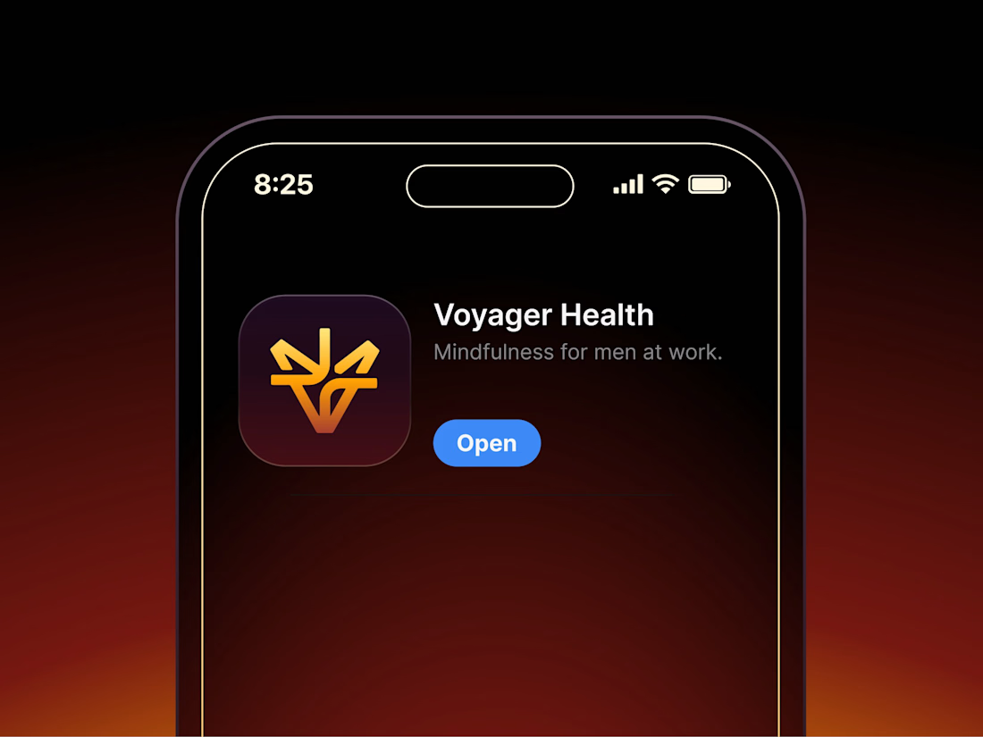

Aryna, that golden symbol pops so nicely against the plum background ✨

Santa Monica Tile & Stone E-Commerce Design, 2025.
Buying tile online is mostly guesswork, so I designed a concept store where every page answers one buyer question. Shoppable rooms show how it looks, a coverage calculator tells you how much you need, and free samples let you see it first. Deep green, warm gold, and an AI tile scan that turns inspiration photos into products. Open for e-commerce and web design projects.
Full case study on my Contra Profile
TOP!!