The network for creativity
Join 1.25M professional creatives like you
Connect with clients, get discovered, and run your business 100% commission-free
Creatives on Contra have earned over $150M and we are just getting started
Back to feedPost

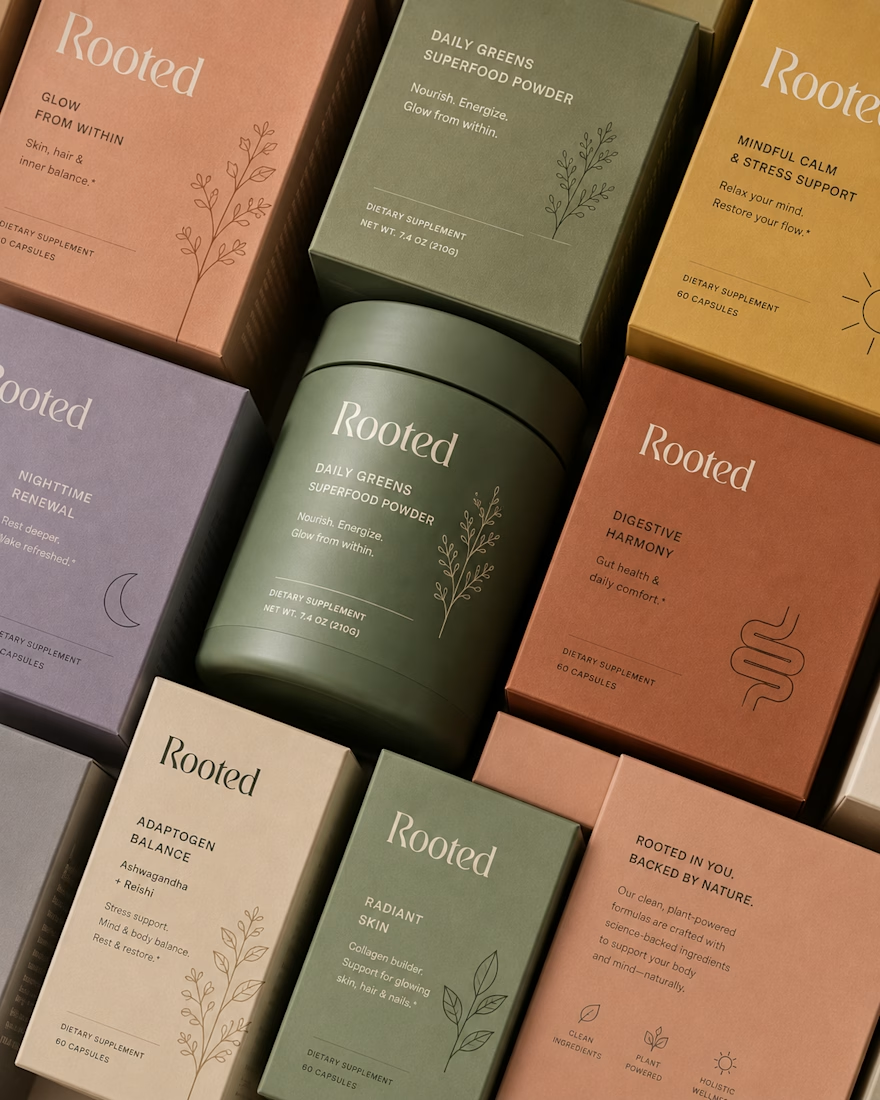
Completed a client's project, met Rooted, a premium wellness brand, backed by nature, built for women of all ages.


The network for creativity
Join 1.25M professional creatives like you
Connect with clients, get discovered, and run your business 100% commission-free
Creatives on Contra have earned over $150M and we are just getting started





Related posts

Fillerkosm Brand Identity
Fillerkosm is a brand identity project built at the intersection of science, beauty and precision.
The creative process started from the meaning behind the name itself: Fillerkosm combines the world of aesthetic medicine with kosmos, the Greek idea of order and harmony. From there, I explored visual references connected to chemistry, space and refined beauty, with the goal of creating an identity that could feel technical, authoritative and premium without becoming cold or overly clinical.
The logo was developed as a direct extension of this concept. Two elliptical forms move through the wordmark like planetary orbits, while the circular elements at their extremities also suggest a molecular structure. The result creates a deliberate duality between the scientific precision of aesthetic medicine and the broader idea of harmony, balance and universal beauty.
Rather than designing a logo in isolation, the objective was to build a coherent visual language capable of expressing reliability, innovation and elegance across every brand touchpoint.

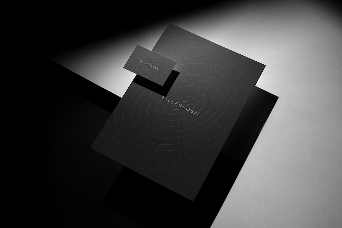
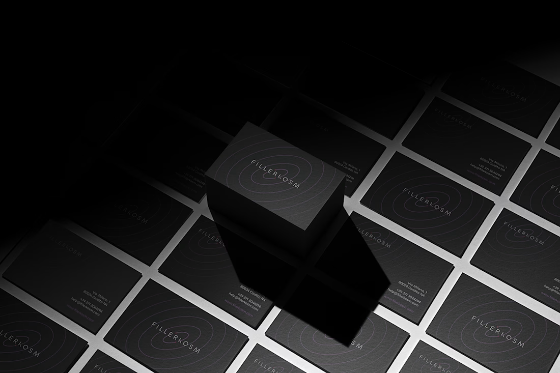
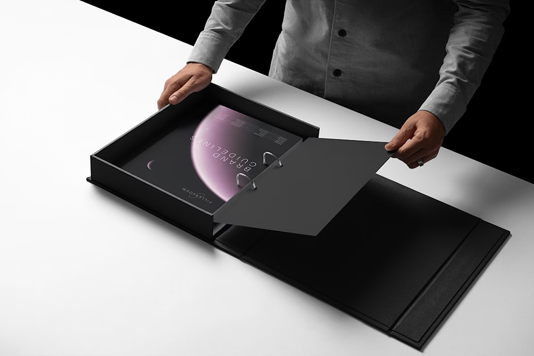

Monochrome with that one soft pink moment in the last shot. Really restrained.

Brewed where the tide comes in 🌊
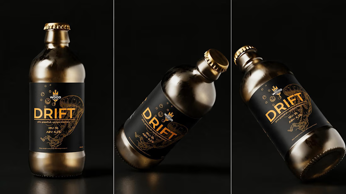
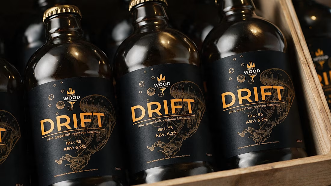
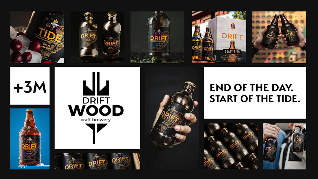
Spent the past week designing DRIFTWOOD — a coastal craft brewery brand built on one idea: a beach-town brand should come from the shore itself, not a folder of nautical clipart.
No anchors, no sailor stripes, no hand-lettered "est." typography. Just driftwood grain, salt, and tide lines — four beers told apart by color, not illustration, with a seasonal variant built right into the system. 🍺
Some brands borrow the coast. This one was built from it.



Nice work 🙌

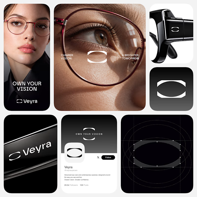
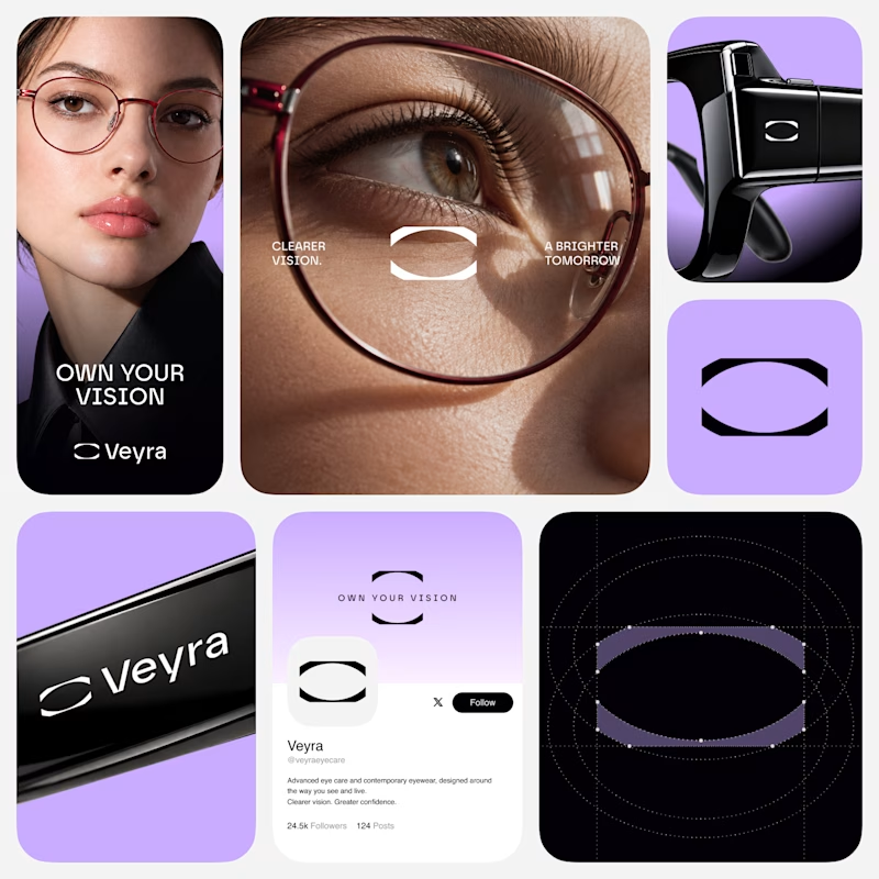
Which direction feels more Veyra?
Exploring two visual directions for Veyra - a contemporary eye care & eyewear brand.
01 - Monochrome
02 - Violet
Same identity. Different energy.
Which direction would you choose - 01 or 02?
6 voted
55%
5 voted
45%
11 votes
Closed