The network for creativity
Join 1.25M professional creatives like you
Connect with clients, get discovered, and run your business 100% commission-free
Creatives on Contra have earned over $150M and we are just getting started
Back to feedPost

PawsOnWheels: a booking and automation system for Patrick, a solo mobile dog groomer running one van across Minneapolis and St. Paul.
The problem: Patrick can't answer calls or texts mid-groom or behind the wheel, so new customers book elsewhere. Saturdays overflow while weekdays sit empty, winter weather brings last-minute cancellations, and bookings scattered across the Twin Cities waste hours on the road.
What I built turns "can I book with you?" into "you're booked" with zero effort from Patrick.
For pet parents: pick a service and dog size, enter a ZIP code, and see the days the van is already nearby. Every time slot includes travel and becomes a 45-minute arrival window. A $20 Stripe deposit confirms the booking instantly. Their dashboard shows upcoming visits, their dogs, and a loyalty punch card that applies itself.
For Patrick: each day is planned around one area of the city. One tap opens the whole route in Google Maps. He sees booked, collected, and owed at a glance, and when a groom is done, one tap texts the customer a card link.
The automation: Twilio sends confirmations, 24-hour and 2-hour reminders, and on-my-way alerts. Cancelled and unconfirmed slots are offered to the waitlist, and customer questions get AI-drafted replies with real open times.
How it's engineered: Lovable Cloud (Postgres, auth, edge functions), Stripe webhooks, Twilio messaging, the Lovable AI Gateway, and Google Maps Platform drive times, feeding a route-aware slot engine.
More grooming, less admin.


🐾🛞👏🏻
The network for creativity
Join 1.25M professional creatives like you
Connect with clients, get discovered, and run your business 100% commission-free
Creatives on Contra have earned over $150M and we are just getting started











Related posts

Building a Modern Restaurant Management Dashboard with Lovable (Light ☀️ vs. Dark 🌙)
I’ve been working on the dashboard interface for ReserveTable (Eat Pro Japan), focusing on giving restaurant managers and users a clean, modern, and intuitive interface to manage bookings, tables, and analytics.
Using Lovable, I was able to rapidly prototype and construct a modern UI system complete with smooth component transitions and native theme switching.
✨ Key Design & Tech Highlights:
⚡ Built with Lovable: Leveraged AI-powered design-to-code workflows to assemble clean component hierarchies, responsive search/filter bars, and sleek cards rapidly.
🌗 Seamless Light & Dark Mode: Designed a flexible color system using modern CSS variables / Tailwind tokens so the entire interface gracefully shifts between an elegant light aesthetic and a moody, dark dining ambience.
🎯 Contextual UI Elements: Styled input controls, select menus, and primary CTA buttons to maintain legibility and contrast across both light and dark themes.


For reservation and table states, the same semantic color tokens need to stay clear in light and dark mode. Did you define status tokens once and map both themes to them, or tune those colors per component?

A hungry customer decides in about 3 seconds.
Is your website making them hungrier, or sending them to the competitor down the street?
Marco's restaurant had great food, and empty tables every Friday night.
Not because the pasta was bad. Because the website was.
Last month, a couple searched "Italian restaurant near me" and found Marco's page. Blurry photos. A menu as a PDF that never loaded on the phone. No way to book a table. They closed the tab in 5 seconds and walked into the place next door.
Marco never knew. That's the dangerous part. You don't see the customers your website loses.
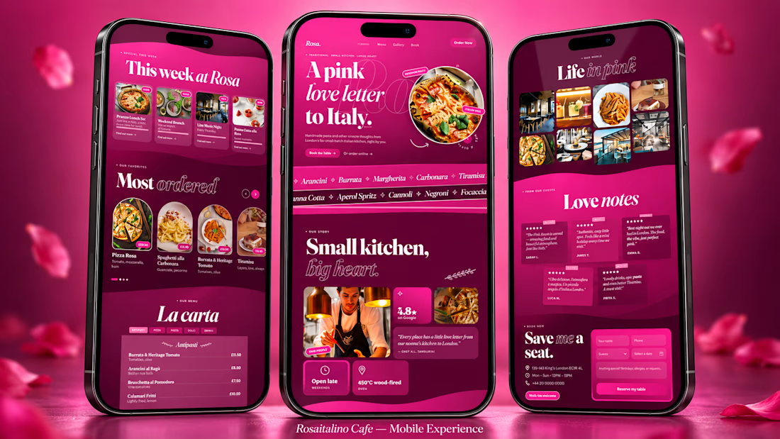
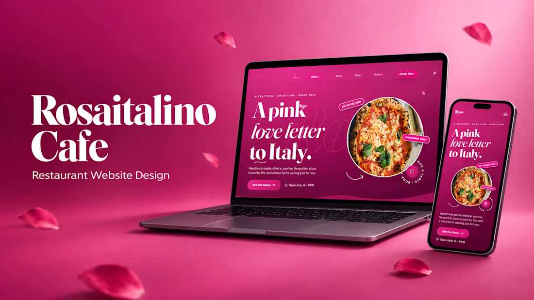
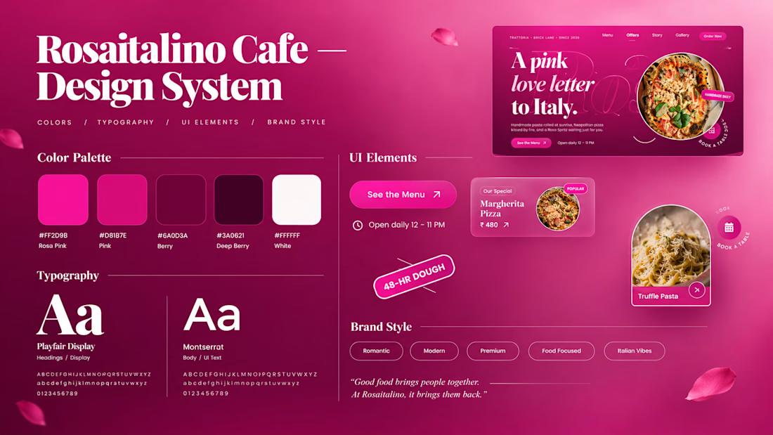
So I built a concept to show what that same restaurant could look like: Rosa italino Cafe, a rose-pink Italian restaurant website for London.
Here's what a website like this gives the owner:
🌹 A first impression that sells
People judge a restaurant in 3 seconds. A bold, beautiful design makes them hungry before they read a single word.
🍝 A menu that works like your best waiter
Dishes with photos, descriptions and prices, easy to scroll on a phone. Your signature dishes get the spotlight, so people order more of what you want to sell.
📱 Bookings from thumbs
Most people find a restaurant on their phone. A simple booking section means they reserve a table in a few taps instead of giving up.
⭐ Trust at a glance
Reviews, photos and your story in one place, so a stranger feels safe choosing you over the place next door.
📣 A place for your offers
Lunch sets, weekend specials, live music nights: update them and your regulars see them first.
🕛 A sales person that never sleeps
Your website is open at 2 AM, on Sundays and on holidays, showing your food to everyone who searches.
None of this needs a bigger budget. It needs a website designed like it cares about your food as much as you do.
That's what I do. I'm Swayam. I design and build websites for restaurants and small businesses, made to look stunning and turn visitors into customers.
Run a restaurant, cafe, salon or any small business?
Message me your business name and I'll send you a quick concept idea for your brand. No pressure, no boring sales pitch.
(Rosa italino Cafe is a concept project. Marco is a fictional character, but the problem is very real.)


Thats real intuitive post!


A few months back, a real estate agency was referred to Lowkey.Club.
We started with an audit of their brand foundation and website.
Rather than pitching another static PDF, I used Lovable to build a visual proposal. Messaging, tone of voice, typography, colour and functionality, all brought together to give the client a feel for where we could take things.
DM me if u wanna see that link:🎉
The catch? Their existing website ran on SiteJet, a cPanel-based builder I hadn't worked with before.
No need to reinvent the wheel, though.
I got familiar with the platform and translated the creative direction into their existing setup, keeping future property listings manageable.
A sharper brand, a more considered landing page, and a happy client.
Sometimes the best design solution isn't a new platform. It's knowing what to do with the one you've got.


building the proposal in lovable instead of a static pdf is a really nice touch. do most of lowkey.club's clients come through referrals like this one, or do you reach out too?


