The network for creativity
Join 1.25M professional creatives like you
Connect with clients, get discovered, and run your business 100% commission-free
Creatives on Contra have earned over $150M and we are just getting started
Back to feedPost

Built a player evaluation platform for youth soccer clubs this year. The hardest part wasn't the multi-tenant architecture or the Stripe billing. It was sun glare.
Coaches use this outdoors on a Saturday morning. One hand holds a whistle, the other holds the phone. Half the fields have no cell coverage.
None of that shows up in a feature list, but all of it decides whether the product gets opened a second time.
So the build changed. Dark mode became the default instead of a setting, because a bright screen is unreadable in direct sun. Tap targets got large enough to hit without looking down. Capture went offline-first with sync reconciliation, so a coach can rate forty players in a dead zone and lose nothing. Player safety flags surface on the card before evaluation starts, instead of sitting three taps deep in a profile.
The lesson I keep relearning: figure out where your user is physically standing when they open the app. That answer changes more decisions than the stack does.
sportformiq.com if you want a look.
The network for creativity
Join 1.25M professional creatives like you
Connect with clients, get discovered, and run your business 100% commission-free
Creatives on Contra have earned over $150M and we are just getting started











Related posts

I created a Technical Player Evaluation app for a real soccer school to help coaches evaluate technical skills, and track each player's development over time.


this is so specified & so clever! i'm positive that this would make a soccer coach's job easier & their feedback more impactful thanks to being able to track.

Tennis league organizers coordinate seasons, tournaments, teams, match results, and rankings. When those workflows are spread across different tools, it can be difficult to keep information organized.
Fragstat brings league management into one SaaS dashboard. Organizers can navigate between seasons, brackets, teams, analytics, and moderation, while the overview surfaces tournament activity, match status, and team performance.
The visual direction pairs tennis photography and vivid green accents with structured dashboard components to make complex information easier to scan.


🧪 TASTY TEST: WHICH ONE MAKES NEXT WEEK FEEL SORTED?
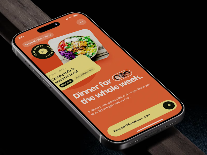
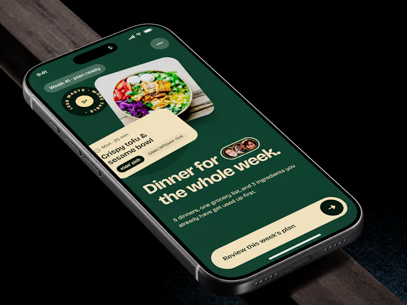
Meal planner mobile app design. Same UX, two palettes.
🍊 A · Citrus Energy
Orange + buttery yellow. Appetite first.
🌿 B · Forest Calm
Deep green + cream. A calmer weekly ritual.
💡 GROWTH THINKING
Users want dinner handled, not another planning task.
My hypothesis: orange could win the first tap; green could signal less effort. I’d test plan-open rate AND grocery-list completion. More taps mean little if people abandon the next step.
🗳️ A OR B — WHICH WOULD YOU TRUST WITH NEXT WEEK’S DINNERS?
Vote and tell me why.
📩 BUILDING A MOBILE APP? LET’S FIND WHAT’S HOLDING GROWTH BACK.
https://calendly.com/asol_design/demo
#MobileAppDesign #AsolDesign
8 votes
Ends in 1d