The network for creativity
Join 1.25M professional creatives like you
Connect with clients, get discovered, and run your business 100% commission-free
Creatives on Contra have earned over $150M and we are just getting started
Back to feedPost

Sell/Rent more properties with a lead-focused website.
Real Estate websites don't have to look old when they are trying to sell/rent luxury properties sometimes.
A good looking website creates trust in your clients.
The network for creativity
Join 1.25M professional creatives like you
Connect with clients, get discovered, and run your business 100% commission-free
Creatives on Contra have earned over $150M and we are just getting started



Related posts

Real estate decks are some of my favourite to design. The product already looks good on camera, so the photos carry half the story. The tricky half is the numbers: rental yields and prices per listing have to sit next to a glossy Dubai skyline without killing the mood.
For Elevate Realty I made the numbers visual too. Instead of a plain "93% client satisfaction", the slide shows 100 small figures with 7 of them left grey. Your eye finds the grey ones before it reads the number.
Do you like working with real estate clients?
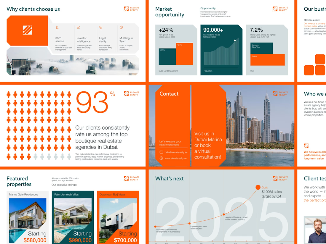

Love the 93 percent visual, 100 small figures with 7 left grey makes the number land in a way a plain stat never does. Real estate clients definitely respond to that kind of clarity.

Designed for modern real estate experiences — making property discovery, browsing, and buying feel effortless. 🏡
#RealEstateDesign #RealEstateApp #UIUXDesign #UIDesign #UXDesign


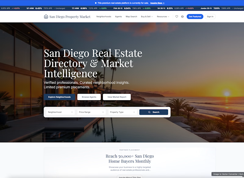
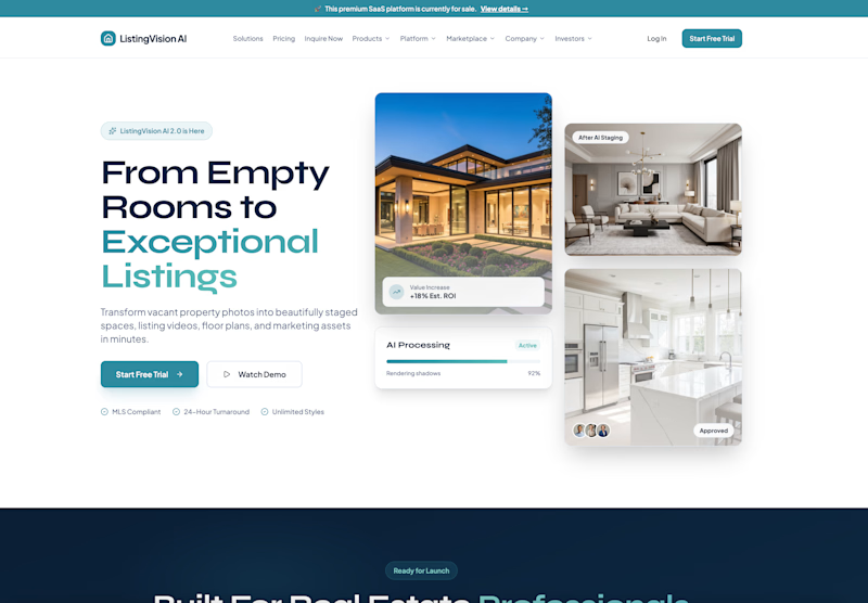
Which real estate homepage makes the stronger first impression?
ListingVision AI features a bright layout, teal accents, and property imagery to introduce its AI staging and listing tools.
San Diego Property Market pairs coastal photography with classic typography, neighborhood search, and market resources.
Which design feels more inviting and makes you want to explore further? Does the clean presentation of ListingVision AI catch your attention, or do you prefer the location-focused experience of San Diego Property Market?
Vote for your favorite and share what influenced your choice: imagery, colors, typography, layout, or calls to action.
#WebDesign #RealEstateMarketing #AIWebsites #UIUXDesign #TransformedDesign


3 voted
43%
4 voted
57%
7 votes
Closed

ListingVision AI. One clear primary button and the staged before/after right in the hero, while San Diego asks you to choose between three equal buttons and a search bar before you know why.