The network for creativity
Join 1.25M professional creatives like you
Connect with clients, get discovered, and run your business 100% commission-free
Creatives on Contra have earned over $150M and we are just getting started
Back to feedPost

Built by Shawnee — Custom Websites + Business Systems


The network for creativity
Join 1.25M professional creatives like you
Connect with clients, get discovered, and run your business 100% commission-free
Creatives on Contra have earned over $150M and we are just getting started
Challenges
View all


Related posts

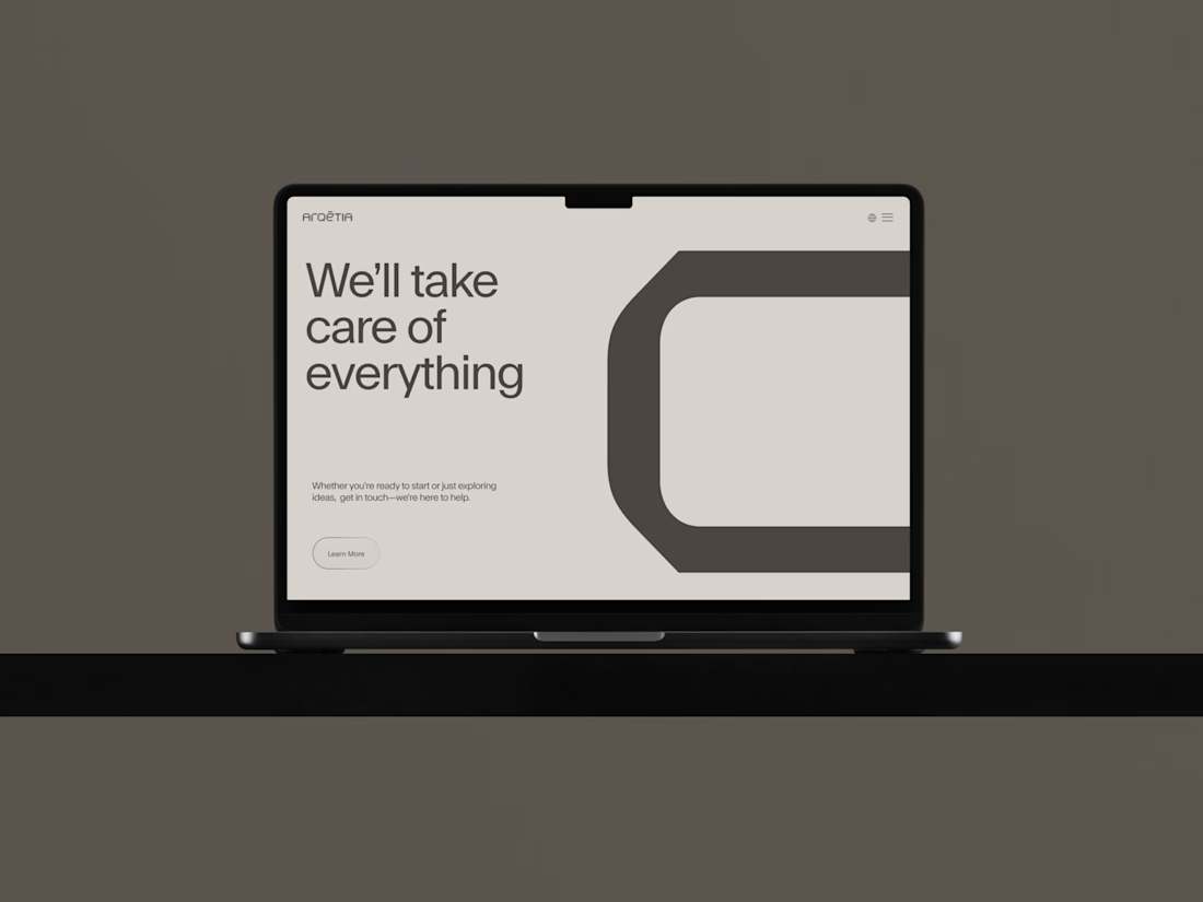
What if construction felt as clear as the space it creates?
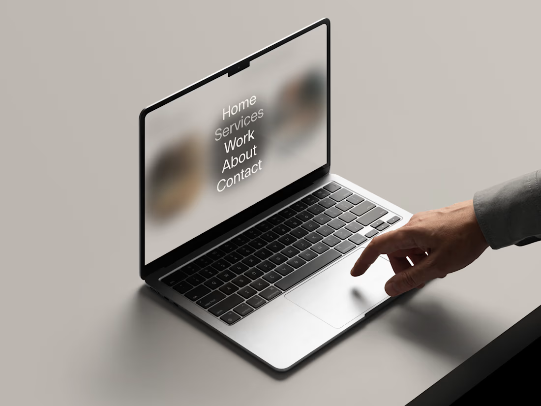
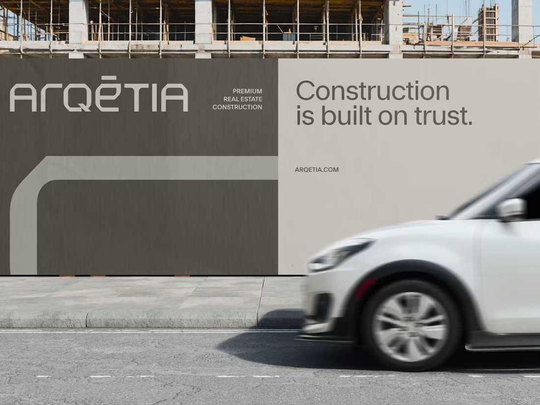
For Arqētia, we built a visual identity around one of the industry's most important client needs: transparency. A direct response to the uncertainty often associated with construction, from unclear processes and budgets to timelines and decision-making.
The concept makes transparency tangible, translating it into a visual system that feels open, structured and precise.
check it out

Very clean identity work

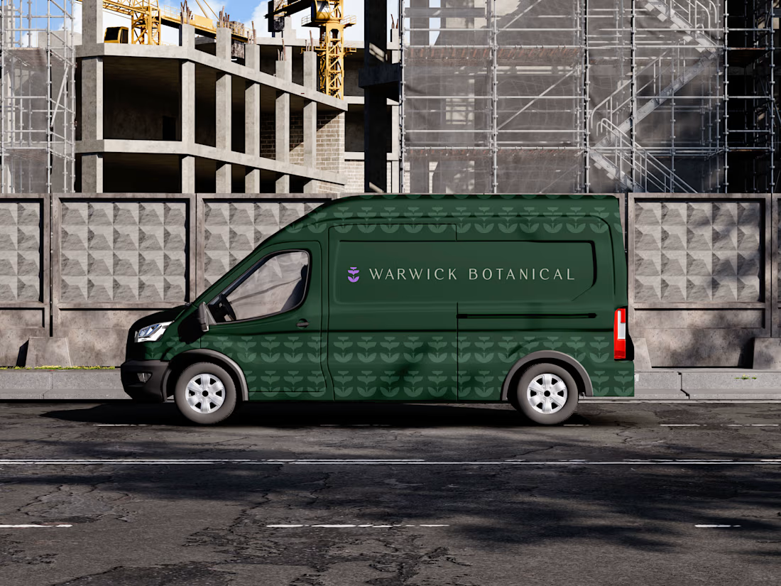
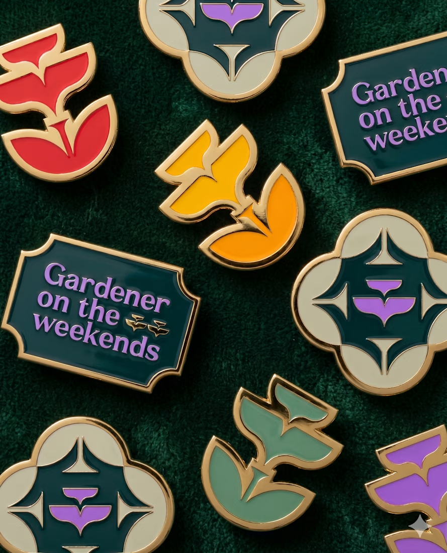
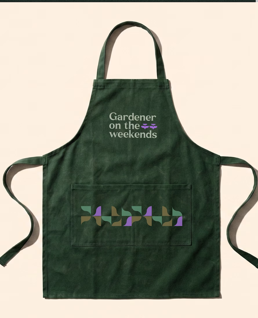
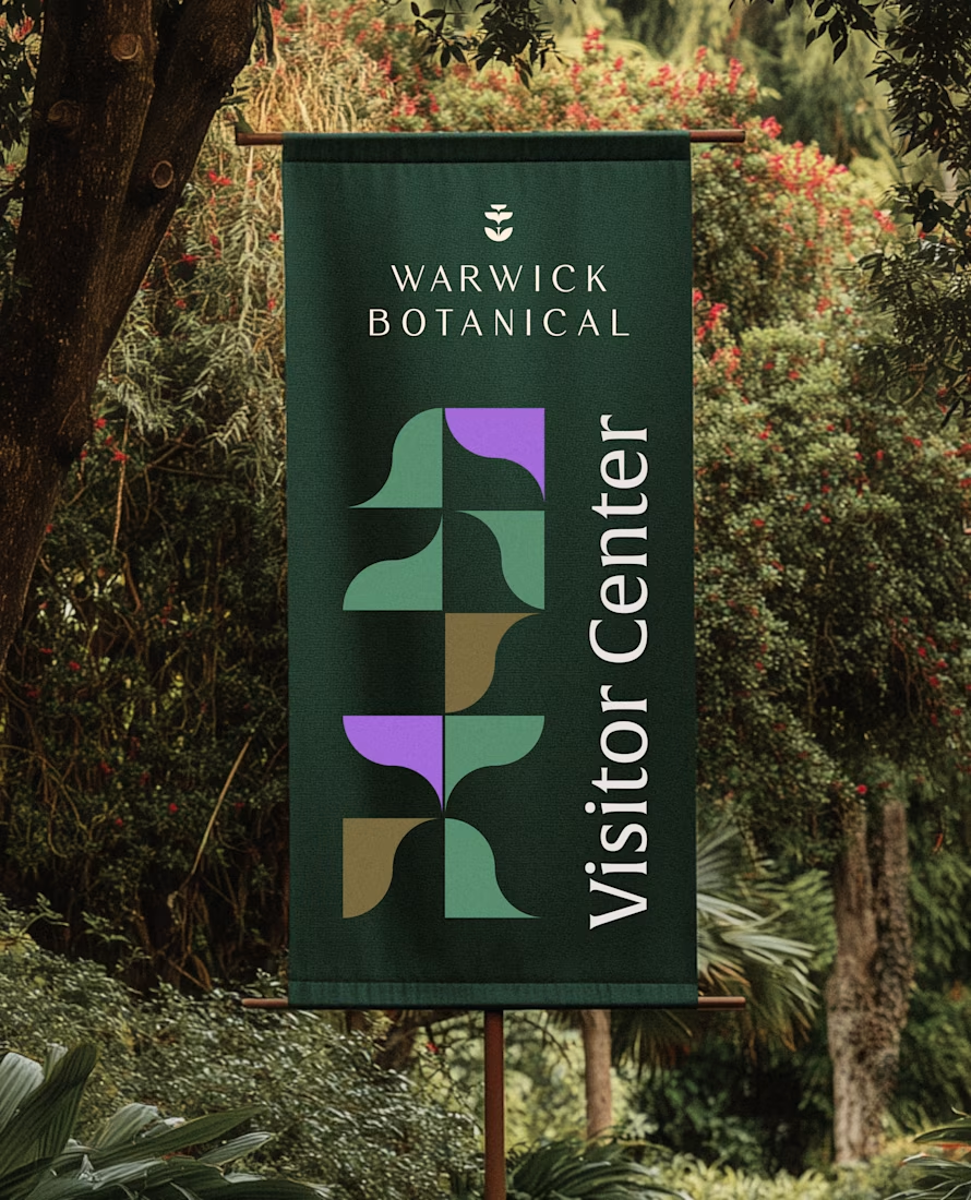
For brand identity, I like to show mockups to test of the identity system: the logo, pattern, and color palette all needed to work at a much larger scale without feeling overdesigned.
That’s where a flexible brand system really starts to prove itself.

Powerful greenish look 👌
A little preview of something I’m working on.
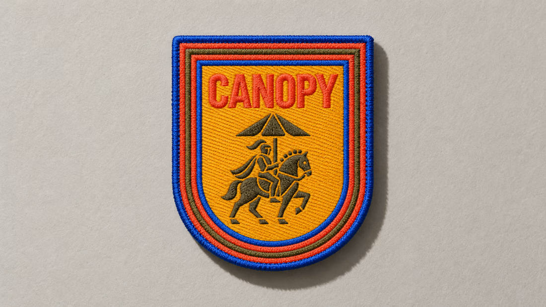
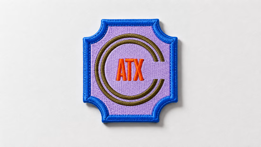
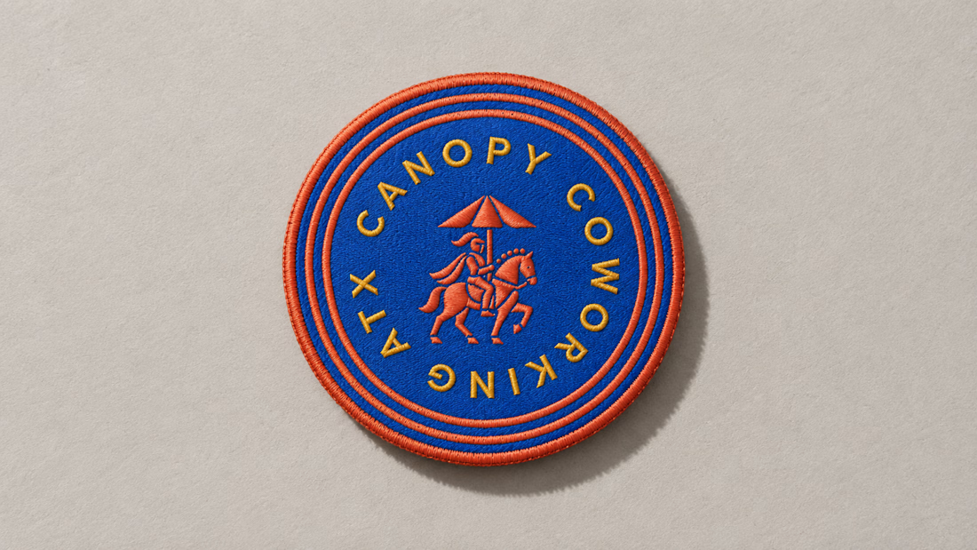
These embroidered patches are a small part of a much larger brand system, but details like this matter. The challenge is making sure the identity still feels distinct and intentional when it moves from screen to something physical you can hold in your hand.
That’s where a strong brand system starts begins to prove itself. More soon :)