The network for creativity
Join 1.25M professional creatives like you
Connect with clients, get discovered, and run your business 100% commission-free
Creatives on Contra have earned over $150M and we are just getting started
Back to feedPost

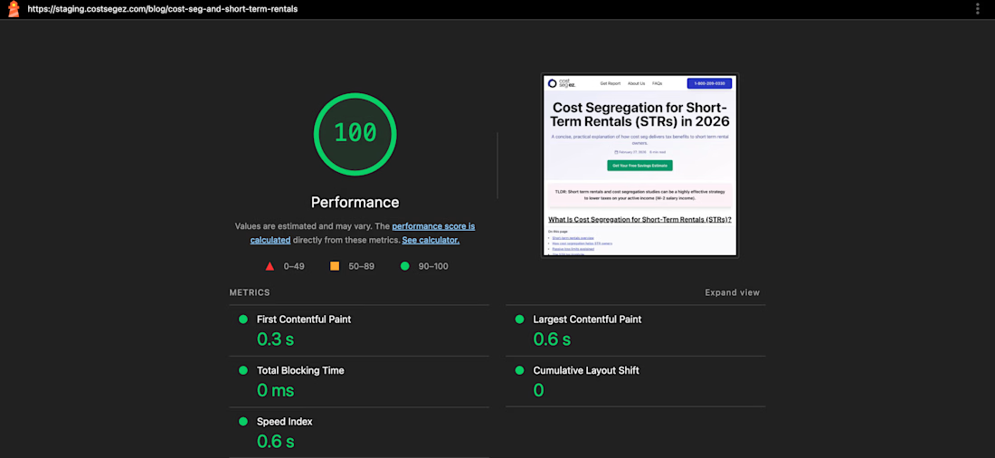
Most developers chase Lighthouse scores like a number.
That’s why their apps still feel slow.
Lighthouse doesn’t make your product fast. Decisions do.
A 300kb library in your critical path.
Client-side rendering where it’s not needed.
Animations that block the main thread.
That’s where performance actually breaks.
I recently worked on improving a web app from ~60 to 95+.
Not by adding tools.
By removing things.
Replacing heavy dependencies.
Shipping less JavaScript.
Letting the browser do its job.
Performance isn’t optimization.
It’s restraint.

The network for creativity
Join 1.25M professional creatives like you
Connect with clients, get discovered, and run your business 100% commission-free
Creatives on Contra have earned over $150M and we are just getting started





Related posts

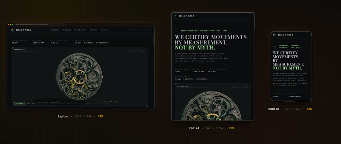
A watch movement lifted from one photograph into 3D. HEXANOX is an independent horology institute. We certify mechanical movements by measurement, amplitude, beat error, positional variance, to tolerances your eye cannot see.
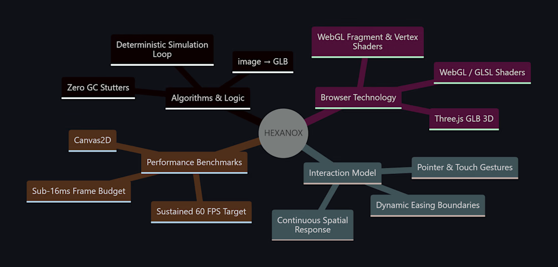
I built this project to test A watch movement lifted from one photograph into 3D. HEXANOX is an independent horology institute. We certify mechanical movements by measurement, amplitude, beat error, positional variance, to tolerances your eye cannot see. The core engineering challenge was sustaining uncompromised 60 FPS rendering using Three.js (GLB 3D) while handling continuous user interaction without framework overhead.
WHAT I WAS TESTING:
I focused on two core engineering benchmarks:
Precision implementation of image → GLB under continuous interactive user input
Sustained 60 FPS render performance and zero-dependency browser execution
THE TECHNICAL SIDE:
Engineered directly in the browser with Three.js (GLB 3D), WebGL / GLSL Shaders, Canvas2D, Image → GLB. The application runs without third-party frameworks or build-step dependencies, using hardware-accelerated rendering and custom event loops to achieve zero-latency response.
Everything executes in the browser using Three.js (GLB 3D), WebGL / GLSL Shaders, Canvas2D, Image → GLB. No third-party frameworks, no heavy runtime bundles, and zero external tracking.
WHAT I LEARNED:
Balancing the mathematical rigors of image → GLB with tactile browser interaction required tuning event throttling and memory allocation to eliminate all garbage collection stutters.
Finding the sweet spot between mathematical precision and frame budget took careful profiling, but the result runs at a steady 60 FPS even on modest hardware.
TRY IT YOURSELF:
The live build is deployed on Netlify. Open it in your browser, test the controls, and observe the render response times.
If you are building high-performance 3D, physics, or creative web systems and want to collaborate, reach out here on Contra.




Built Loop - a landing page that turns “noise into a system.”
Warm gold, dark glass, subtle data-flow animations, and an interactive scroll story.
Built using Cadence Studios
What do you think? 🚀


the gold accents work really well here bro. just enough color to guide the eye without making the page feel busy

Real Estate Webapp
A responsive frontend real estate application featuring a polished UI and optimized layouts for a premium property-browsing experience.


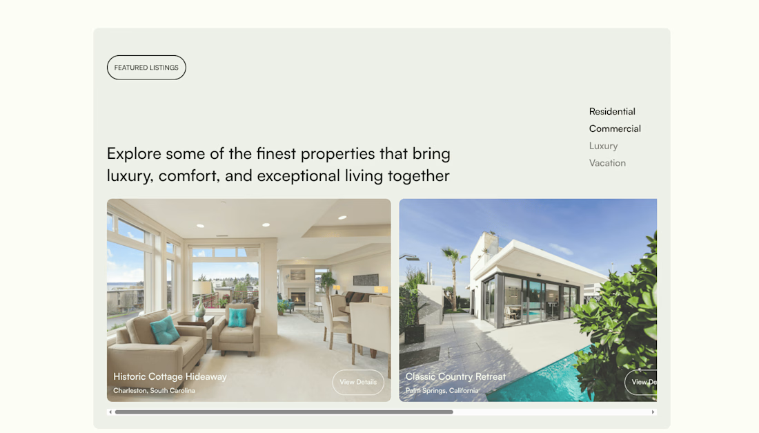
nice one, the big property photos make sense here. i'd give the text over them a bit more contrast though, especially the location