The network for creativity
Join 1.25M professional creatives like you
Connect with clients, get discovered, and run your business 100% commission-free
Creatives on Contra have earned over $150M and we are just getting started
Back to feedPost


Just wrapped this material exploration for a Lemanoosh course and had to share it.
The challenge: take the Nintendo Switch, one of the most iconic consumer electronics out there, and rebuild it entirely through a natural material language. Cork, compressed fiber, bone white. No form changes. Just materials doing all the work.
What surprised me most was how much personality shifts when you change the surface. Same silhouette, completely different feeling.


Beautiful exploration 👏 Translating an iconic consumer product into a natural material language is a fascinating constraint. Curious — what was the hardest trade-off between realism and usability?
That makes complete sense 👏
Constraints like manufacturability vs concept exploration always create interesting tension. Really enjoyed how you approached it.

I loved your project, the texture of the material, and the soft lighting.

Nice renders.
The network for creativity
Join 1.25M professional creatives like you
Connect with clients, get discovered, and run your business 100% commission-free
Creatives on Contra have earned over $150M and we are just getting started








Related posts


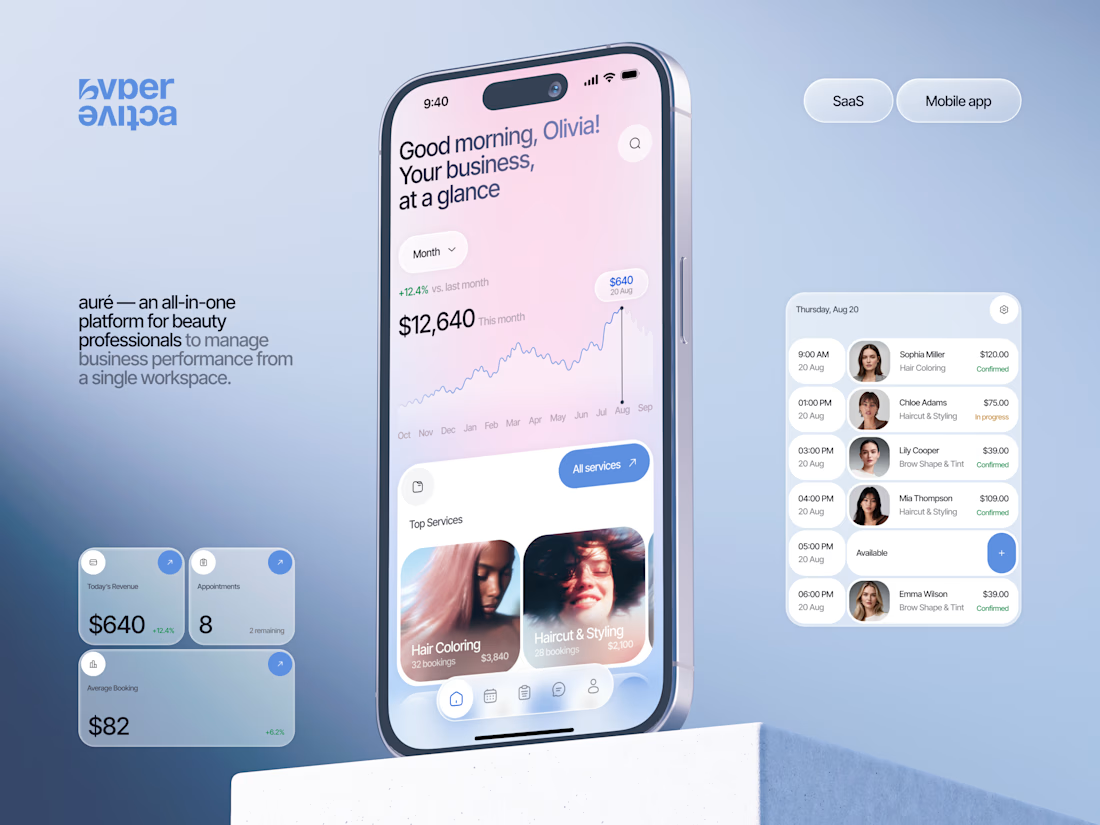
Finally wrapped up this project, and I’m excited to share the case study! 💅 A fresh product design concept for a beauty dashboard. Would love to hear your thoughts! ✨


A beauty dashboard is such a fun product design challenge, Oleksandra. The Good morning, Olivia! greeting in the header makes business metrics feel personal instead of clinical, which is exactly what a beauty professional would want.

The Good Times website is live 👀
Most app sites start with a phone mockup and a list of features. This one starts with the problem, so you can see yourself in it first. The app shows up after that, as the answer.
https://goodtimestimer.com/
Built with Astro.


Great concept

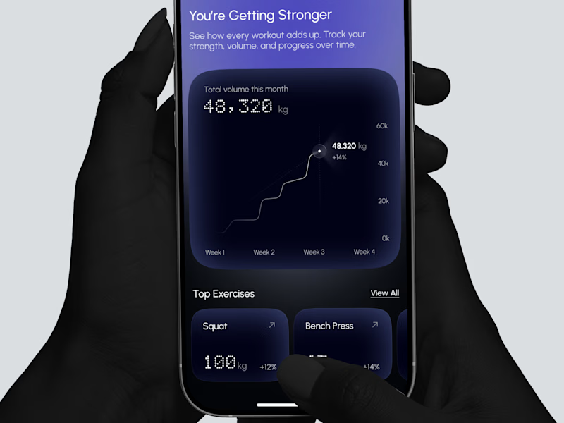
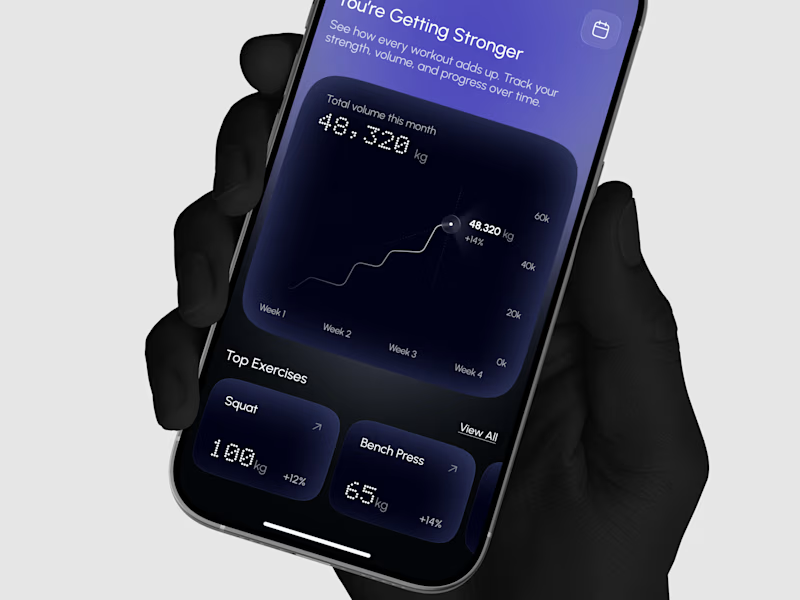
Designed a strength progress screen where you can watch your total volume grow and track your top lifts over time.
Same screen, two shots. Which one would stop your scroll? 👀


2 voted
29%
5 voted
71%
7 votes
Closed