The network for creativity
Join 1.25M professional creatives like you
Connect with clients, get discovered, and run your business 100% commission-free
Creatives on Contra have earned over $150M and we are just getting started
Back to feedPost

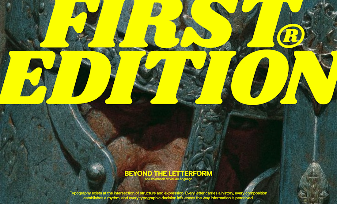
Just wrapped up a fresh magazine spread design focusing on editorial formatting and custom layout elements.
The network for creativity
Join 1.25M professional creatives like you
Connect with clients, get discovered, and run your business 100% commission-free
Creatives on Contra have earned over $150M and we are just getting started



Related posts

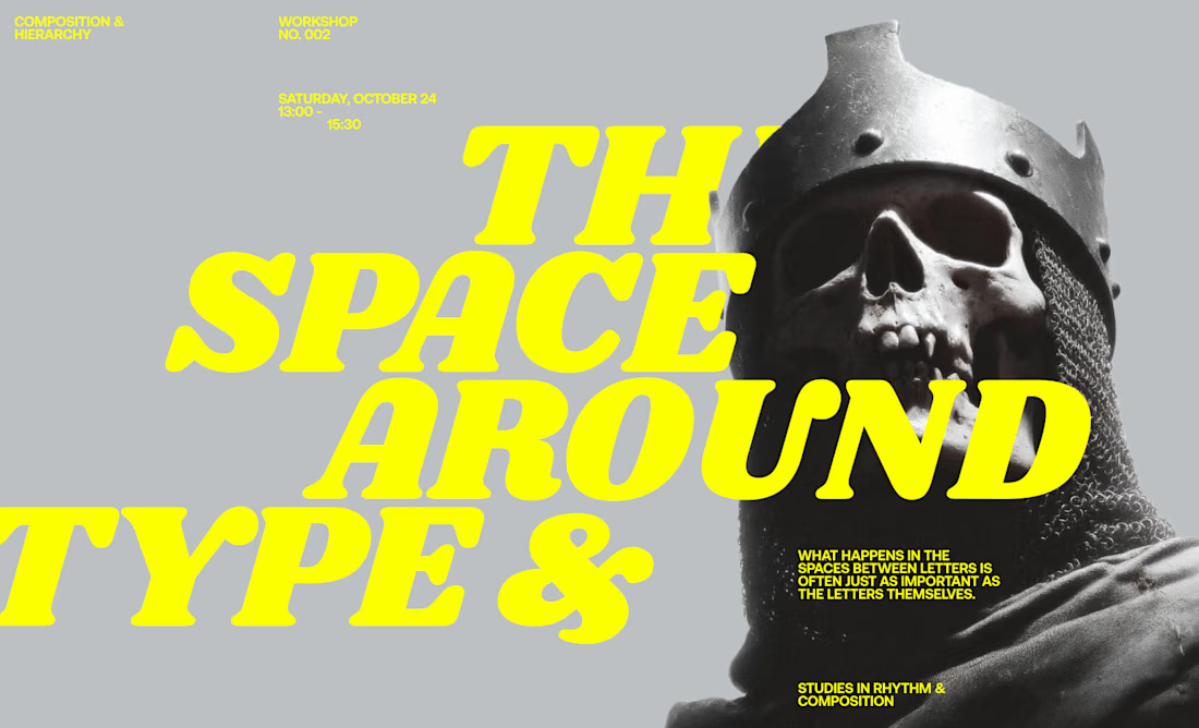
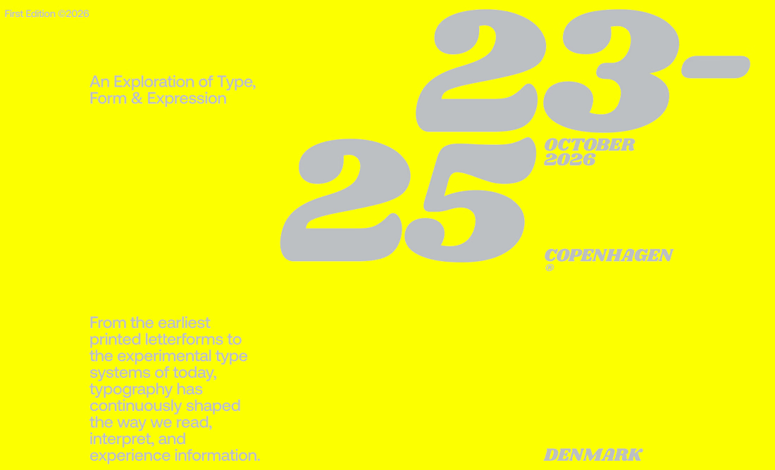
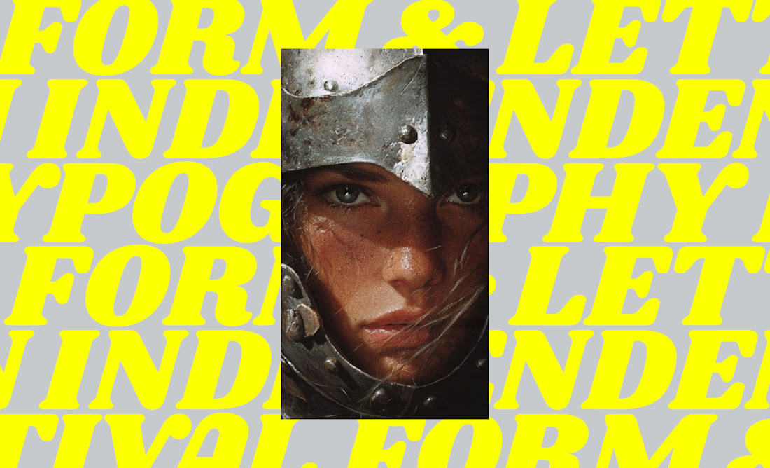
I designed a series of editorial-inspired layouts for a fictional typography event and workshop focused on the history of type.
↳ Master typography & layout - The foundation of timeless web design. Join 350+ designers inside my 13-hour online course https://typomonday.com/course


i love your compositions, always so inspiring:))

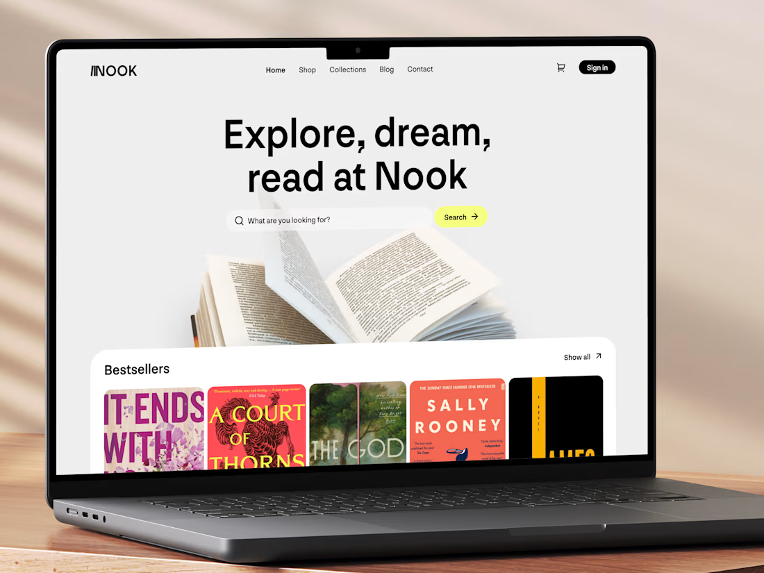
Really like this concept! The clean layout and typography look great, and the bestseller section is a nice touch. Genre filters could make browsing even better. Great work! 👏


New concept for bookstore 📚
What do you think?

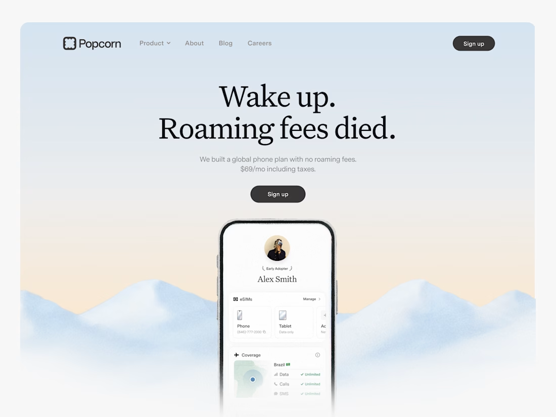

Looks great! What about readability though?
Text seems low contrast to me. Although I have a poor vision and most things seem too small and low contrast to me.