The network for creativity
Join 1.25M professional creatives like you
Connect with clients, get discovered, and run your business 100% commission-free
Creatives on Contra have earned over $150M and we are just getting started
Back to feedPost
When you deny the trend of so called " Luxury Real Estate Website " with same black and gold dull scheme and build a Modern Masterpiece from scratch

Real Estate - Modern Theme Website
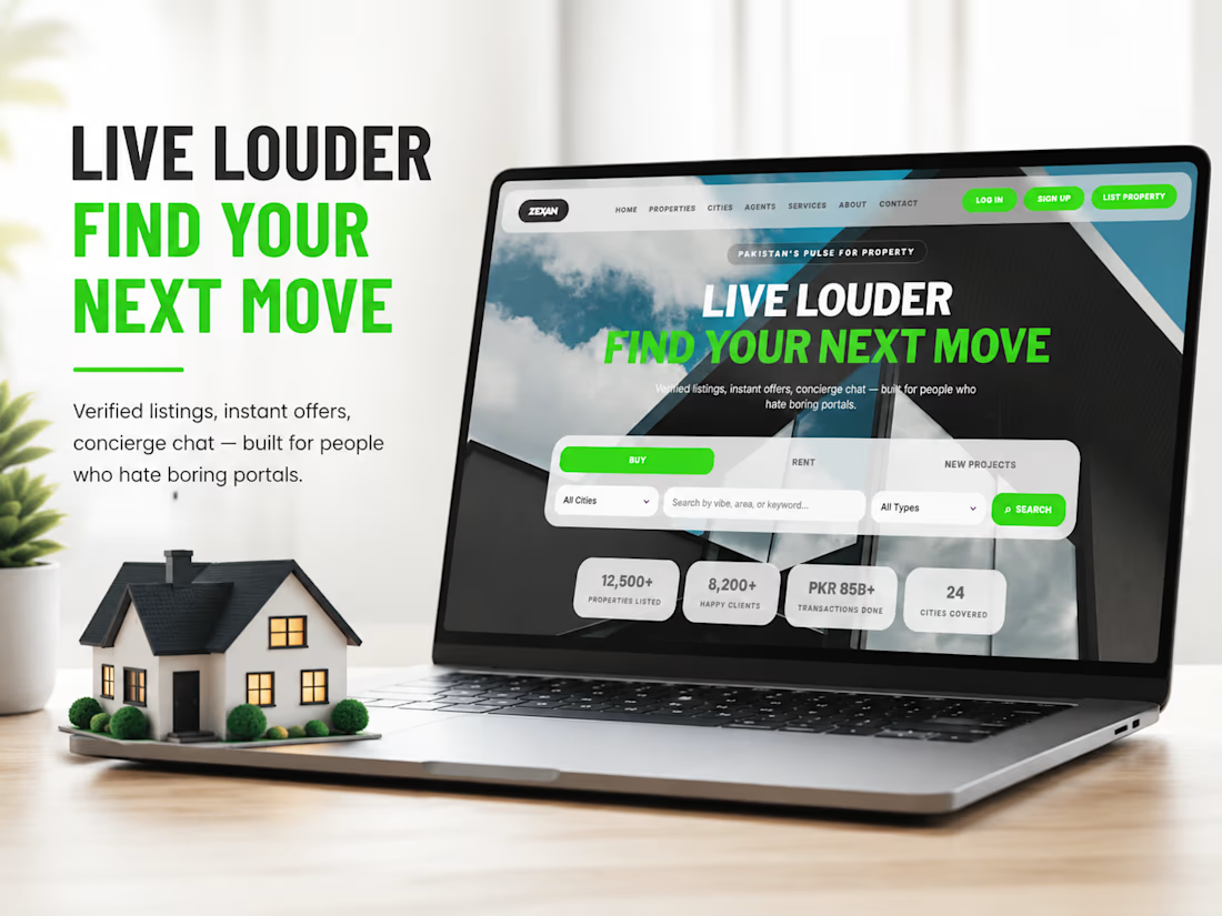

This is really refreshing to see. I genuinely love your approach. As a designer who’s worked with many real estate agents, I can honestly say it’s rare to find someone who doesn’t end up wanting the classic black-and-gold branding in the end 😅

I'm Glad someone said that !
Honestly, after working on so many projects for real estate agents in Los Angeles, I can only remember one client who wanted something other than the usual black-and-gold look — she asked for red 😅
A red color real estate website 😦 , that's really ' rare '.
I'm excited to see that site , you got a link or smth ? ( no probs if the link is not available.... )
The network for creativity
Join 1.25M professional creatives like you
Connect with clients, get discovered, and run your business 100% commission-free
Creatives on Contra have earned over $150M and we are just getting started

Challenges
View all


Related posts

When your landing Page is so goated that you no longer need a launch video.


Thats what a landing page do for you hahahaah

Designed a dashboard concept for tracking net worth across every asset type — stocks, crypto, property, pensions, funds, cash, and liabilities — all in one place.
Instead of the usual pie chart or bar graph, the centerpiece is a dial: a single, glanceable gauge showing where your wealth actually sits. Behind it, a quiet grid of every asset category fades in and out of visibility, reinforcing that everything's accounted for even when it's not the focus.
Dark UI, a single confident green accent, and a lot of negative space — built to make a genuinely overwhelming task (seeing your entire financial picture at once) feel calm instead of cluttered.


wow the animation feels super smooth, what is this animation for?

SENE car rental Website Projects
A car rental website shouldn't make people think too much. It should help them find the right car, understand the price, trust the service, and book with confidence.
I designed SENE around exactly that principle.
Need a website that turns visitors into customers?
I help businesses create modern, conversion-focused websites that look premium and make the user journey easier.
Available for website design & redesign projects.

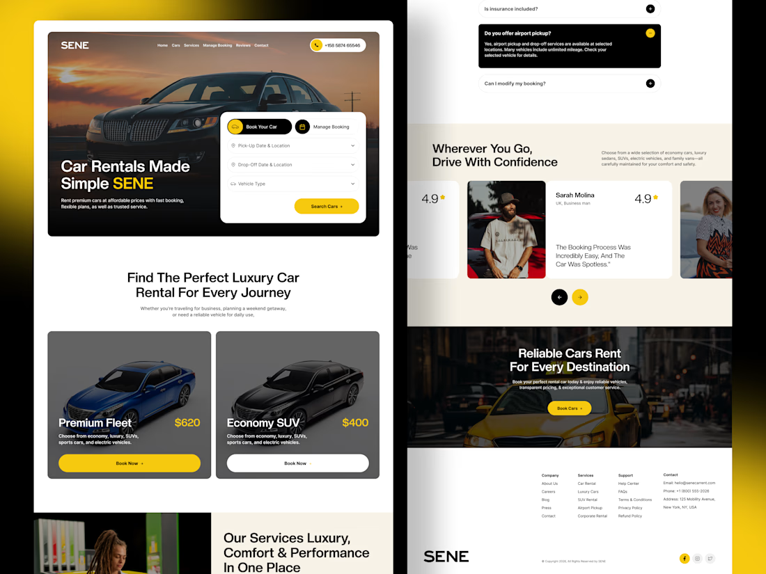

The composition is extremely clean and well organized. It’s impressive how you managed to fit so much information into the layout while keeping everything visually comfortable.