The network for creativity
Join 1.25M professional creatives like you
Connect with clients, get discovered, and run your business 100% commission-free
Creatives on Contra have earned over $150M and we are just getting started
Back to feedPost


The network for creativity
Join 1.25M professional creatives like you
Connect with clients, get discovered, and run your business 100% commission-free
Creatives on Contra have earned over $150M and we are just getting started

Challenges
View all


Related posts

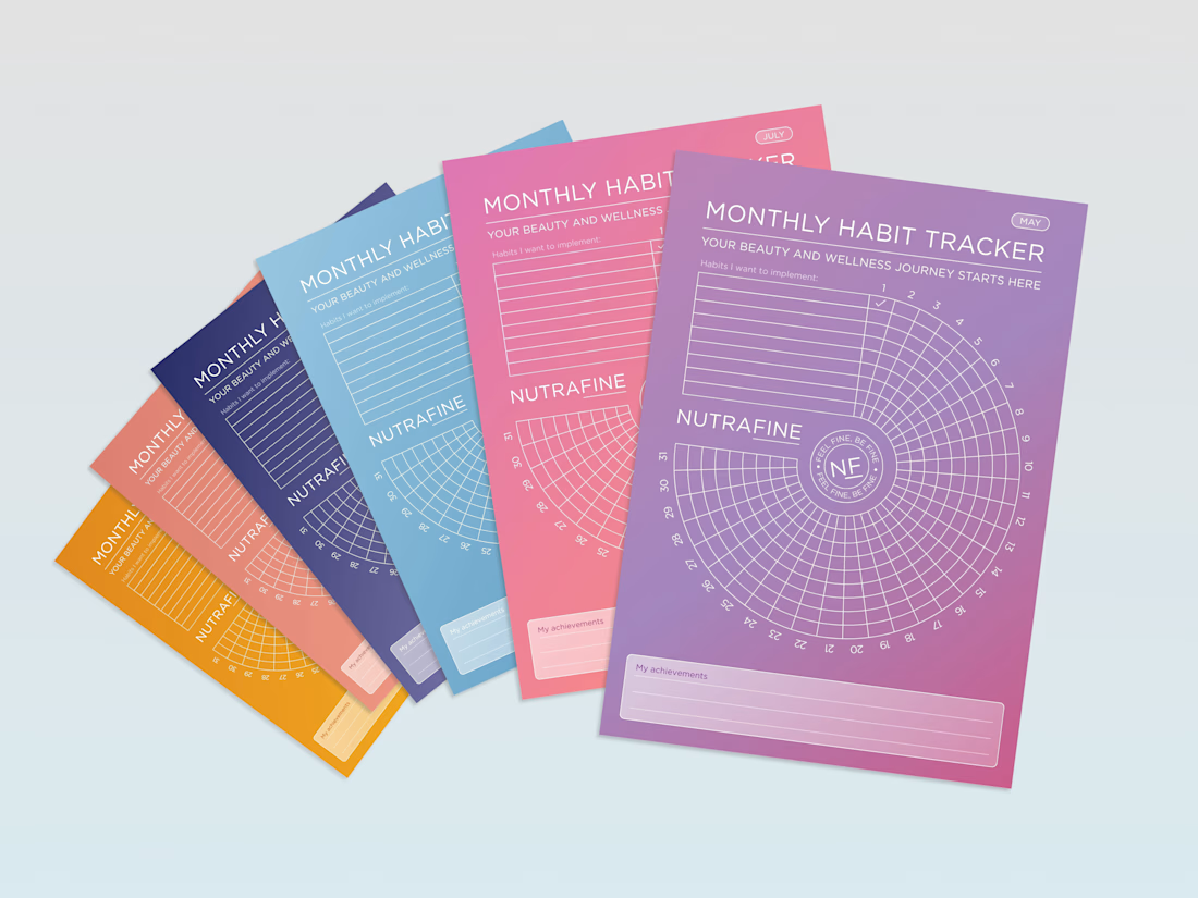
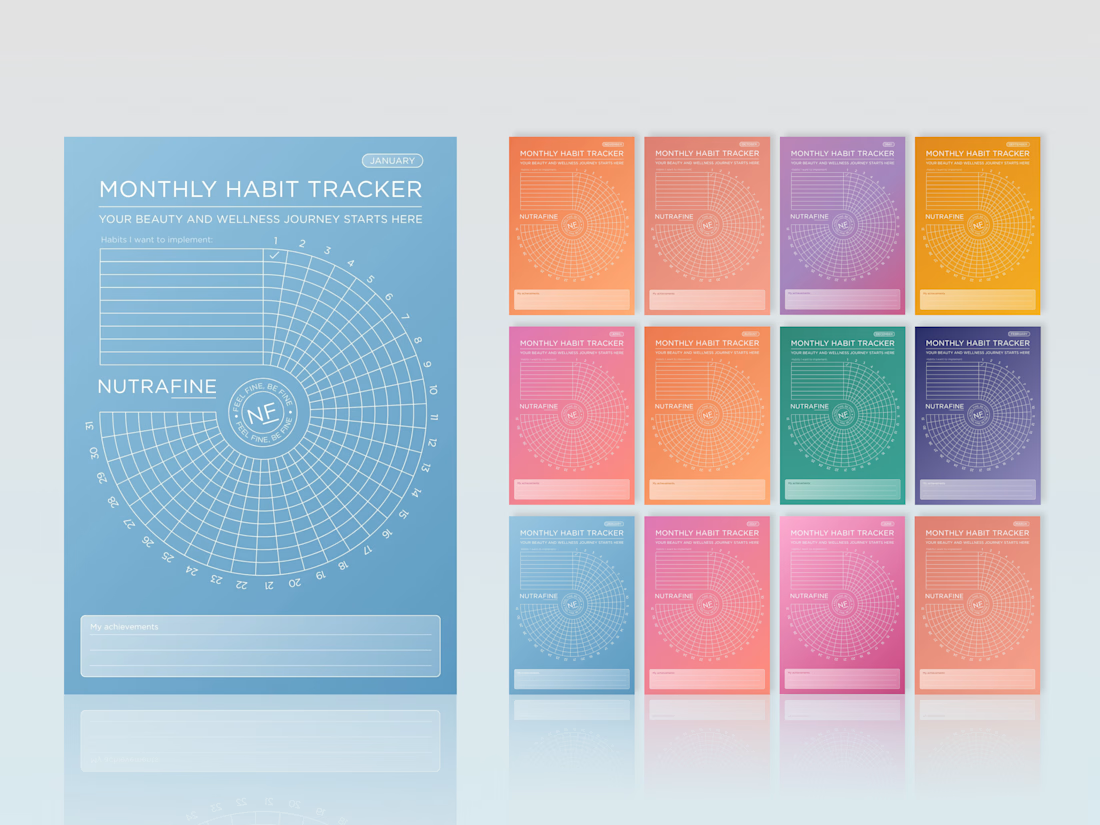
Can a habit tracker feel like a brand experience, not just a table?
For Nutrafine’s corporate gifting, each month is tied to one SKU, using the same colour as its packaging. It’s more colour than I would usually choose, but the depth of the palette, white linework and typography make the system hold together.
The bigger idea was to make the tracker itself feel less expected. Instead of a grid, we built a spiral, turning a practical tool into something more playful, memorable and distinctly Nutrafine.
#BrandDesign #CorporateGift #WellnessBranding #BrandExperience #CreativeDirection



Love these!

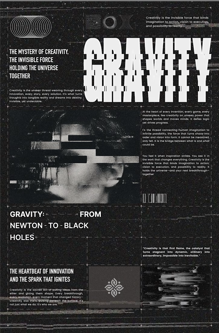
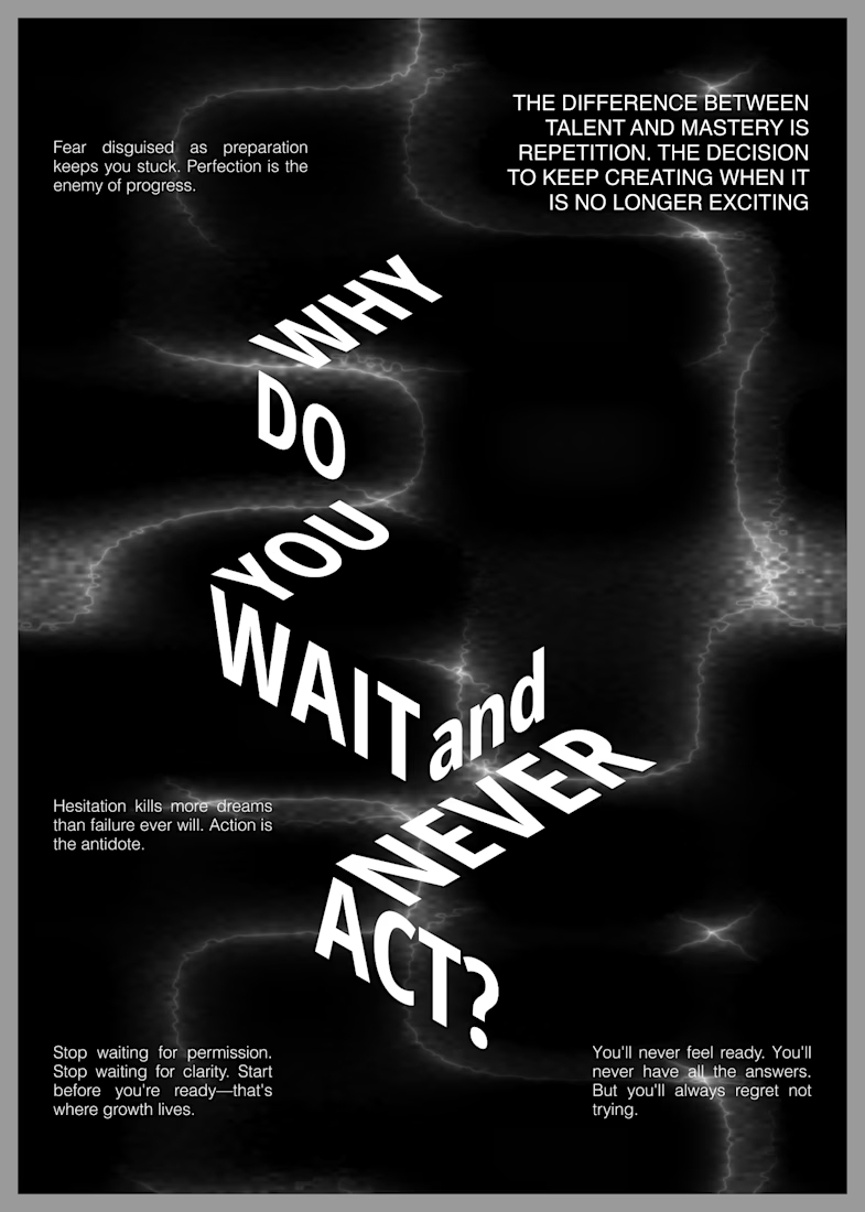
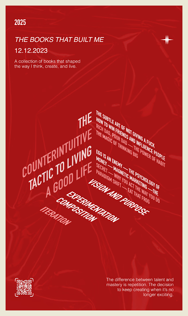
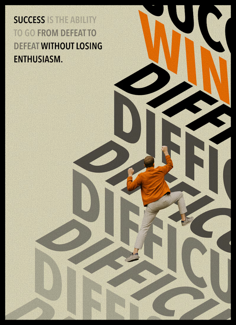
Typography becomes more than language when it starts to behave like an image. Scale, rhythm, distortion, and space give words a physical presence, creating compositions that can be read, felt, and experienced before they are fully understood.

Love the bold and gritty approach. Great set!

Created this AI-powered UGC ad for NOMA, a fictional travel neck pillow brand.
The goal was simple: make it feel like a real traveler genuinely using the product, not an AI-generated commercial.
The product consistency took a few rounds of refining especially keeping the same pillow shape and branding across the scenes.
What do you think?


Great work!